0

I am trying to plot different series (Columns) using ggplot2. But I can't seem to be able to produce the plot.

Here is what my data looks like (goes from 1976 to 2017):

Year     Atlantic     Prairie   Ter   Ontario       BC        Quebec      Canada

1976    1.2638857   0.4546927   NA   0.6815441  0.7264928   1.0050021   0.8424173
1977    1.1722437   0.4819217   NA   0.5951699  0.7264113   0.8883986   0.7701221
1978    1.1990781   0.4870121   NA   0.5737307  0.7684976   0.8672100   0.7604538
1979    1.1287050   0.4333563   NA   0.5194313  0.6579418   0.8407571   0.7086144
1980    1.1133467   0.4198007   NA   0.5313260  0.5992944   0.7677071   0.6745683

Here is my code that I got from similar questions here in SO.

library("reshape2")
coverage <- read.xlsx(. . .)
Tall_data <- melt(coverage ,  id.vars = "Year", variable.name = "series") #Step1: Rearrange data in tall format
ggplot(Tall_data, aes(Year,value)) + geom_line(aes(colour = series)) #Step2: Plot

In Step 1, R gives me the message: "attributes are not identical across measure variables; they will be dropped"

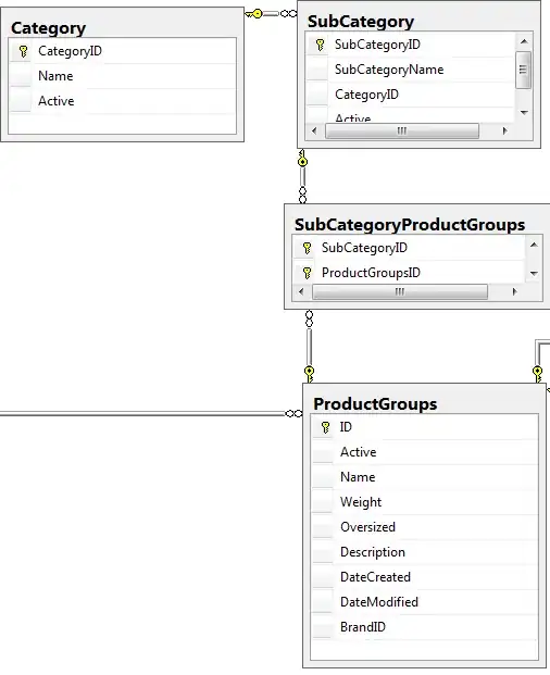
I have attached the produced plot - it is bizarre.

Note that some data in Column "Territories" is NA (from 1976 to 2003).

I know I can do it this way:

ggplot(coverage, aes(Year)) + 

  labs(y= "The B/U Ratio") +
  geom_line(aes(y=Atlantic_Provinces), colour="green") +
  geom_line(aes(y=Prairie_Provinces), colour="red") + ...

But I want to be able to do it with one single command. Also, doing them individually does not give me the legend names. I have looked into other R guides that more or less suggests the same code that I have used. But for some reason its not working for me.

Here are two similar posts:

Plot multiple columns on the same graph in R.

How to plot all the columns of a data frame in R - This is the one I followed.
enter image description here

Marcus Campbell
  • 2,746
  • 4
  • 22
  • 36
Pineapple
  • 193
  • 8
  • 2
    Out of curiosity, after you `melt` the data, what type does `value` have? Typically I see an axis such as the one in the bizarre plot when `value` is coded as a `character` or `factor` – Punintended Oct 15 '19 at 23:58
  • @Punintended Ahhhh... it is Character. I don't know why. Any ideas? – Pineapple Oct 16 '19 at 00:00
  • 2
    I'm not exactly sure. If you're `melt`ing columns of different types, maybe it defaults to the more permissive one? Put another way, it's perfectly acceptable for numbers to be `character` vectors, as `"42"` means something different than `42`, but `"hello"` can't be represented as a `numeric`. Regardless, try calling `as.numeric` on `Tall_data$value`. If that doesn't work, please modify your question to include `str(head(Tall_data))`, as that will give us some insight – Punintended Oct 16 '19 at 00:04
  • @Punintended I deleted the NA's in the original excel file (which I had written instead of leaving them blank). And the problem disappeared. Thanks for telling me *"...but "hello" can't be represented as a numeric..."*. That helped. – Pineapple Oct 16 '19 at 00:31

1 Answers1

1

Is this the right direction?

dat <-
"Year     Atlantic     Prairie   Ter   Ontario       BC        Quebec      Canada
1976    1.2638857   0.4546927   NA   0.6815441  0.7264928   1.0050021   0.8424173
1977    1.1722437   0.4819217   NA   0.5951699  0.7264113   0.8883986   0.7701221
1978    1.1990781   0.4870121   NA   0.5737307  0.7684976   0.8672100   0.7604538
1979    1.1287050   0.4333563   NA   0.5194313  0.6579418   0.8407571   0.7086144
1980    1.1133467   0.4198007   NA   0.5313260  0.5992944   0.7677071   0.6745683
"
df <- read.delim(textConnection(dat), sep="")
library(tidyverse)
tall_df <- pivot_longer(df, 
            cols = c("Atlantic", "Prairie", "Ter", "Ontario", "BC", "Quebec", "Canada"),  
            names_to = "region"  
            )
ggplot(tall_df, aes(x = Year, y = value, color=region)) +
  geom_line()

enter image description here

Zhiqiang Wang
  • 6,206
  • 2
  • 13
  • 27