Basically I'm trying to get this layout in CSS. I've somewhat working modal but I'm finding it hard to get the white box behind the text that is responsive and works for all screen sizes.
.info-container {
  margin-top: -50px;
  width: 100%;
  border-bottom: 100px solid #fff;
  border-right: 100px solid transparent;
}
.info-container h2 {
  position: absolute;
  left: 0;
  top: 10px;
}
/* .pl-0 is bootstrap class that gives padding-left: 0; */
<link href="https://maxcdn.bootstrapcdn.com/bootstrap/4.0.0/css/bootstrap.min.css" rel="stylesheet"/>
<div class="container">
<div class="row">
<div class="col-mg-12">
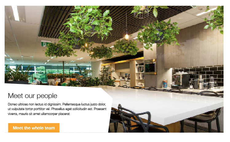
<img src="http://placeimg.com/1000/480/any" />
</div>
</div>
</div>
<div class="container">
<div class="row">
<div class="col-md-8 pl-0">
<div class="info-container">
<h2>Meet our team</h2>
</div>
<p>
Donec ultrices non lectus id dignissim. Pellentesque luctus justo dolor, ut vulputate tortor porttitor vel. Phasellus eget sollicitudin est. Praesent viverra,
</p>
</div>
</div>
</div>