I'm trying to render a "solar system" diagram only with css, the concentric circles are easy to do with css border-radius, border and some transforms but I'm trying to find a way to have the little "planets" adhere to the "orbits" or colored borders. There has to be a more precise way to achieve this
If you look at this image you will see what I'm trying to do:

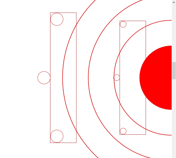
And how it currently looks, sorry for inline css...
<div style="width:100%; height:100vh; padding:0px; background-color:white; display:flex; flex-direction:column; position:relative; align-items:flex-end;">
        <div style="width:250px; height:250px; position:absolute; border-radius:50%; background-color:red; top:50%; transform:translateY(-50%) translateX(50%);  right:0px"></div>
        <div style="width:450px; height:450px; position:absolute; border-radius:50%; border:2px solid red; top:50%; transform:translateY(-50%) translateX(50%);  right:0px"></div>
        <div style="width:650px; height:650px; position:absolute; border-radius:50%; border:2px solid red; top:50%; transform:translateY(-50%) translateX(50%);  right:0px"></div>
        <div style="width:850px; height:850px; position:absolute; border-radius:50%; border:2px solid red; top:50%; transform:translateY(-50%) translateX(50%);  right:0px"></div>
        <div style="position:absolute; height:70%; width:100px; top:50%; transform:translateY(-50%); right:15%; outline:1px solid red;">
            <div style="width:25px; height:25px; border-radius:50%; border:1px solid red; position:absolute; top:0px; left:0px;"></div>
            <div style="width:25px; height:25px; border-radius:50%; border:1px solid red; position:absolute; transform:translateY(-50%); top:50%; right:100%;"></div>
            <div style="width:25px; height:25px; border-radius:50%; border:1px solid red; position:absolute; bottom:0px; left:0px;"></div>
        </div>
        <div style="position:absolute; height:80%; width:100px; top:50%; transform:translateY(-50%); right:55%; outline:1px solid red;">
            <div style="width:50px; height:50px; border-radius:50%; border:1px solid red; position:absolute; top:0px; left:0px;"></div>
            <div style="width:50px; height:50px; border-radius:50%; border:1px solid red; position:absolute; transform:translateY(-50%); top:50%; right:100%;"></div>
            <div style="width:50px; height:50px; border-radius:50%; border:1px solid red; position:absolute; bottom:0px; left:0px;"></div>
        </div>
    </div>