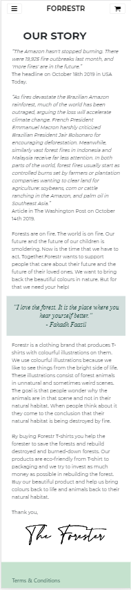
I'm working on this page where I have a container with 2 paragraphs. Between those 2 paragraphs I want (only on small screens) to show a quote in a div that has a full screen-width, however due to the container I can't seem to get it full width small screen view.
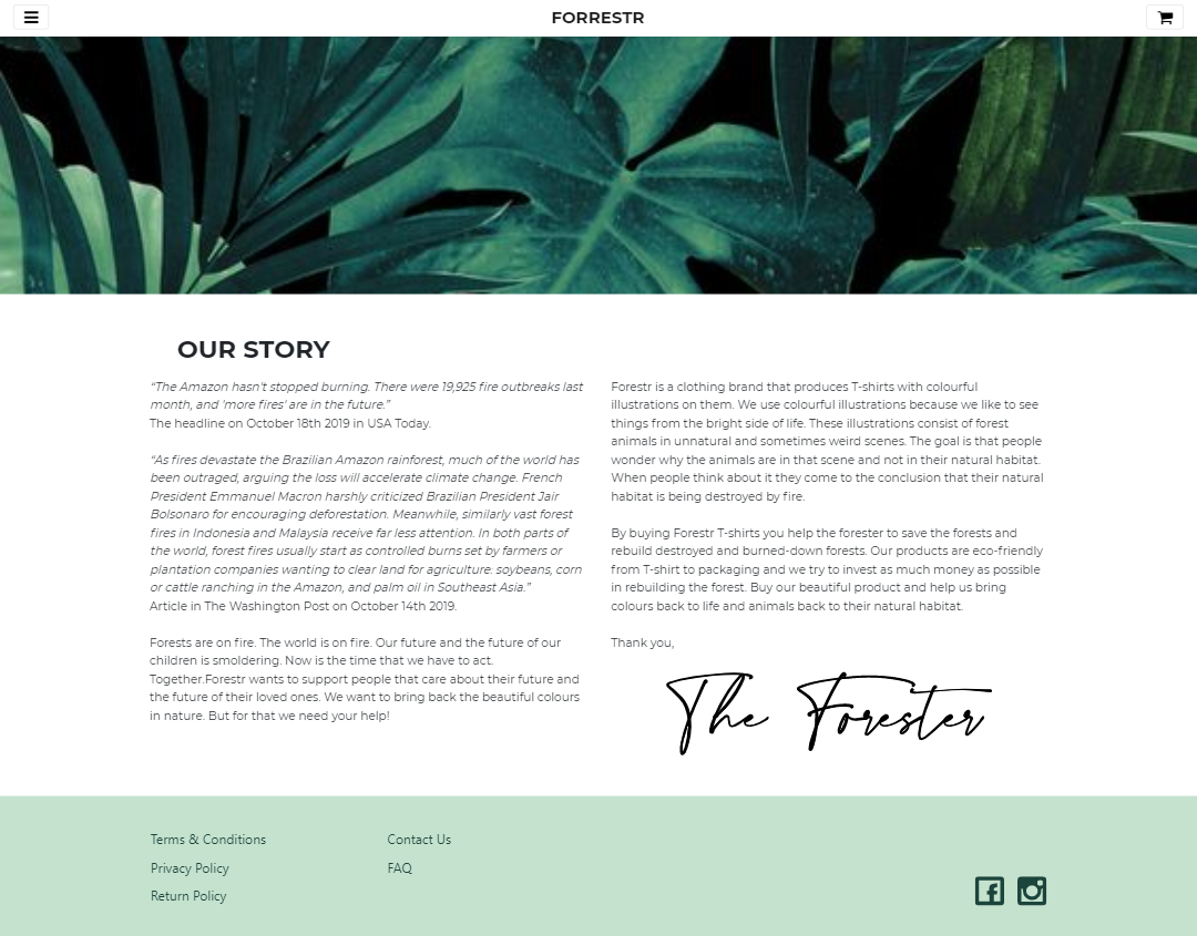
I know it's possible to make multiple containers, but that's not what I want, since it has to look like THIS on middle and large screens (2 columns). As you can see the quote is also only on the small screens. Any way to fix this? This is my code
HTML:
<!DOCTYPE html>
<html lang="en">
<head>
<meta charset="UTF-8">
<meta http-equiv="X-UA-Compatible" content="IE=edge">
<meta name="viewport" content="width=device-width, initial-scale=1, shrink-to-fit=no">
<meta http-equiv="x-ua-compatible" content="ie=edge">
<link rel="stylesheet" href="css/bootstrap.min.css">
<link rel="stylesheet" href="css/stylesheet.css">
<link rel="stylesheet" href="https://cdnjs.cloudflare.com/ajax/libs/font-awesome/4.7.0/css/font-awesome.min.css">
<title>Our Story</title>
</head>
<header>
<div class="container">
<nav class="navbar bg-light navbar-light fixed-top">
<button class="navbar-toggler align-items-center" type="button" data-toggle="collapse" data-target="#navDropdownMenu" aria-controls="navbarDropdownToggle" aria-expanded="false" aria-label="Toggle navigation">
<i class="fa fa-bars"></i>
</button>
<a class="navbar-brand mx-auto" href="index.html">FORRESTR</a>
<button class="shoppingCart navbar-toggler" type="button">
<i class="fa fa-shopping-cart"></i>
</button>
<div class="container">
<div class="collapse navbar-collapse" id="navDropdownMenu">
<ul class="navbar-nav">
<a class="nav-item nav-link" href="index.html">Products</a>
<a class="nav-item nav-link active" href="ourstory.html">Our Story</a>
<a class="nav-item nav-link" href="partners.html">Partners</a>
<a class="nav-item nav-link" href="process.html">Process</a>
<a class="nav-item nav-link" href="contact.html">Contact Us</a>
<a class="nav-item nav-link" href="faq.html">FAQ</a>
</ul>
</div>
</div>
</nav>
</div>
</header>
<main>
<picture>
<img class="img-fluid headerImg mt-5 mb-5" src="images/jungle.jpg">
</picture>
<div class="container">
<div class="row">
<div class="col d-flex mb-3 align-items-center">
<h1 class="m-0 ml-5" style="flex-grow: 1;">Our Story</h1>
</div>
</div>
<div class="container mb-5">
<div class="row d-flex">
<div class="col-sm-12 col-md-6">
<p class="mb-0"><em>“The Amazon hasn't stopped burning. There were 19,925 fire outbreaks last month, and 'more fires' are in the future.”<br></em>The headline on October 18th 2019 in USA Today.<br><br><em>“As fires devastate the Brazilian Amazon rainforest, much of the world has been outraged, arguing the loss will accelerate climate change. French President Emmanuel Macron harshly criticized Brazilian President Jair Bolsonaro for encouraging deforestation. Meanwhile, similarly vast forest fires in Indonesia and Malaysia receive far less attention. In both parts of the world, forest fires usually start as controlled burns set by farmers or plantation companies wanting to clear land for agriculture: soybeans, corn or cattle ranching in the Amazon, and palm oil in Southeast Asia.”</em><br>Article in The Washington Post on October 14th 2019.<br><br>Forests are on fire. The world is on fire. Our future and the future of our children is smoldering. Now is the time that we have to act. Together.Forestr wants to support people that care about their future and the future of their loved ones. We want to bring back the beautiful colours in nature. But for that we need your help!</p>
</div>
<div class="d-sm-block d-md-none" style="height: 16px; background-color: transparent; width: 100%; visibility: hidden;"></div>
<div class="col-sm-12 col-md-4 d-flex quote d-sm-block d-md-none">
<p class="quote text-center" style="overflow-x: hidden;">“I love the forest. It is the place where you hear yourself better.”<br>- Fahadh Faasil</p>
</div>
<div class="d-sm-block d-md-none" style="height: 16px; background-color: transparent; width: 100%; visibility: hidden;"></div>
<div class="col-sm-12 col-md-6">
<p class="mb-0">Forestr is a clothing brand that produces T-shirts with colourful illustrations on them. We use colourful illustrations because we like to see things from the bright side of life. These illustrations consist of forest animals in unnatural and sometimes weird scenes. The goal is that people wonder why the animals are in that scene and not in their natural habitat. When people think about it they come to the conclusion that their natural habitat is being destroyed by fire.<br><br>By buying Forestr T-shirts you help the forester to save the forests and rebuild destroyed and burned-down forests. Our products are eco-friendly from T-shirt to packaging and we try to invest as much money as possible in rebuilding the forest. Buy our beautiful product and help us bring colours back to life and animals back to their natural habitat.<br><br>Thank you,
</p>
<div class="w-100 text-center">
<img class="img-fluid mt-4 w-75" src="images/Signature-01.svg" alt="ForestrSignature">
</div>
</div>
</div>
</div>
</div>
<script src="js/jquery-3.4.1.min.js"></script>
<script src="js/bootstrap.min.js"></script>
</main>
<footer>
<div class="container">
<ul class="list-unstyled">
<div class="row flex-md-row">
<div class="col-md-6 col-lg-3">
<li><a class="mx-3" href="#">Terms & Conditions</a></li>
<li><a class="mx-3" href="#">Privacy Policy</a></li>
<li><a class="mx-3" href="#">Return Policy</a></li>
</div>
<div class="d-sm-block d-md-none" style="height: 10px; background-color: white; width: 100px; visibility: hidden;"></div>
<div class="col-md-6 col-lg-3">
<li><a class="mx-3" href="contact.html">Contact Us</a></li>
<li><a class="mx-3" href="faq.html">FAQ</a></li>
</div>
</div>
</ul>
<a href="https://www.instagram.com/theforrestr/">
<div class="icons mx-3 float-right">
<img src="images/instagram.svg" alt="instagramIcon">
</div>
</a>
<a href="https://www.facebook.com/theforrestr/">
<div class="icons float-right">
<img src="images/facebook.svg" alt="facebookIcon">
</div>
</a>
</div>
</footer>
</html>
CSS:
.quote{
  background-color: #d3dfdd;
  width: 100%;
  margin: 0px;
  padding-top: 10px;
  padding-bottom: 10px;
}

p.quote{
  font-family: 'lora italic';
  font-size: 18px;
  line-height: 25px;
  font-style: italic;
  color: #1b443c;
  margin: auto
}