36

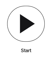
I am trying to create a button with an icon in the center. The top and bottom part of the circle are a little flat. Is there a way to do this without using corner radius? Here is my layout for the button.

<com.google.android.material.button.MaterialButton
        android:id="@+id/start_dispenser_btn"
        style="@style/Widget.MaterialComponents.Button.OutlinedButton"
        android:layout_width="175dp"
        android:layout_height="175dp"
        android:padding="14dp"
        app:cornerRadius="150dp"
        app:icon="@drawable/ic_play_arrow_black_60dp"
        app:iconGravity="end"
        app:iconSize="150dp"
        app:layout_constraintBottom_toBottomOf="parent"
        app:layout_constraintEnd_toStartOf="@+id/stop_dispenser_btn"
        app:layout_constraintStart_toStartOf="parent"
        app:layout_constraintTop_toBottomOf="@+id/test_dispenser_container"
        app:strokeColor="@color/background_black" />

enter image description here

Gabriele Mariotti
  • 320,139
  • 94
  • 887
  • 841
QThompson
  • 1,599
  • 3
  • 16
  • 40

3 Answers3

62

You can use the app:shapeAppearanceOverlay attribute to define the corner size. You can use the 50% value.

<com.google.android.material.button.MaterialButton
    android:layout_width="50dp"
    android:layout_height="50dp"
    style="@style/Widget.MaterialComponents.Button.OutlinedButton.Icon"
    app:icon="@drawable/ic_add_24px"
    app:iconSize="24dp"
    app:iconGravity="textStart"
    android:padding="0dp"
    app:iconPadding="0dp"
    android:insetLeft="0dp"
    android:insetTop="0dp"
    android:insetRight="0dp"
    android:insetBottom="0dp"
    app:shapeAppearanceOverlay="@style/ShapeAppearanceOverlay.MyApp.Button.Circle"
    />

with:

  <style name="ShapeAppearanceOverlay.MyApp.Button.Circle" parent="">
    <item name="cornerFamily">rounded</item>
    <item name="cornerSize">50%</item>
  </style>

enter image description here

or with the style="@style/Widget.MaterialComponents.Button.Icon"

enter image description here

It requires at least the version 1.1.0.


With jetpack compose you can use the OutlinedButton applying a CircleShape as shape:

    OutlinedButton(onClick = { /* ... */ },
        modifier= Modifier.size(50.dp), // it is important otherwise the button is oval
        shape = CircleShape,
        border= BorderStroke(1.dp, Color.Blue),
        contentPadding = PaddingValues(0.dp),
        colors = ButtonDefaults.outlinedButtonColors(contentColor =  Color.Blue)
    ) {
            Icon(Icons.Default.Add, contentDescription = "content description")
    }

enter image description here

Gabriele Mariotti
  • 320,139
  • 94
  • 887
  • 841
  • 3
    Great solution! I wasn't able to find anywhere in the documentation where it states we can use percentages for the cornerSize attribute - thanks for this answer. For others who find this answer, it's important to define the insets individually (left, right, etc.) or they won't be applied. – DalvikDroid Mar 07 '20 at 00:02
  • It's weird that as soon as I put this button, I get IllegalArgumentException: The style on this component requires your app theme to be Theme.MaterialComponents (or a descendant). My app theme already has a parent Theme.MaterialComponents.Light.DarkActionBar. I had to explicitly set android:theme="@style/AppTheme" on this button to get rid of this error. Really weird. – Shivam Pokhriyal Jun 21 '20 at 05:41
  • @ShivamPokhriyal Post a question with all details. It is not related to this button. – Gabriele Mariotti Jun 21 '20 at 07:14
  • 1
    Thank you! I didn't realize you could use percentages instead of explicit values. – Stephen Sep 08 '20 at 04:32
  • 1
    This is fantastic. Period. – ror Oct 06 '20 at 11:36
23

By using cornerRadius along with inset you can get the rounded shape:

<com.google.android.material.button.MaterialButton
    style="@style/Widget.MaterialComponents.Button.OutlinedButton.Icon"
    android:layout_width="48dp"
    android:layout_height="48dp"
    app:cornerRadius="30dp"
    android:insetTop="0dp"
    android:insetBottom="0dp"
    android:insetLeft="0dp"
    android:insetRight="0dp"
    app:icon="@drawable/ic_menu"/>
Ahmed Ashour
  • 562
  • 5
  • 14
1

my answer is the enhancement of above answers. to build reusable resource :

<style name="ShapeAppearance.MdcShapeAppearance.SmallComponent.OutlinedCircleButton" parent="Widget.MaterialComponents.Button.OutlinedButton.Icon">
    <item name="android:insetLeft">@dimen/dip_0</item>
    <item name="android:insetRight">@dimen/dip_0</item>
    <item name="android:insetTop">@dimen/dip_0</item>
    <item name="android:insetBottom">@dimen/dip_0</item>
    <item name="android:padding">@dimen/dip_0</item>
    <item name="iconGravity">textStart</item>
    <item name="iconPadding">@dimen/dip_0</item>
</style>

then, you can use it as button style. don't forget to add app:cornerRadius="@dimen/dip_20" to make it circle with your desired size

<com.google.android.material.button.MaterialButton
        android:id="@+id/btn_plus"
        style="@style/ShapeAppearance.MdcShapeAppearance.SmallComponent.OutlinedCircleButton"
        android:layout_width="@dimen/dip_20"
        android:layout_height="@dimen/dip_20"
        app:cornerRadius="@dimen/dip_20"
        android:layout_marginEnd="@dimen/dip_16"
        app:icon="@drawable/ic_plus"
        app:iconTint="?colorOnBackground"
        app:layout_constraintBottom_toBottomOf="@id/tv_total_checkout_product"
        app:layout_constraintEnd_toEndOf="parent"
        app:layout_constraintTop_toTopOf="@id/tv_total_checkout_product"
        app:strokeColor="?colorOnBackground" />
icgoogo
  • 401
  • 5
  • 7