I'm in the middle of coding a website and im trying to do something which i'm not sure is possible. I have a layout which I like, but I want to allow to divs to resize to fit the browser. At the minute the layout is like this:
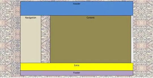 Now I want to keep the header section the same height and width always, the same with the extra and footer div. But I want the navigation (it needs renaming) and content divs to automatically adjust so that the browser window is always filled (ideally with 10px border at top and bottom but not necessary).
The whole page (obviously excluding background) is held inside a container at the moment. but this is a fixed height. This is the CSS I have
Now I want to keep the header section the same height and width always, the same with the extra and footer div. But I want the navigation (it needs renaming) and content divs to automatically adjust so that the browser window is always filled (ideally with 10px border at top and bottom but not necessary).
The whole page (obviously excluding background) is held inside a container at the moment. but this is a fixed height. This is the CSS I have
html,body{
    margin:0;
    padding:0;
}
body{
    background-image:url(images/bg2.jpg);
}
a{
    text-decoration: none;
}
#container{
    text-align:left;
    width:1000px;
    height:648px;
    margin: 0 auto;
    border-radius:30px;
    padding-top:10px;
    padding-left:10px;
    padding-right:10px;
    padding-bottom:10px;
}
#header{
    float:left;
    height:123px;
    width:1000px;
    background-color:#FFFFFF;
    border-top-right-radius:30px;
    border-top-left-radius:30px;
    text-align:center;
}
#links{
    float:left;
    height:43px;
    width:714px;
    background-color:#FFFFFF;
    text-align:center;
    padding-left:286px;
}
.link span{
    list-style: none;
    border: 6px solid #1c2f45;
    font-size: 13px;
    height: 25px;
    text-align: center;
    border-radius: 1em 4em 1em 4em;
    float: left;
    margin-left: 5px;
    padding-top:5px;
    width:90px;
}
.linkcurrentpage span{
    list-style: none;
    border: 6px solid #1c2f45;
    background-color: #1c2f45;
    font-size: 13px;
    color: #FFFFFF;
    height: 25px;
    text-align: center;
    border-radius: 1em 4em 1em 4em;
    float: left;
    margin-left: 5px;
    padding-top:5px;
    width:90px;
}
#content{
    position:relative;
    float:right;
    height:420px;
    width:737px;
    background-color:#FFFFFF;
    overflow:auto;
}
#galleryselector {
    float: left;
    text-align: center;
}
#navigation{
    float:left;
    width:263px;
    height:420px;
}
#extra{
    background:#FFFFFF;
    float:right;
    height:70px;
    width:1000px;
}
#footer{
    background:#FFFFFF;
    float:right;
    height:40px;
    width:1000px;
    margin: 0 auto;
    padding-bottom:5px;
    text-align: center;
    border-bottom-left-radius:40px;
    border-bottom-right-radius:40px;
}
#footer p{
    margin: 0 auto;
}
Can anybody advise on how I may achieve this? I'm not too concerned with having a scrollbar on the content div, I just ideally don't want one on the right hand side of the page for the whole screen.
P.S I am not after website critique, the website isn't for me its for a relative who wants a site designed for her and wants the background that I have put (I know its a bit garish)
UPDATE: Ok so thanks to Hristo I have the layout just as I want it now minus one tiny detail), The screenshot below shows how the page now, The niggle I have is the navigation buttons at the top (simply just span tags with borders applied)...I want them aligned centrally to the div, the only way I found before was to apply a fixed amount of padding to the div but I dont know if that will work again...I shall upload a screenshot (apologies for the blue border around one of the h1 tags, had F12 developer tools running) and also my css for the links section as it stands now.
#links{
    float:left;
    height:43px;
    width:100%;
    background-color:#FFFFFF;
    text-align:center;
}
.link span{
    list-style: none;
    border: 6px solid #1c2f45;
    font-size: 13px;
    height: 25px;
    text-align: center;
    border-radius: 1em 4em 1em 4em;
    float: left;
    margin-left: 5px;
    padding-top:5px;
    width:90px;
}
.linkcurrentpage span{
    list-style: none;
    border: 6px solid #1c2f45;
    background-color: #1c2f45;
    font-size: 13px;
    color: #FFFFFF;
    height: 25px;
    text-align: center;
    border-radius: 1em 4em 1em 4em;
    float: left;
    margin-left: 5px;
    padding-top:5px;
    width:90px;
}
