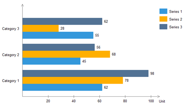
How can I plot a horizontal bar chart with the values at the end of the bar, Something similar to this
I tried this
plt.barh(inc.index,inc)
plt.yticks(inc.index)
plt.xticks(inc);
plt.xlabel("Order Count")
plt.ylabel("Date")
How can I plot a horizontal bar chart with the values at the end of the bar, Something similar to this
I tried this
plt.barh(inc.index,inc)
plt.yticks(inc.index)
plt.xticks(inc);
plt.xlabel("Order Count")
plt.ylabel("Date")
The answer can be found here: How to display the value of the bar on each bar with pyplot.barh()?
Just add the for loop as cphlewis said:
for i, v in enumerate(inc):
    ax.text(v + 3, i + .25, str(v), color='blue', fontweight='bold')
plt.show()
Here is the code that I tried for your situation:
import matplotlib.pyplot as plt
import numpy as np
inc = [12, 25, 50, 65, 40, 45]
index = ["2019-10-31", "2019-10-30", "2019-10-29", "2019-10-28", "2019-10-27", "2019-10-26"]

fig, ax = plt.subplots()
ax.barh(index,inc, color='black')
plt.yticks(index)
plt.xticks(inc);
plt.xlabel("Order Count")
plt.ylabel("Date")

# Set xticks
plt.xticks(np.arange(0, max(inc)+15, step=10))

# Loop for showing inc numbers in the end of bar
for i, v in enumerate(inc):
    ax.text(v + 1, i, str(v), color='black', fontweight='bold')
plt.show()
Plot looks like this:

To generate a plot with values superimposed, run:
ax = inc.plot.barh(xticks=inc, xlim=(0, 40));
ax.set_xlabel('Order Count')
ax.set_ylabel('Date')
for p in ax.patches:
    w = p.get_width()
    ax.annotate(f' {w}', (w + 0.1, p.get_y() + 0.1))
Note that I set xlim with upper limit slightly above the maximum Order Count, to provide the space for annotations.
For a subset of your data I got:

And one more impovement:
As I see, your data is a Series with a DatetimeIndex.
So if you want to have y label values as dates only (without 00:00:00 for hours), convert the index to string:
inc.index = inc.index.strftime('%Y-%m-%d')
like I did, generating my plot.