2

Hello when I try to plot this code :

ggplot(subset(tabcourt, !is.na(Score) & !is.na(`PSA level (ng/ml)`)))
+facet_wrap(.~Method,scales='free')
+aes(x =Score, y =`PSA level (ng/ml)`,color=Method)
+stat_compare_means(show.legend=FALSE,label.x.npc = 0.5,label.y.npc = 0.93,color="black",size=4)
+geom_boxplot()+theme_bw()

It doesn't show the Kruskal Wallis on the middle plot, I tried all I could but can't seem to have the solution, any ideas on how to fix this ? Plot description

Edit : when putting free_y instead of free it fixes the bug but the x axis is bad (1 to 30 for each)

here's the head and the str of the data : Head description Head description

MrIce
  • 23
  • 6
  • your bracketing is wierd, and `aes` usually gois inside a `geom` layer, not outside (I think). PLease include a sample of your data to make this reproducible – morgan121 Nov 07 '19 at 23:25

2 Answers2

3

I think your error could come either how you wrapped your data into ggplot or from your data it self.

I don't have a sample of your data, so I used the sample database Toothgrowth and your code for stat_compare_mean, I get the display you are looking for.

Here is my code:

library(ggpubr)
data("ToothGrowth")

# Box plot faceted by "dose"
p <- ggboxplot(ToothGrowth, x = "supp", y = "len",
               color = "supp", palette = "jco",
               add = "jitter",
               facet.by = "dose", short.panel.labs = FALSE)
# Adding stat_compare_means
p + stat_compare_means(show.legend=FALSE, label.x.npc = 0.5, 
                       label.y.npc = 0.93, color = "black", size = 4) + theme_bw()

Here is the plot:

enter image description here

If you use this instead, you have a better plotting:

p + stat_compare_means() + theme_bw()

enter image description here

UPDATE: TRICK TO GET THE FINAL PLOT DISPLAYED

So, I tried to reproduce your data in order to reproduce the error of plotting you get and I succeed to plot the p values using a trick described in this post: R: ggplot2 - Kruskal-Wallis test per facet

Here is the code that I used to mimicks your data:

set.seed(1)
# defining the sample dataset AJCC
PSA_levels <- rnorm(100,mean = 2, sd = 2)
AJCC_data <- data.frame(cbind(PSA_levels))
x <- NULL
for(i in 1:100) {x <- c(x,sample(1:4,1))}
AJCC_data$score <- x
AJCC_data$Method <- 'AJCC'

# defining the sample dataset Gleason
PSA_levels <- rnorm(100,mean = 2.5, sd = 1)
Gleason_data <- data.frame(cbind(PSA_levels))
x <- NULL
for(i in 1:100) {x <- c(x,sample(5:10,1))}
Gleason_data$score <- x
Gleason_data$Method <- 'Gleason'

# defining the sample dataset TNM
PSA_levels <- rnorm(100,mean = 2.5, sd = 1)
TNM_data <- data.frame(cbind(PSA_levels))
x <- NULL
for(i in 1:100) {x <- c(x,sample(1:30,1))}
TNM_data$score <- x
TNM_data$Method <- 'TNM'

df <- rbind(AJCC_data, Gleason_data, TNM_data)
df$score <- as.factor(df$score)

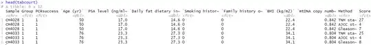
Here is the output of df that looks similar to your data tabcourt

> str(df)
'data.frame':   300 obs. of  3 variables:
 $ PSA_levels: num  0.747 2.367 0.329 5.191 2.659 ...
 $ score     : Factor w/ 30 levels "1","2","3","4",..: 2 1 2 2 2 3 1 2 3 3 ...
 $ Method    : chr  "AJCC" "AJCC" "AJCC" "AJCC" ...

Then, I tried to reproduce your boxplot faceted:

library(ggplot2)
library(ggpubr)
g <- ggplot(df, aes(x = score, y = PSA_levels, color = Method))
p <- g + facet_wrap(.~Method, scales = 'free_x')
p <- p + geom_boxplot()
p <- p + theme_bw()

When, I tried to add p values on the graph using the stat_compare_means function, I get same error of plotting as you. So, according to the post cited above, I used the package dplyr to generate the pvalue of the Kruskal Wallis test for each group.

library(dplyr)
ptest <- df %>% group_by(Method) %>% summarize(p.value = kruskal.test(PSA_levels ~score)$p.value)

Here the output of ptest:

> ptest
# A tibble: 3 x 2
  Method  p.value
  <chr>     <dbl>
1 AJCC      0.575
2 Gleason   0.216
3 TNM       0.226

Now, I can add that the boxplot by doing:

p + geom_text(data = ptest, aes(x =  c(2,3,10), y = c(6,6,6), label = paste0("Kruskal-Wallis\n p=",round(p.value,3))))

And here, what you get: enter image description here

So, I think it is because stat_compare_means did not understand which group to compare and how to represent all statistical comparisons on the graph. Doing the test out of the ggplot and then adding as a geom_text argument solve the situation.

Hope it will works with your real data !

dc37
  • 15,840
  • 4
  • 15
  • 32
  • Hello, I tried yours and it worked but without a free_x, because when i added scale="free_x" then your code didn't work, so i tried on mine and when i remove the free scale it works.... but it's such a bad plot then... ```compare_means(!is.na(`mtDNA copy number`) ~ !is.na(Score), data = tabcourt, group.by = "Method")``` strangely gives me ```Error: Strings must match column names. Unknown columns: !is.na(Score)```, I verified, Score is there How can I give you my data ? – MrIce Nov 08 '19 at 07:06
  • Sorry, I made a mistake the correct code is `compare_means(!is.na("mtDNA copy number") ~ !is.na("Score"), data = tabcourt, group.by = "Method")`. (I forget brackets on Score). Try that, it should work. By the way, there is no `free-x` on my code, where did you see that ? – dc37 Nov 08 '19 at 07:12
  • I tried it because there is one on mine, without that I have 1 to 30 for x on each axis, [https://i.ibb.co/frX7Tm8/Capture.png](https://i.ibb.co/frX7Tm8/Capture.png) here's the head ! Same error tho : ```> compare_means(!is.na("mtDNA copy number") ~ !is.na("Score"), data = tabcourt, group.by = "Method") Error: Strings must match column names. Unknown columns: !is.na("Score") Call `rlang::last_error()` to see a backtrace``` – MrIce Nov 08 '19 at 07:20
  • Sorry forgot ```str(tabcourt)``` here it is : [https://i.ibb.co/Wp5fxrW/Capture2.png](https://i.ibb.co/Wp5fxrW/Capture2.png) Thank you for your kind help ! – MrIce Nov 08 '19 at 07:21
  • Just a quick comment, in your code, you have `aes(x =Score, y =`PSA level(ng/ml)`, color = Method)`, is it not supposed to be `mtDNA copy number` ? – dc37 Nov 08 '19 at 08:02
  • Oopsie, it's supposed to be PSA, ```ggplot(subset(tabcourt, !is.na(Score) & !is.na(`PSA level (ng/ml)`)))+facet_wrap(.~Method,scales='free')+aes(x =Score, y =`PSA level (ng/ml)`,color=Method)+stat_compare_means(show.legend=FALSE,label.x.npc = 0.5,label.y.npc = 0.93,color="black",size=4)+geom_boxplot()+theme_bw()``` thank you – MrIce Nov 08 '19 at 08:38
  • @MrIce, I edited my answer to provide you a way to get the plot you are looking for. Hope it will works for you. Keep me update – dc37 Nov 08 '19 at 21:03
0

thank you for this workaround !!! It did work, but I had to add : +scale_x_discrete() otherwise I'd get Error: Discrete value supplied to continuous scale

Here's the code I used if this happens to others :

ptest = tabcourt %>% group_by(Method) %>%summarize(p.value=kruskal.test("mtDNA copy number"~Score)$p.value)
p2 = ggplotly(ggplot(subset(tabcourt, !is.na(Score) & !is.na("mtDNA copy number")),aes(x =Score, y ="mtDNA copy number",color=Method)) 
+ scale_x_discrete()
+ geom_text(data = ptest, aes(x =c(2,3,10), y= c(1.5,1.5,1.5), label = paste0("Kruskal-Wallis\n p=",round(p.value,3))))
+ facet_grid(.~Method,scales='free')
+ geom_boxplot()
+ theme_bw())

Weird tho that stat_compare_means have an hard time doing it's job !

dc37
  • 15,840
  • 4
  • 15
  • 32
MrIce
  • 23
  • 6
  • Great that it is working for you ! Apparently, `stat_compare_means` is more limited that `compare_means` and for example can take the output of `compare_means` as an argument. Maybe in a near future, new versions of this function will solve this issue. – dc37 Nov 09 '19 at 13:53