3

I'm having a really hard time creating the following layout using the CSS grid feature, and I'm not sure if it's even possible:

layout I need

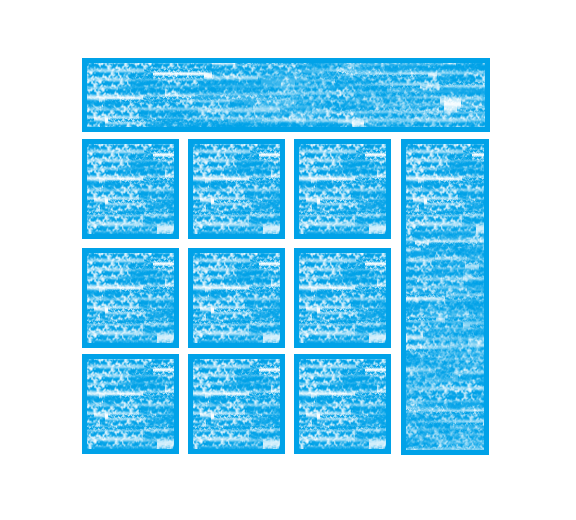
I could potentially put the top and right bars outside the grid in a table, but since the columns in the repeating part of the grid are a fixed width, I haven't found a way not to leave a space between them and the sidebar without letting them stretch.

I tried a lot of different things and none of them worked. I would think a solution would look something like that:

.my_grid {
    display: grid;
    justify-content: center;
    grid-template-columns: repeat(auto-fit, 300px);
}

.grid_top_bar {
    grid-row-start: 1;
    grid-row-end: 1;
    grid-column-start: 1;
    grid-column-end: -1;
}

.grid_right_side_bar {
    grid-row-start: 2;
    grid-row-end: -1;
    grid-column-start: -1;
    grid-column-end: -1;
}

.grid_item {
}
<div class="my_grid">
    <div class="grid_top_bar">...</div>
    <div class="grid_right_side_bar">...</div>
    
    <!-- repeating items -->
    <div class="grid_item">...</div>
    <div class="grid_item">...</div>
    <div class="grid_item">...</div>
    ...
</div>

... but of course that doesn't work. Any idea if/how this can be done?

Nir Arbel
  • 215
  • 1
  • 3
  • 11
  • is it a 4col x Xrows or Xcol x Xrows grid ? – G-Cyrillus Nov 17 '19 at 04:50
  • you don't need to put the top and sidebar to your grid. you can just make the repeating section as grid. use Html/Css as your advantage, Not the other way around. – cute_programmer Nov 17 '19 at 05:00
  • Merlon, as I mentioned I haven't been able to put the sidebar outside the grid without leaving a space between them. Maybe I'm understanding this incorrectly, but if you use repeat, and the width of the columns is fixed, it'll use as much space as it can and leave the rest empty. I could justify-content to the right but then I can't center the entire thing perfectly on the page... – Nir Arbel Nov 17 '19 at 05:10

1 Answers1

2

for a variable number of column, to avoid empty gaps and with a responsive behavior, you may use

  • width:max-content ,
  • a subgrid while using specific tags for
  • a coherent markup (header,aside,main) instead of neutral div.

aside width:max-content on the parent, you have to set a min-width to main via calc() to avoid the empty gap and allow row wrapping according to the window's width instead a single column :

.grid {
  display: grid;
  grid-gap: 0.5em;
}

#myGrid {
  grid-template-columns: 1fr 300px;
  grid-template-rows: auto 1fr;
  grid-auto-flow: dense;
  width: max-content;
  margin: auto;
}

main {
  grid-template-columns: repeat(auto-fit, 300px);
  min-width: calc( (100vw - 400px) / 1.35);  /* make it smaller than window's removing average 400px fom aside and gaps to start width then divide (1.x) or multiplicate (0.x) to adjust */
}

header {
  grid-column: 1/3;
}

aside {
  grid-column: 2;
}

.grid> :not(.grid) {
  border: solid rgb(0, 112, 202);
  padding: 0.5em;
  background: linear-gradient(40deg, rgb(9, 164, 233), transparent, rgb(9, 164, 233), rgb(9, 164, 233), transparent), linear-gradient(-40deg, rgb(9, 164, 233), transparent, rgb(9, 164, 233), rgb(9, 164, 233), transparent) rgb(144, 215, 245);
  background-size: 8px 15px, 6px 12px
}
<div class="grid" id="myGrid">
  <header>Play me in full page mode and resize window's width to check on my behavior</header>
  <aside>...</aside>
  <main class="grid">
    <!-- repeating items -->
    <div class="grid_item">...</div>
    <div class="grid_item">...</div>
    <div class="grid_item">...</div>
    <div class="grid_item">...</div>
    <div class="grid_item">...</div>
    <div class="grid_item">...</div>
    <div class="grid_item">...</div>
    <div class="grid_item">...</div>
    <div class="grid_item">...</div>
    <div class="grid_item">...</div>
    <div class="grid_item">...</div>
    <div class="grid_item">...</div>
  </main>

</div>

codepen to play with

G-Cyrillus
  • 101,410
  • 14
  • 105
  • 129
  • 1
    Very impressive, thank you! Another thing that worked for me was to put the top bar, side bar, and grid in a table and use JS to set the width of the grid to exactly as many columns as the page minus the sidebar can accommodate. I wish you could use modulo or floor in CSS or I wouldn't need JS to do it. – Nir Arbel Nov 18 '19 at 03:51