I have developed Navigation bar using HTML and PHP. But issue is that I can see Navigation bar in desktop and laptop but it can not be seen in mobile screen.
My code is look like this.
<header class="page__header media__img ratio--small">
        <?php include "navigation.php"; ?>

        <div class="nav--sub visible-sm">
            <input type="hidden" name="product_category_id" id="product_category_id" value="<?php echo $_GET["id"]; ?>">
            <ul>
                <?php
                $selectcategory = mysqli_query($conn, "select * from product_category where is_active='1' and is_delete='0'");

                while ($rowcategory = mysqli_fetch_array($selectcategory)) {

                    ?>
                    <li class="<?php if ($_GET['id'] == $rowcategory['product_category_id']) {
                        echo 'selected';
                    } ?>">
                        <a href="product_list.php?id=<?php echo $rowcategory['product_category_id']; ?>"><?php echo $rowcategory['product_category_name']; ?></a>
                    </li>
                    <?php

                }


                ?>

            </ul>
        </div>
     </header>
it perfectly works in large screen but not in Mobile devices. Any bootstrap that make it visible to mobile devices.
Laptop View

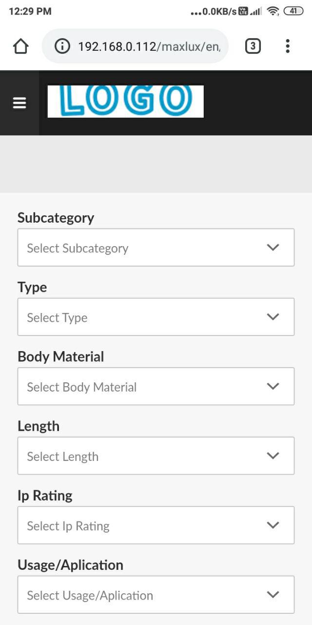
Mobile View