0

some text from MDN
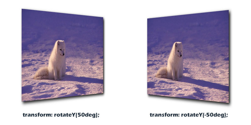
The amount of rotation created by rotateY() is specified by an . If positive, the movement will be clockwise; if negative, it will be counter-clockwise.

const rotate1 = [
  {
    transform: `rotateX(0)`
  },
  {
    transform: `rotateY(45deg)`
  },
  {
    transform: `rotateX(0)`
  }
];

const rotate2 = [
  {
    transform: `rotateY(0)`
  },
  {
    transform: `rotateY(-45deg)`
  },
  {
    transform: `rotateY(0)`
  }
];

document.getElementById('rotated1').onclick = function(){this.animate(rotate1,1000)}
document.getElementById('rotated2').onclick = function(){this.animate(rotate2,1000)}

document.getElementById('rotated1').animate(rotate1,1000)
document.getElementById('rotated2').animate(rotate2,1000)
div {
  width: 180px;
  height: 180px;
}

#rotated1 {
  background-color: pink;
}

#rotated2 {
  background-color: green;
}
<div id="rotated1">click me</div>

<div id="rotated2">click me</div>

pls have a look on this demo

it makes me confused..

what i expect is : http://img.htmleaf.com/1610/rotateY-demo.jpg

codenoobforreal
  • 101
  • 1
  • 5

1 Answers1

0

You need to add some perspective to get what you want:

const rotate1 = [
  {
    transform: `rotateX(0)`
  },
  {
    transform: `rotateY(45deg)`
  },
  {
    transform: `rotateX(0)`
  }
];

const rotate2 = [
  {
    transform: `rotateY(0)`
  },
  {
    transform: `rotateY(-45deg)`
  },
  {
    transform: `rotateY(0)`
  }
];

document.getElementById('rotated1').onclick = function(){this.animate(rotate1,1000)}
document.getElementById('rotated2').onclick = function(){this.animate(rotate2,1000)}

document.getElementById('rotated1').animate(rotate1,1000)
document.getElementById('rotated2').animate(rotate2,1000)
div {
  width: 150px;
  height: 150px;
  margin:5px;
}

#rotated1 {
  background-color: pink;
}

#rotated2 {
  background-color: green;
}

body {
  perspective:200px;
  perspective-origin:left center;
  margin:0;
  min-height:100vh;
}
<div id="rotated1">click me</div>

<div id="rotated2">click me</div>

Or like below:

const rotate1 = [
  {
    transform: `perspective(200px) rotateX(0)`
  },
  {
    transform: `perspective(200px) rotateY(45deg)`
  },
  {
    transform: `perspective(200px) rotateX(0)`
  }
];

const rotate2 = [
  {
    transform: `perspective(200px) rotateY(0)`
  },
  {
    transform: `perspective(200px) rotateY(-45deg)`
  },
  {
    transform: `perspective(200px) rotateY(0)`
  }
];

document.getElementById('rotated1').onclick = function(){this.animate(rotate1,1000)}
document.getElementById('rotated2').onclick = function(){this.animate(rotate2,1000)}

document.getElementById('rotated1').animate(rotate1,1000)
document.getElementById('rotated2').animate(rotate2,1000)
div {
  width: 150px;
  height: 150px;
  margin:5px;
}

#rotated1 {
  background-color: pink;
}

#rotated2 {
  background-color: green;
}
<div id="rotated1">click me</div>

<div id="rotated2">click me</div>

Some related questions for more details:

perspective and translateZ moves diagonally

CSS 3d transform doesn't work if perspective is set in the end of property

Temani Afif
  • 245,468
  • 26
  • 309
  • 415