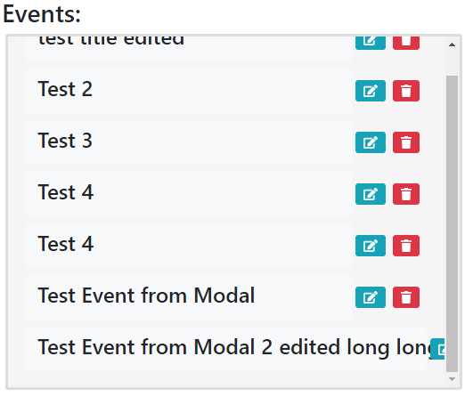
I currently have a todo website, and on the home screen I display events in a div. However, when there is a really long title it overflows. Currently I have the x overflow hidden. How would I make it so it would add a ... at the end? I tried text-overflow: ellipsis, but that doesn't seem to help.
Code that displays events:
<div class="col-md-6 inline mb-4">
        <h3 class="ml-1">Events:</h3>
        <div class="events-content-section ml-2">
            {% for event in events %}
                <div class="mb-2" style="display: flex; align-items: center;">
                    <button type="button" class="view-event btn btn-light" style="width: 100%;" data-id="{% url 'view-event' event.pk %}">
                        <span>
                            <h4 style="float: left;">{{ event.title }}</h4>
                            <button type="button" class="update-event btn btn-sm btn-info ml-1" data-id="{% url 'update-event' event.pk %}" style="float: right;">
                                <span class="fas fa-edit"></span>
                            </button>
                            <button type="button" class="delete-event btn btn-sm btn-danger mr-2 ml-2" data-id="{% url 'delete-event' event.pk %}" style="float: right;">
                                <span class="fa fa-trash"></span>
                            </button>
                        </span>
                    </button>
                </div>
            {% endfor %}
        </div>
    </div>
css for div
.events-content-section {
  background: #f5f5f5;
  padding: 10px 20px;
  border: 3px solid #dddddd;
  border-radius: 3px;
  overflow-y: auto;
  overflow-x: hidden;
  text-overflow: ellipsis;
  height: 400px;
  }
EDIT: When I put my browser into fullscreen the div expands to fit about half the screen, so more text would fit. Is there a functionality to do this if the div is big enough?