I am working on a custom shape and am pretty sure I can achieve it using the radial-gradient CSS function. Until now, I have been able to make half of the work, which looks like this :
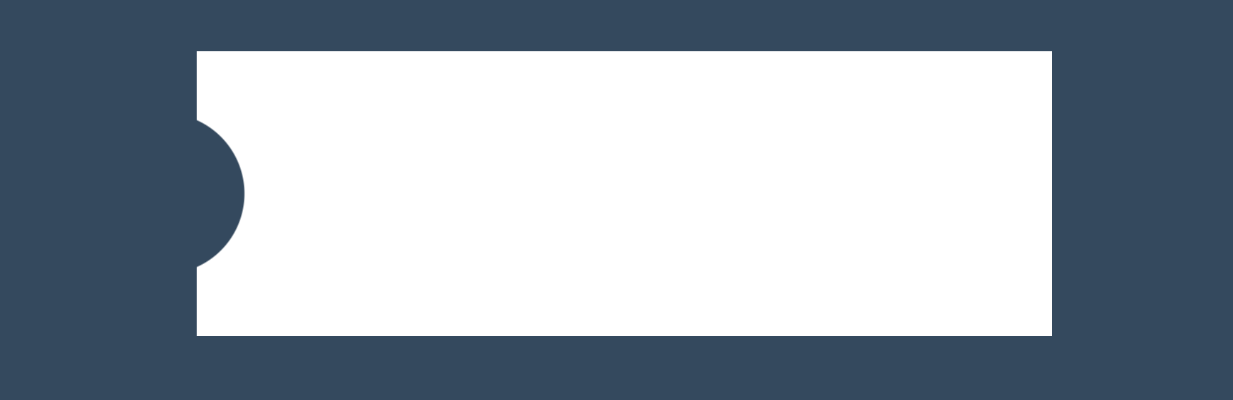
... using this CSS code :
.block {
    width: 600px;
    height: 200px;
    position: relative;
    margin: 50px auto;
    z-index: 1000;

    background-image: -moz-radial-gradient(
        -23px 50%, /* the -23px left position varies by your "gap" */
        circle closest-corner, /* keep radius to half height */
        transparent 0, /* transparent at center */
        transparent 55px, /*transparent at edge of gap */
        transparent 56px, /* start circle "border" */
        white 57px /* end circle border and begin color of rest of background */
    );
    background-image: -webkit-radial-gradient(-23px 50%, circle closest-side, rgba(0, 0, 0, 0) 0, rgba(0, 0, 0, 0) 55px, transparent 56px, white 57px);
    background-image: -ms-radial-gradient(-23px 50%, circle closest-corner, rgba(0, 0, 0, 0) 0, rgba(0, 0, 0, 0) 55px, transparent 56px, white 57px);
    background-image: -o-radial-gradient(-23px 50%, circle closest-corner, rgba(0, 0, 0, 0) 0, rgba(0, 0, 0, 0) 55px, transparent 56px, white 57px);
    background-image: radial-gradient(-23px 50%, circle closest-corner, rgba(0, 0, 0, 0) 0, rgba(0, 0, 0, 0) 55px, transparent 56px, white 57px);
}
Now, I'd like to make the same circle shape on the right corner (symmetrical to the circle shape of the left corner). I have tried separating my radial-gradient functions with commas but can't find a way to make it symmetrical to the other one... Can you help?
Thanks!