Consider the following diagram:
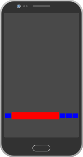 The blue buttons are buttons and the red is a textview. I am trying to place them side by side as shown in the diagram but am having confusion because the app should be compatible with different screen sizes and densities.
Basically I want all the buttons to be of the same sizes(square typically) and TextView larger and say when the screen gets bigger(e.g. rotating) only the middle(red) textView should expand and the button size should be the same while they stay in their positions.
what I have tried
- I tried using
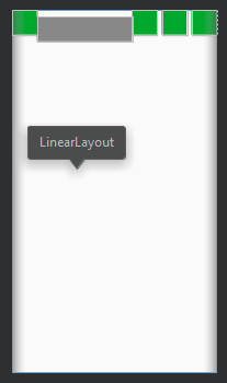
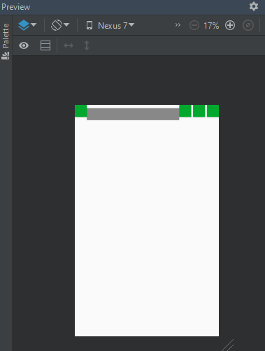
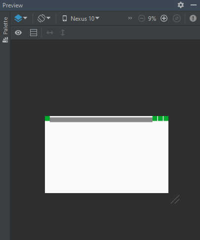
LinearLayoutwithlayout_weightset accordingly but for bigger screensizes the buttons(blue) would also scale in proportion of their layout weight, and they'd not look square. - It'd be easy doing this using
constraint layoutbut, it requires hardcoding the button size(sizing the button in the design editor does this), which I don't think is a good idea because if screen get bigger button would be smaller.
I could also take a certain percentage of the screen width and apply it to the button size, but how do I make sure that icon for the button renders okay with the scaled buttons and the buttons are aligned as so:

i.e. their centers are aligned but different in height, equidistant from each other. also I'd have to do that programmatically instead of using the design editor or the xml.
So for this type of purposes what layout should I use and how should I set up my views?
