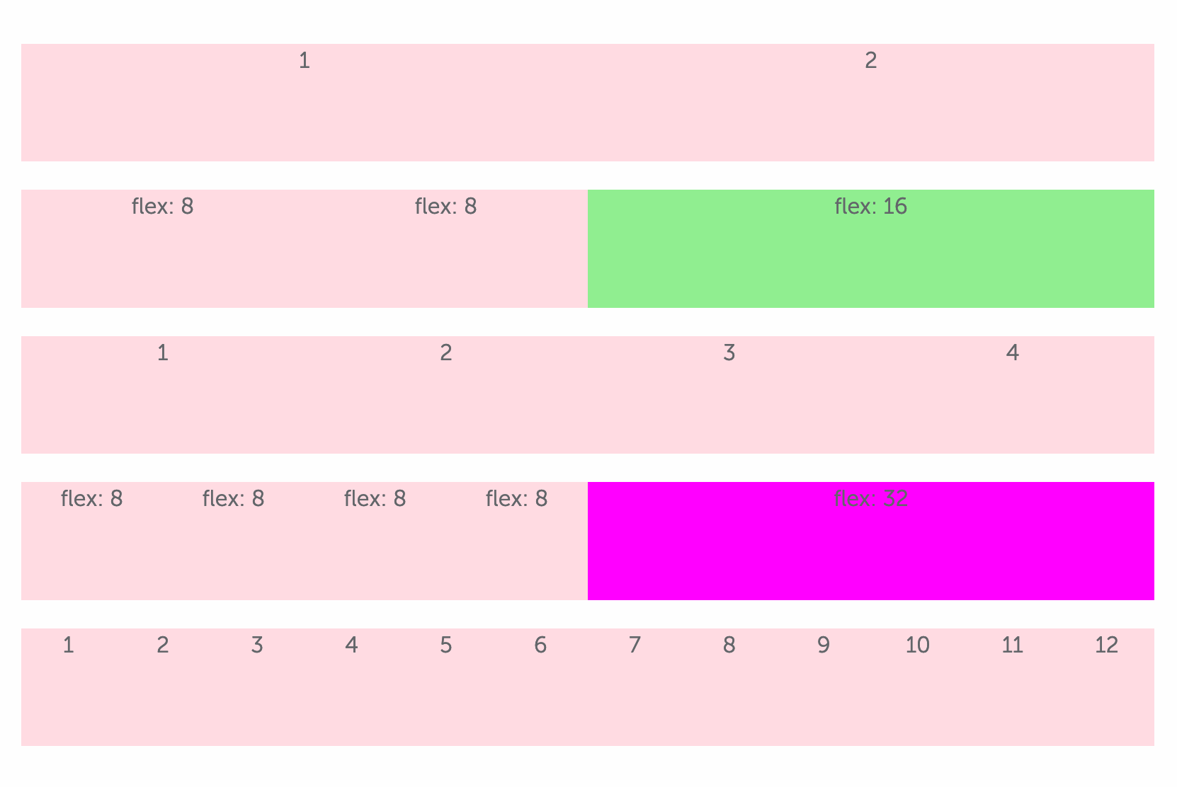
I'm trying to create a column-based layout with specific gutter sizes using flexbox.
I would like to include the option to add a class like col-2 to a given element that would make that element the size of 2 of the other elements in that row, for instance. col-3 for the size of 3 elements, col-4 for 4, etc.
I am doing this by altering the flex property of the element to which the col-n class is added.
SCSS mixins
// number of columns
$columns: 8;

// column proportions mixin
@mixin column-prop($n) {
    flex: $columns * $n;
}

.col-2 {
    @include column-prop(2);
}
.col-3 {
    @include column-prop(3);
}
.col-4 {
    @include column-prop(4);
}
...
HTML
<div class="grid">
    <div>flex: 8</div>
    <div>flex: 8</div>
    <div class="col-2">flex: 16</div>
</div>

<div class="grid">
    <div>1</div>
    <div>2</div>
    <div>3</div>
    <div>4</div>
</div>

<div class="grid">
    <div>flex: 8</div>
    <div>flex: 8</div>
    <div>flex: 8</div>
    <div>flex: 8</div>
    <div class="col-4">flex: 32</div>
</div>
This works if I do not use any padding:
 But if I add padding, the padding is sized in addition, to the content (as if its a content-box) despite my having set
 box-sizing: border-box;on all child elements.
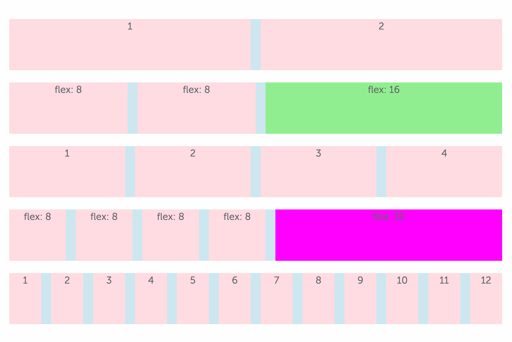 I believe
 box-sizing: border-box; does not work for flex items.
How can I simply have the padding be included in the size of each element as if they are boxer-box elements?