0

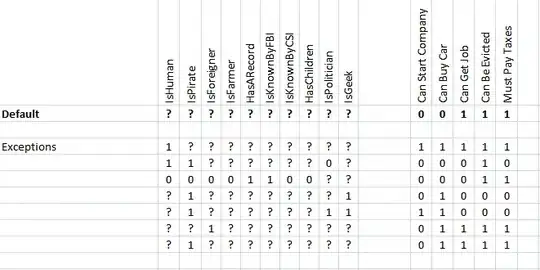
I wonder if it is possible to create a vertical plot like the attached in R.

The graph does not have an X axis and it is designed to visualise positive and negative pols of a factor identified by a factor analysis. If this is not possible in R, what other softwares can create such a plot (e.g., SAS, SPSS)?

some data:

bijmb   11.76   
chjoc   8.4    
dejcp   5.03    
memse   13.41    
phjgr   5.86    
altj    7.26    
bujbv   -9.53    
maemj   -10.59    
poejpr  -9.72    
soajs   -10.59    
bijmb   -7.39

vertical graph showing -/+ pols of a factor identified by a factor analysis

s__
  • 9,270
  • 3
  • 27
  • 45
  • 3
    Hello, welcome to SO ! Providing example data with your post is critical for us to try out stuff. If you don't have some on hand, it may be time consuming to build some, but we can't guess everything ! – RoB Dec 06 '19 at 09:08
  • 1
    your "bijmb" category appears twice - is that intentional ? – tjebo Dec 06 '19 at 10:33

2 Answers2

1

@Tjebo 's answer is graphically closer to what you posted, but this type of visualization is kind of unreadable. You have to ask yourself if you absolutely want it to look like this, at the cost of readability.

I'll give you an alternative way of plotting it with a simple barplot.

dat <- "bijmb   11.76   
chjoc   8.4    
dejcp   5.03    
memse   13.41    
phjgr   5.86    
altj    7.26    
bujbv   -9.53    
maemj   -10.59    
poejpr  -9.72    
soajs   -10.59"
dat <- read.table(text = dat, h = F)
colnames(dat) <- c("name", "value")

library(ggplot2)
library(ggfittext)# for geom_bar_text

ggplot(dat, aes(x = reorder(name, value), y = value, label = name)) + geom_bar(stat = "identity") + coord_flip() + theme_classic() + 
  geom_bar_text(col = "white", place = "left")

enter image description here

RoB
  • 1,833
  • 11
  • 23
  • 1
    you could also use `geom_col` , which is essentially the same as your `geom_bar(stat = "identity")` – tjebo Dec 06 '19 at 13:47
  • 1
    @Tjebo True. I just gravitate towards `_bar` because i think "barplot". – RoB Dec 06 '19 at 13:50
0

Interesting type of visualisation. It's possible - but it's a bit of a hack. Credit for inspiration how to handle geom_text goes to @gregor 's answer of this question.
Another challenge for this hack is to find the correct plot dimensions. R Studio won't show you the real output, and even defining the device size did not help me. Or here, a useful cheatsheet for plot sizes So therefore I did what I usually do and preview in a jpg which I produce with ggsave. My final plot is then usually a pdf.

Further comments are in the code.

library(ggplot2)

mydf <- read.so::read.so('chjoc   8.4    
dejcp   5.03    
memse   13.41    
phjgr   5.86    
altj    7.26    
bujbv   -9.53    
maemj   -10.59    
poejpr  -9.72    
soajs   -10.59    
bijmb   -7.39', header = FALSE)
#I use the fantastic read.so package for reading data which has been posted not ideally

mydf$value <- 0 # create a value 0 column for the geom_col hack to come
mydf$V2fac <- as.factor(mydf$V2) 
#factorise your values so that your plot is in the right order, 
# and the variable is categorical rather than continuous

p <- ggplot(mydf) + 
  geom_col(aes(x = V2fac, y = 0), color = 'black') + 
  # that's the hack - using color ensures that you will get a line at 0. You can change it's thickness with the size argument 
  geom_text(aes(V2fac, y = 0.2, hjust = 0, label = V1, group = V1), position = position_dodge(0.5)) +
  scale_y_continuous(expand = expand_scale(mult = c(.1, 10))) +
  # here is a lot happening. 
  # You need group for dodging (you have some categories with the same value). 
  # You want the labels aligned - therefore hjust. 
  # You don't want the labels to be cut by the plot borders - therefore the expand argument. 
  # y = 0.2 is basically chosen randomly
  coord_flip() + #that's obviously the key thing to switch all at the end.
  theme(axis.title = element_blank(),
        axis.text.x = element_blank(),
        panel.background = element_blank(),
        panel.grid = element_blank(),
        axis.ticks = element_blank())
# note that using theme after coord_flip is used for the newly assigned x/y axis
# ggsave(plot = p, width = 1.2, height = 5, filename = 'p.jpg')
enter image description here The image is not output of the reprex code but just a screenshot of the image.

Created on 2019-12-06 by the reprex package (v0.3.0)
tjebo
  • 21,977
  • 7
  • 58
  • 94
  • Thanks! Is it possible to add labels to the two extreme points of the axis? The original plot has two labels: one at the bottom and the other at the top of the axis. – Tom Riddler Dec 07 '19 at 01:24