First I'd recommend reading:
Introduction to the CSS basic box model
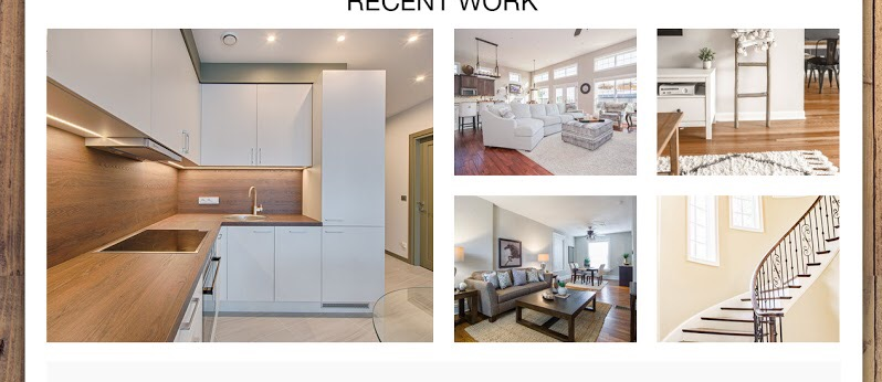
Next we need to break down what it is we are trying to achieve. It's typically easiest to break down a layout by rows and columns and do any spacing between elements last. Since there is an image that spans across two rows, to me, it would be easier to start with a columns. I'm starting with a border to help visually see if the layout is working as intended.
| Col 1 | Col 2 | Col 3 |
To Achieve this with flexbox:
div {
  border: 2px solid blue;
}

div > div {
  border: 2px solid red;
}

.d-flex {
  display: flex;
}

.flex-row {
  flex-direction: row;
}
<div class="d-flex flex-row">
  <div> Col 1 </div>
  <div> Col 2 </div>
  <div> Col 3 </div>
</div>
Now we can break down columns into rows for the additional spaces required:
|  Col 1 | Col 2 Row 1 | Col 3 Row 1 |
|  Col 1 | Col 2 Row 2 | Col 3 Row 2 |
div {
  border: 1px solid blue;
}

div > div {
  border: 2px solid red;
}

div > div > div {
  border: 3px solid green;
}

.d-flex {
  display: flex;
}

.flex-row {
  flex-direction: row;
}

.flex-column {
  flex-direction: column;
}
<div class="d-flex flex-row">
  <div> Col 1 </div>
  <div class="d-flex flex-column">
    <div> Col 2 Row 1</div>
    <div> Col 2 Row 2</div>
  </div>
  <div class="d-flex flex-column">
    <div> Col 3 Row 1</div>
    <div> Col 3 Row 2</div>
  </div>
</div>
Here are some assumptions Ill work against since they were not included at the time I wrote this answer; the spacing between these elements and the container elements is all the same, and we are not trying to dynamically change the images sizes to be scaled as the window grows or shrinks (we won't resize the images to fit in the space allocated, they are of a static size).
Basically My Opinion of Margins vs Padding:
Margins - When you want to separate elements from each other.
Padding - When you want the contents of your elements to be separated from the elements border.
There are many subtle differences between the two which I won't go over here. Another advantage of margins in this scenario is that we only need to apply them to the inner most containers. Since we are in a flexbox model we need to do some semi-tricky stuff to get the margins to all align correctly.
div {
  border: 1px solid blue;
}

div > div {
  border: 2px solid red;
}

div > div > div {
  border: 3px solid green;
}

.d-flex {
  display: flex;
}

.flex-row {
  flex-direction: row;
}

.flex-column {
  flex-direction: column;
}

.m-20 {
  margin: 20px;
}

.mtr-20 {
  margin: 20px 20px 0 0;
}

.mtrb-20 {
  margin: 20px 20px 20px 0;
}
<div class="d-flex flex-row">
  <div class="m-20"> Col 1 </div>
  <div class="d-flex flex-column">
    <div class="mtr-20"> Col 2 Row 1</div>
    <div class="mtrb-20"> Col 2 Row 2</div>
  </div>
  <div class="d-flex flex-column">
    <div class="mtr-20"> Col 3 Row 1</div>
    <div class="mtrb-20"> Col 3 Row 2</div>
  </div>
</div>
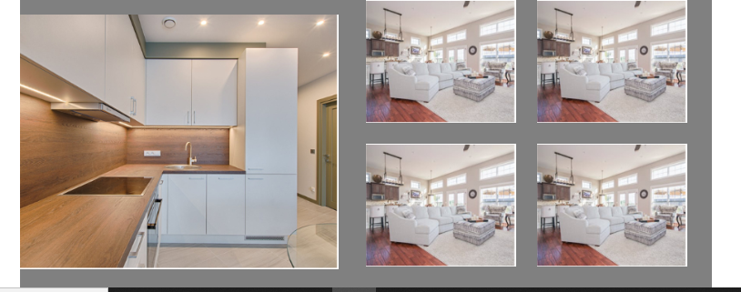
Now we can see that all the borders are lining up as needed. Now we can remove the border and insert any images and see if everything will work as intended.
.d-flex {
  display: flex;
}

.flex-row {
  flex-direction: row;
}

.flex-column {
  flex-direction: column;
}

.m-20 {
  margin: 20px;
}

.mtr-20 {
  margin: 20px 20px 0 0;
}

.mtrb-20 {
  margin: 20px 20px 20px 0;
}
<div class="d-flex flex-row">
  <div class="m-20"><img src="https://via.placeholder.com/150x220.png"/></div>
  <div class="d-flex flex-column">
    <div class="mtr-20"><img src="https://via.placeholder.com/150x100.png"/></div>
    <div class="mtrb-20"><img src="https://via.placeholder.com/150x100.png"/></div>
  </div>
  <div class="d-flex flex-column">
    <div class="mtr-20"><img src="https://via.placeholder.com/150x100.png"/></div>
    <div class="mtrb-20"><img src="https://via.placeholder.com/150x100.png"/></div>
  </div>
</div>
Now we notice that the images aren't quite aligned even though we've been very careful to get it pixel perfect. This is because images are display: inline by default and you can read all about those affects on the question Image inside div has extra space below the image.
So instead of inline we'll set them to flex.
.d-flex {
  display: flex;
}

.flex-row {
  flex-direction: row;
}

.flex-column {
  flex-direction: column;
}

.m-20 {
  margin: 20px;
}

.mtr-20 {
  margin: 20px 20px 0 0;
}

.mtrb-20 {
  margin: 20px 20px 20px 0;
}

img {
  display: flex;
}
<div class="d-flex flex-row">
  <div class="m-20"><img src="https://via.placeholder.com/150x220.png"/></div>
  <div class="d-flex flex-column">
    <div class="mtr-20"><img src="https://via.placeholder.com/150x100.png"/></div>
    <div class="mtrb-20"><img src="https://via.placeholder.com/150x100.png"/></div>
  </div>
  <div class="d-flex flex-column">
    <div class="mtr-20"><img src="https://via.placeholder.com/150x100.png"/></div>
    <div class="mtrb-20"><img src="https://via.placeholder.com/150x100.png"/></div>
  </div>
</div>
