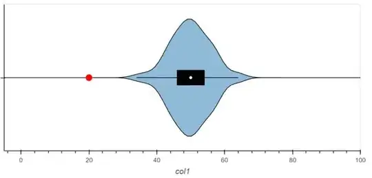
I made a violinplot of 1 column in my dataframe.
Now I would like to show where one specific datapoint (outlier) lies in comparison with that violinplot.
Below I have created some sample data and I would to plot 1 specific outlier, for example a datapoint with value 20.
How do I add this datapoint with a marker to my plot?
The problem is I know the value of 20 which is the x-axis, but I don't know the value of the y-axis, it seems to be 'anonymous'. I tried to overlay a scatterplot with point (None, 20), but that didn't work.
Example code:
# import libaries
import numpy as np
import pandas as pd
import hvplot
import hvplot.pandas
import holoviews as hv
hv.extension('bokeh')

# create sample_data
sample_data = np.random.poisson(lam=50, size=100)
df = pd.DataFrame(sample_data, columns=['col1'])

# create violin plot with hvplot:
violin_plot = df.hvplot.violin(ylim=(-5, 100), invert=True)

# or create it with holoviews:
violin_plot = hv.Violin(df, vdims=['col1'])
violin_plot.opts(ylim=(-5, 100), invert_axes=True, width=500)

