This existing question relates to bootstrap 3: Bootstrap 3 offset on right not left
I want to find a Bootstrap 4 example, whereby the left div has space on the right preventing the next sibling div from being on the same row, in the same way that offset pushes a div to the right (but opposite)?
I want multiple dynamic divs within a row, and using 1 or 2 classes to force any one of those divs to be by itself pushed to the left on its own row and the following div to be on the next row like this code does, (but without the empty div as a spacer):
<style>
    .row {
        background: #f8f9fa;
        margin-top: 20px;
    }

    .col {
        border: solid 1px #6c757d;
        padding: 10px;
    }
</style>
<div class="container">
    <div class="row">
        <div class="col col-3 offset-3">
            1st of 3
        </div>
        <div class="col col-3">
            2nd of 3
        </div>
        <div class="col col-3">
            3rd of 3
        </div>
        <div class="col col-3">
            1 of 1
        </div>
        <div class="col col-9">

        </div>
        <div class="col col-3">
            1st of 3
        </div>
        <div class="col col-3">
            2nd of 3
        </div>
        <div class="col col-3">
            3rd of 3
        </div>
    </div>
</div>
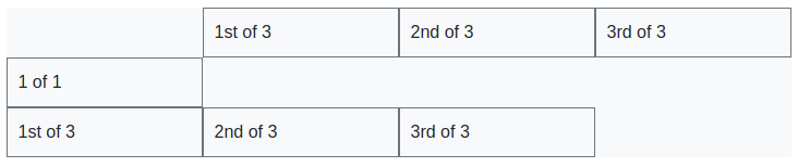 Even though this code achieves the result by using an extra div to fill the space, it is not ideal, because I want to be able to iterate across my data and create divs per data element and not have to add extra divs to achieve this result, surely there a class modifier way to do it with bootstrap.