I tested with the following answers:
- Pure CSS rotate animation broken while in infinite loop
- Stop infinite CSS3 animation and smoothly revert to initial state
- CSS Image Fade Animation Only Runs First Time,
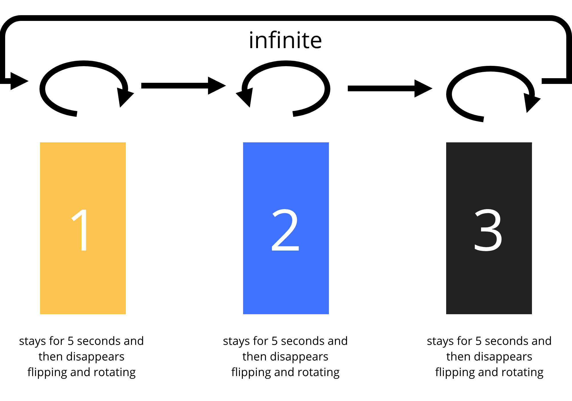
but the animation duration and timeline (for example, from step by step, from start to end) did not work. The three images need to be in the same place at once.
I wanted to use https://codepen.io/jay-bee-why/pen/Htejl, but unfortunately I do not want to use jQuery. I am CSS and JavaScript purist.
An image is worth a thousand words. You will understand easily the image. I also provide very small snippet code box.
  .flipping-images
  {
    align-items: center;
    display: flex;
    flex-flow: row nowrap;
    height: 80%;
    justify-content: center;
    /* opacity: 0; */
    position: relative;
    transform: translateX(100%);
    width: 22%;
  }
.show-l
{
  animation: show-image 5s ease-in-out 300ms infinite;
  left: 0;
  position: absolute;
  transform-origin: left;
}

.hide-l
{
  animation: hide-image 5s ease-in-out 800ms infinite;
  position: absolute;
  transform-origin: left;
}

.hide-l2
{
  animation: hide-image 5s ease-in-out 600ms infinite;
  position: absolute;
  transform-origin: right;
}
@keyframes hide-image
{
  0%
  {
    left: 0;
    transform: rotateY(0deg);
  }

  30%
  {
    left: 10%;
    transform: rotateY(0deg);
  }

  50%
  {
    opacity: 1;
  }

  100%
  {
    left: -100%;
    opacity: 0;
    transform: rotateY(90deg);
  }
}

@keyframes show-image
{
  0%
  {
    left: 100%;
    transform: rotateY(90deg);
  }

  30%
  {
    left: 110%;
    transform: rotateY(90deg);
  }

  100%
  {
    left: 0%;
    transform: rotateY(0deg);
  }
}
<div class="flipping-images">
<img class="show-l" src="https://via.placeholder.com/432x864/fdc34f/FEFEFE?text=1">
<img class="hide-l2" src="https://via.placeholder.com/432x864/3e72ff/FEFEFE?text=2">
<img class="hide-l" src="https://via.placeholder.com/432x864/222222/FEFEFE?text=3">
</div>