0

Template (Angular) :

<mat-card fxLayout="row" fxLayoutAlign="space-between" style="margin-bottom: 20px;">

      <div fxFlex="24%">  
         ...
      </div>

      <mat-divider [vertical]="true" style="margin-bottom: 0; margin-left: 1%; margin-right: 1%"></mat-divider>

      <div fxFlex="50%">
         ...
      </div>

      <mat-divider [vertical]="true" style="margin-bottom: 0; margin-left: 1%; margin-right: 1%"></mat-divider>

      <!-- div filter -->
      <div fxFlex="22%">
          <div fxLayout="row" fxLayoutAlign="space-between">

            <mat-form-field>
              <mat-select [formControl]="filterchips" multiple placeholder="Filter by tags">
                <mat-select-trigger>
                  ...
                </mat-select-trigger>
                <mat-option *ngFor="..." [value]="..." (click)="...">
                  {{ ... }}
                </mat-option>
              </mat-select>
            </mat-form-field>

            <div style="height: 70%; width: 70%;" style="display: block">
              <button [disabled]="isDisabled" mat-raised-button color="primary" (click)="..." >APPLY FILTER</button><br>
            </div>

          </div>
          <mat-chip-list aria-label="...">
            <mat-chip *ngFor="..." selected>{{...}}</mat-chip>
          </mat-chip-list>
      </div>
    </mat-card>

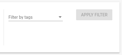
This is the result when I use the entire size of my screen (only the third div ) :

third div of my mat card which is good

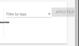
But when I change the size of the window :

third div of my mat card no responsiveness

Edric
  • 24,639
  • 13
  • 81
  • 91
licer93
  • 311
  • 2
  • 7
  • 18
  • You should change flex-direction to column instead row WHEN size is smaller (-420px for example) – PierreD Dec 30 '19 at 13:11
  • I want my 3 div to be in the same line, so I use `fxLayout="row"`, my row basically is my mat card – licer93 Dec 30 '19 at 13:17
  • and same for the select and the mat button, i want them to be in the same line so i use row – licer93 Dec 30 '19 at 13:18
  • But there is no space for set it in the same space (look at ur screenshot), so what You want to do for fixing it ? You can make it in column / reduce size (very very bad practice) or hide element (here i guess you wont) – PierreD Dec 30 '19 at 13:20
  • not fixing it (because like you said there is no space enough when the window's size is changed), but the button should resize himself (responsive) – licer93 Dec 30 '19 at 13:22
  • Mmmh, try adding `overflow: auto` to the parent div – PierreD Dec 30 '19 at 13:30
  • its better, it doesn't change the size of the material button tho : https://zupimages.net/viewer.php?id=19/01/4qpl.png – licer93 Dec 30 '19 at 13:41
  • it adds a hozirontal scroll bar – licer93 Dec 30 '19 at 13:42

1 Answers1

1

You can use the property wrap of Flex: https://developer.mozilla.org/en-US/docs/Web/CSS/flex-wrap

So when there is no more space for the html elements inside the div, it will re-order the elements in order all the elements get into the div.

In your case, you should do:

          <div fxLayout="row wrap" fxLayoutAlign="space-between">

            <mat-form-field>
              <mat-select [formControl]="filterchips" multiple placeholder="Filter by tags">
                <mat-select-trigger>
                  ...
                </mat-select-trigger>
                <mat-option *ngFor="..." [value]="..." (click)="...">
                  {{ ... }}
                </mat-option>
              </mat-select>
            </mat-form-field>

            <div style="height: 70%; width: 70%;" style="display: block">
              <button [disabled]="isDisabled" mat-raised-button color="primary" (click)="..." >APPLY FILTER</button><br>
            </div>

          </div>

Check the Angular Flex Layout documentation about wrap:

https://github.com/angular/flex-layout/wiki/fxLayout-API#fxlayout--wrap

German Quinteros
  • 1,870
  • 9
  • 33
  • thanks for your answer, its a very effective solution, i hope i'm not exaggerating by asking you this question : Is there not a way to resize the button depending on the size of its parent div ? – licer93 Dec 30 '19 at 14:10
  • Yes, here you have an example: https://stackoverflow.com/questions/54288017/set-child-width-relative-to-its-parents-height-in-pure-css . Or you can use css media queries: https://www.w3schools.com/css/css_rwd_mediaqueries.asp – German Quinteros Dec 30 '19 at 14:48