So I have a container with label text and checkboxes, now this is what I currently have
body {
  display: flex;
  justify-content: center;
}

.container {
  background-color: yellow;
  display: flex;
  width: 200px;
  height: fit-content;
  margin: 0 10px;
  justify-content: space-around;
}

.container.firstCheck{
  flex-grow: 1;
}
.container.secondCheck{
  flex-grow: 1;
}
<div class="container">
<div class="checkboxes">
<div class="firstCheck">
<label for="check1">this is 1</label>
<input name="check1" type="checkbox"/>
</div>
<div class="SecondCheck">
<label for="check2">this is 2</label>
<input name="check2" type="checkbox"/>
</div>
</div>
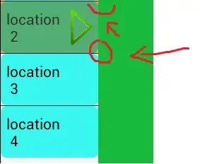
</div>now I want the label to be at the far left of the container and the checkbox to be at the far right of the container using flexbox. This illustrates my goal
 .
.
PS: I also want to be able to reduce html tags if possible.