0

I have two columns in a row with bootstrap 4. I want to use the whole screen to show the image. This is my code:

<div class="container-fluid" style="padding-left:0px;">
        <div class="row">
            <div class="col-md-6 ">
                <img class="img-fluid" src="jumbo_background.jpg" />
            </div>
            <div class="col-md-6">
                <div class="contact-wrapper">
                  <p>Test</p>
                </div>
            </div>
        </div>
   </div>

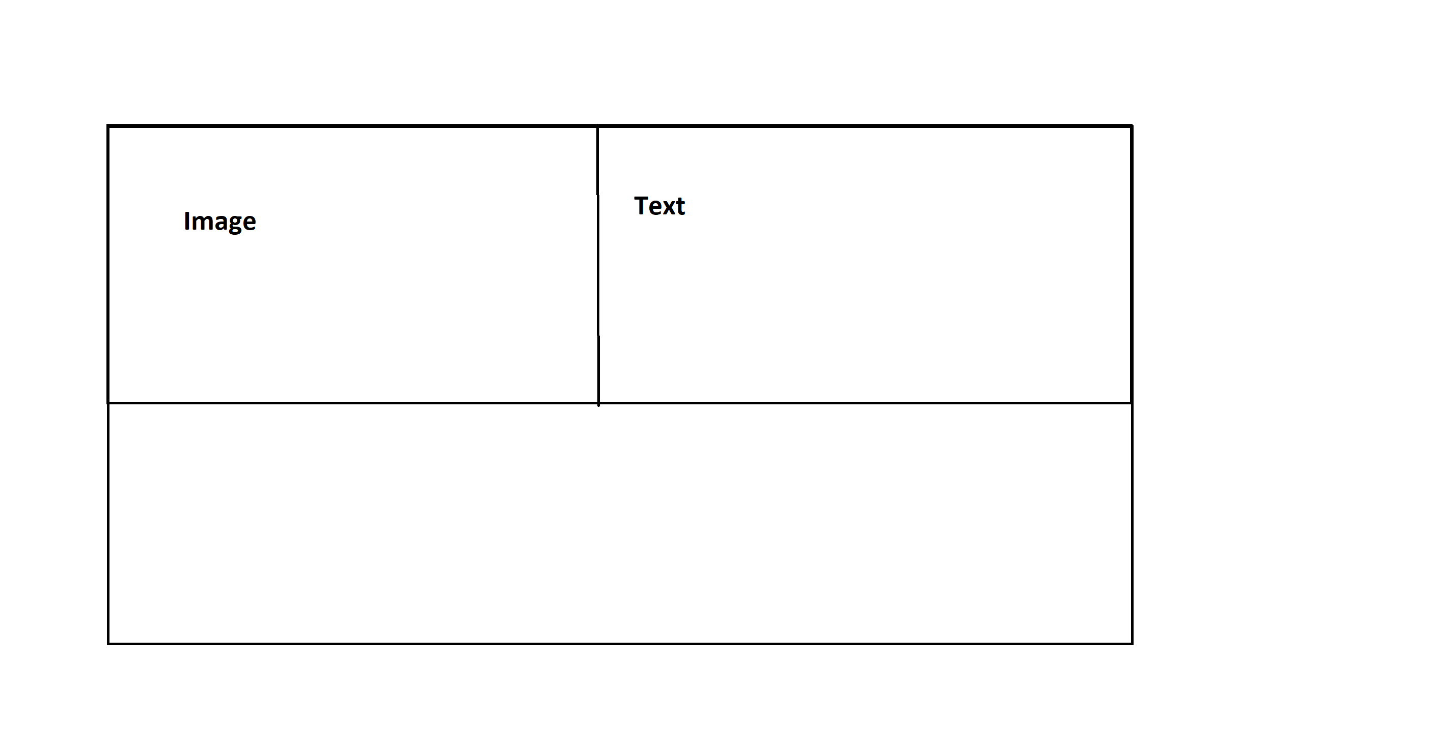
Everything is working good and responsive but this is the result I get from this code:

result 1

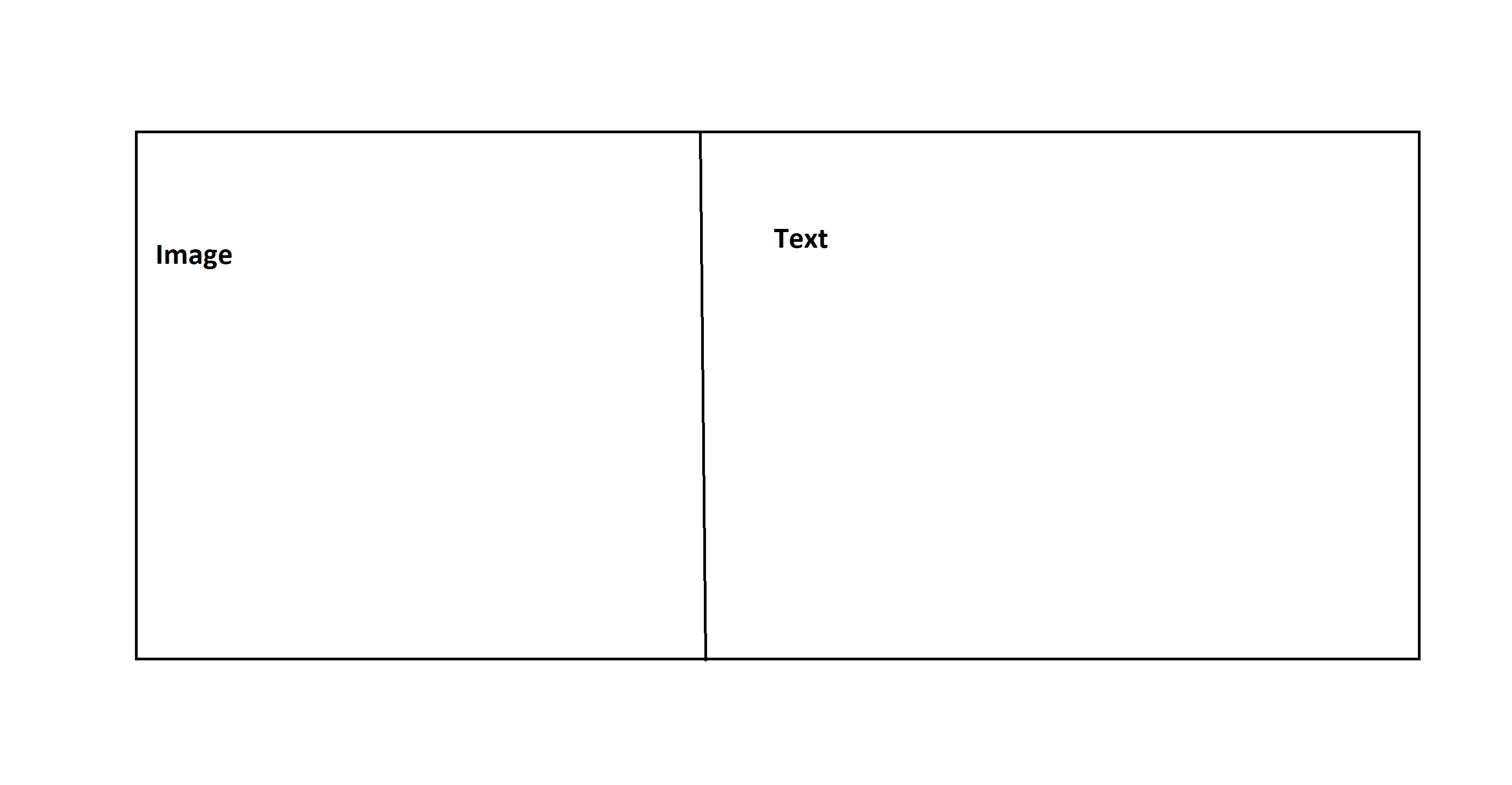
The preferred result I want is this:

Result2

The picture I use the dimension are 6000 X 4000

The solutions I have tried:

html, body {
height: 100%;

}

I have inspected the browser with the Google dev tool and I can see the the body is 100% but still not the result I want.

I have used h-100 from bootstrap and still get the same result.

I have used height: 100vh; but on smaller devices it's not responsive

I have checked this link:

Height not 100% on Container Fluid even though html and body are

Still don't get the result I want.

How can I give the image a full height in bootstrap 4?

UPDATE:

After nikolay solution on resolution: 1156 x 1013

result3

Fearcoder
  • 753
  • 3
  • 15
  • 47

2 Answers2

1

You seem to want to use the image as a background. So my suggestion would be to do just that, as the cross-browser support is better (I'm not saying it can't be done with <img> alone, only that it's easier with background-image). Do note I'm leaving the <img> tag in for two reasons:

  • SEO indexing (if you need it)
  • sizing the column properly on mobile devices.

However, the <img> is not rendered. You're always looking at the background image of the <div>.

Here's a solution which grabs the src attribute of the first <img> element in each .column-image and uses it as <div>s backgroundImage. For it to work, make sure the <div> has the image-column class:

$(function() {
  $('.image-column').each(function() {
    const src = $('img', this).eq(0).attr('src');
    if (src) {
      $(this).css({ backgroundImage: `url(${src})` })
    }
  })
});
.image-column {
  min-height: 100vh;
  background: transparent no-repeat center /cover;
}

.image-column .img-responsive {
  visibility: hidden;
}

@media(max-width: 767px) {
  .image-column {
    min-height: 0;
  }
  .image-column .img-responsive {
    width: 100%;
    height: auto;
  }
}
<link href="https://stackpath.bootstrapcdn.com/bootstrap/4.4.1/css/bootstrap.min.css" rel="stylesheet" />
<script src="https://code.jquery.com/jquery-3.4.1.slim.min.js"></script>
<script src="https://cdn.jsdelivr.net/npm/popper.js@1.16.0/dist/umd/popper.min.js"></script>
<script src="https://stackpath.bootstrapcdn.com/bootstrap/4.4.1/js/bootstrap.min.js"></script>

<div class="container-fluid">
  <div class="row">
    <div class="col-md-6 image-column">
      <img src="https://i.picsum.photos/id/237/600/400.jpg" class="img-responsive">
    </div>
    <div class="col-md-6">
      <div class="contact-wrapper">
        <p>Test</p>
      </div>
    </div>
  </div>
</div>

Note: even though it's used as both src of the <img> and background-image of the <div>, the resource (image) is only loaded once.

tao
  • 82,996
  • 16
  • 114
  • 150
0

Here's a solution:

html, body, 
.container-fluid .row, 
.container-fluid .row .col-md-6, 
.container-fluid .row .col-md-6 img { 
height: 100vh !important;
}

Add example for the responsive mobile view as you made above, so I can write a solution.