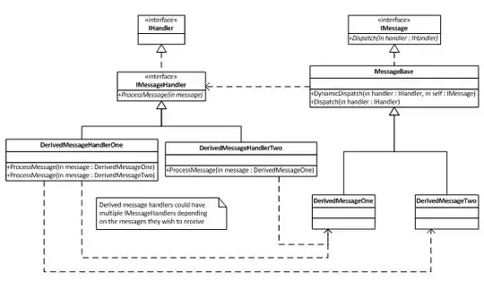
If we zoom in and look closely at both images, we'll notice an immediate difference (at least I do):
The text in the upper image is using CRT-style font smoothing, while the text in the lower image is using Medium LCD-style font smoothing. (All 3 styles of the LCD font smoothing will introduce color casts in the anti-aliased pixels).
We'd need more info about your testing setup to be able to say why this is happening. Under what version(s) of OS X are you testing this with? For example, was your app built against the 10.6 SDK with a deployment target of 10.5, the upper image was taken while testing under OS X 10.5.x (on the same machine), and the lower image was taken while testing under 10.6.x? Or, was all testing done in Mac OS X 10.6.x, and building against the 10.5 SDK resulted in the upper image, and building against the 10.6 SDK resulted in the lower image? What model Mac are you using? What type of external LCD or CRT displays do you have hooked up, if any?
Just a couple of ideas, without having the info asked for above. The default font smoothing style is CRT in 10.5, I believe, and 10.6 defaults to "automatic". So, if you have a system with an LCD display and were testing under 10.5, but have never changed the font-smoothing style from the default CRT-style, then you'd get an image like the upper one. If you then switched to 10.6 on the same system, it's possible that the 10.6 automatic font-smoothing automatically detected your LCD display, and used Medium LCD-style font smoothing, which would result in the "heavier-looking" text in the lower image.
Another thing to keep in mind is that the font smoothing value is stored on a by-host basis. For example, on my machine, the AppleFontSmoothing value is stored in ~/Library/Preferences/ByHost/.GlobalPreferences.##########.plist, where the ########## is your hardware UUID. I suppose it's possible that there could be 2 different values stored for different host setups.