94

I use tailwindCSS and confront a problem with make footer.

base.html

  <body>
    {% include "partials/nav.html" %}

    {% block content %}
    {% endblock %}

    {% include "partials/footer.html" %}
  </body>

footer.html

<footer class="w-full h-64 bg-gray-900 static bottom-0">
        {% load static %}
        <img src="{% static "images/logo_white.png" %}" width="70px"> <p class="text-white"> &copy~~~~~~</p>
</footer>

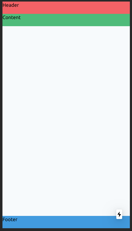
i tried static,absolute,fixed,relative... but .fixed cover the content block and relative make footer going upside. or .mb-0, .bottom-0 doesn't work.

is it possible make footer fixed on the bottom?

doğukan
  • 23,073
  • 13
  • 57
  • 69
dhooonk
  • 2,115
  • 3
  • 11
  • 17

16 Answers16

223
<div class="flex flex-col h-screen justify-between">
  <header class="h-10 bg-red-500">Header</header>
  <main class="mb-auto h-10 bg-green-500">Content</main>
  <footer class="h-10 bg-blue-500">Footer</footer>
</div>

Class justify-between is not required, but I would leave him (for other case).

So, play with h-screen and mb-auto classes.

And you get this UI:

enter image description here

Dmitry S.
  • 3,766
  • 3
  • 18
  • 26
  • This is quite a classy solution but if you want to apply page-wide classes with this setup (like background color) you need to set it for each element separately. – thiras Feb 10 '21 at 14:15
  • If the page is short in content .. it does not go very buttom – mercury Mar 25 '21 at 12:25
  • @HosMercury for me it does, all i did was "flex flex-col h-screen justify-between" if i remove "justify-between" then it does not go very bottom – Fatih Akgun May 17 '21 at 21:40
  • 13
    This is not a sticky footer, this is just a footer. If the content is taller than the screen then it just pushes the footer down. https://codepen.io/therms/pen/BaREVNN – Dustin Wyatt Aug 15 '21 at 17:11
  • 3
    I have never seen an answer so clean! – Igbanam Aug 26 '21 at 22:56
  • I just ran into a similar situation and I was able to make the footer sticky by adding the following tailwind classes "sticky bottom-0" – Brian Holland Oct 15 '21 at 21:44
  • works perfect, thanks! – Nikolay Shabak Nov 23 '21 at 15:24
  • 9
    @DustinWyatt Sorry, but this is exactly what a "Sticky Footer" is supposed to be. Google "Sticky Footers" "A sticky footer pattern is one where the footer of your page "sticks" to the bottom of the viewport in cases where the content is shorter than the viewport height." – Larry Flewwelling Dec 23 '21 at 01:11
  • Use `min-h-screen` instead. If you use `h-screen` and set the footer height (eg. `h-20`), when the height of the content overflows the screen, the footer's height isn't correct anymore! – Anh-Thi DINH Nov 03 '22 at 20:07
  • Much love for this little trick <3 – Kal May 25 '23 at 21:47
108

Another approach would be using flex-grow.

<link href="https://cdnjs.cloudflare.com/ajax/libs/tailwindcss/2.0.2/tailwind.min.css" rel="stylesheet"/>

<div class="flex flex-col h-screen">
    <div class="bg-red-500">header</div>
    <div class="bg-green-500 flex-grow">content</div>
    <div class="bg-blue-500">footer</div>
</div>
ffx14
  • 1,825
  • 2
  • 14
  • 19
37

New solution in 2022. Tailwindcss version 3.0.24 in codepen demo.

<div class="min-h-screen">
  <div>Content</div>
  <div class="sticky top-[100vh]">Footer</div>
</div>

codepen demo

shrekuu
  • 1,716
  • 1
  • 23
  • 38
35

use 'fixed' instead of 'static'

class="fixed bottom-0"

hyukkyulee
  • 1,024
  • 1
  • 12
  • 17
  • how to add this property only when on mobile devices? – Apoorv pandey Jan 07 '22 at 10:35
  • @Apoorvpandey I am quite new to tailwind CSS also, but here is the link to tailwind css document how to target mobile devices https://tailwindcss.com/docs/responsive-design#targeting-mobile-screens – hyukkyulee Mar 06 '22 at 10:51
23

Another way that was recently discovered by Sílvio Rosa uses position: sticky + top: 100vh on the footer. The way to achieve this with TailWindCSS is...

<html class="min-h-screen">
  <body class="min-h-screen">
    
    <header>Header</header>
    <main>Content</main>
    <footer class="sticky top-[100vh]">footer</footer>

  </body>
</html>

You can read the full article on CSS Tricks here

Oneezy
  • 4,881
  • 7
  • 44
  • 73
7

None of the solutions here worked for me since my component wasn't a layout component. I wanted a sticky footer to appear on just a single page and it needed to ignore the margins and padding of parent containers. Here's the tailwind solution that worked for me:

<div className="fixed bottom-0 left-0 bg-red-500 w-screen h-12">
  Sticks to bottom, covers width of screen
</div>
jfunk
  • 7,176
  • 4
  • 37
  • 38
6

A solution without using margin:

.as-console-wrapper {
  display: none !important; /* just to hide stackoverflow console warning */
}
<script src="https://cdn.tailwindcss.com"></script>

<div class="flex flex-col min-h-screen">
  <header class="bg-yellow-600">content</header>
  <div class="bg-blue-600">content</div>
  <div class="flex-1"></div> <!-- here -->
  <footer class="bg-red-400">footer</footer>
</div>

Another so clever solution is using sticky top-[100vh] for footer. by Chris Coyier

.as-console-wrapper {
  display: none !important; /* just to hide stackoverflow console warning */
}
<script src="https://cdn.tailwindcss.com"></script>

<div class="min-h-screen">
  <header class="bg-yellow-600">content</header>
  <div class="bg-blue-600">content</div>
  <footer class="bg-red-400 sticky top-[100vh]">footer</footer>
</div>
doğukan
  • 23,073
  • 13
  • 57
  • 69
5

Sticky Header and Footer

For a sticky header and footer regardless of content and screen size, do this:

<div class="flex flex-col h-screen">
    <div class="sticky top-0 z-50">header</div>
    <div class="grow">content</div>
    <div class="sticky bottom-0 z-50">footer</div>
</div>
Jorge Garcia
  • 2,042
  • 23
  • 25
2

This has been a major pain for me recently. I ended up solving this without flex, I simply gave my body a min-height of 75vh and it seems to have produced the desired result.

IVR
  • 1,718
  • 2
  • 23
  • 41
2

I'm using this:

<div class="min-h-screen flex flex-col justify-start">
   <div>your main content</div>
   <footer class="mt-auto">
      <div>your footer content</div>
   </footer>
</div>
  • 1
    Your answer could be improved with additional supporting information. Please [edit] to add further details, such as citations or documentation, so that others can confirm that your answer is correct. You can find more information on how to write good answers [in the help center](/help/how-to-answer). – Community Oct 16 '22 at 20:03
2

The best answer that I have seen was to set container, containing the footer, to screen height ('min-h-screen') and make it a flexbox ('flex') and set the element above the footer to flex-1 so that it would consume all the spaces and push the footer below.

In your code, it would look like these:

<body class='flex flex-col min-h-screen'>
    {% include "partials/nav.html" %}
    <div class='flex-1'>
      {% block content %}
      {% endblock %}
    </div>
    {% include "partials/footer.html" %}
</body>

Here's a sample code for my use-case:

<div className='flex flex-col min-h-screen'>
  <div className='flex-1 mx-24 mt-12'>
    <Header />
    <div className='grid grid-cols-4 gap-12 my-12'>
      {data.map( (item, i) => <Todo key={i} title={item.title} note={item.note} texts={item.texts}/>)}
    </div>
  </div>
  <Footer />
</div>
Kathulhu
  • 61
  • 1
1

While I avoided using display: grid for a long time, using it seems to be the simplest solution to date (compared to the flexbox solution):

<script src="https://cdn.tailwindcss.com"></script>

<!-- Wrapper element ('display: grid', 'grid-template-rows' defined) -->
<div class="min-h-screen grid grid-rows-[min-content_1fr_min-content] ">
  <header class="bg-blue-200">Header</header>
  
  <!-- Content element (display: grid) -->
  <main class="grid bg-blue-300">Content</main>
  
  <footer class="bg-blue-400">Footer</footer>
</div>

There are two key points:

  • min-h-screen, grid, and grid-rows-[...]have been applied to the wrapping element1. Considering grid-rows, an arbitrary value has to be used (Tailwind v3 offers only evenly distributed rows). The element that should take up all available space needs to have 1fr value; the rest is up to you (min-content might be the best choice).

  • The element that is supposed to take up all the available space needs to have grid class.


1Alternatively, instead of min-h-screen, h-full can be used, but it needs to be applied to all of the wrapping elements, starting with <html/>.

It is actually easier done than said. Take a look at the example above.

HynekS
  • 2,738
  • 1
  • 19
  • 34
0

Use the h-[100vmin] custom class on the first div inside your layout component, typically as follows:

<Layout>
  <div class="container">
    <div class="h-[100vmin]">
      ...
    </div>
  </div>
</Layout>
Anas Abu Farraj
  • 1,540
  • 4
  • 23
  • 31
0
<footer class="absolute bottom-0 w-full px-6 py-6 text-white bg-emerald-500">

I think you can just use absolute bottom-0 to locate it, w-full to fill the width, and px and py to size your footer .

skwidbreth
  • 7,888
  • 11
  • 58
  • 105
0

To avoid breaking a bg-gradient on the <body>:

<main class="min-h-screen"></main>
Source
  • 1
-1
<div class='relative'>
   <div class='fixed bottom-0 right-10 cursor-pointer rounded-t-3xl bg-red-500 w-10 h-10 grid content-center justify-center'>
      your text
   </div>
</div>
  • 1
    Remember that Stack Overflow isn't just intended to solve the immediate problem, but also to help future readers find solutions to similar problems, which requires understanding the underlying code. This is especially important for members of our community who are beginners, and not familiar with the syntax. Given that, **can you edit your answer to include an explanation of what you're doing** and why you believe it is the best approach? – Skully Dec 15 '22 at 12:30