0

I'm having trouble tweaking the graph below.

graph

Here's what the dataframe looks like:
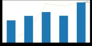
   Year  Some  All     Ratio
0  2016     9  157  0.057325
1  2017    13  189  0.068783
2  2018    21  216  0.097222
3  2019    18  190  0.094737
4  2020    28  284  0.098592

Here's what I want to do:

  • The orange line should be in front of the bars. I tried using the zorder parameter and it didn't help. I also tried switch the order of the axes object, but I couldn't get the line to be assigned to the primary axis.
  • I want the legend on the left side. You'll notice in the code below that I'm using a somewhat large figsize argument. If I use a smaller one, the legend will magically move to the left, but I don't want to use a smaller one.
  • I want to label the bar graphs on top of each bar with its corresponding value. I tried iterating over each value and individually annotating the bars with ax.annotate, but I couldn't center the values automatically. In this minimal example, all the values are three digits long, but in the original data I have numbers that four digits long and I couldn't find a good way to make it centered for all of them.
  • Finally, I want to get rid of the top and right spines. My code below didn't remove them for some reason.

The code to help people get started follows below.

data = {'Year': {0: '2016', 1: '2017', 2: '2018', 3: '2019', 4: '2020'},
 'Some': {0: 9, 1: 13, 2: 21, 3: 18, 4: 28},
 'All': {0: 157, 1: 189, 2: 216, 3: 190, 4: 284},
 'Ratio': {0: 0.05732484076433121,
  1: 0.06878306878306878,
  2: 0.09722222222222222,
  3: 0.09473684210526316,
  4: 0.09859154929577464}}

df = __import__("pandas").DataFrame(data)

ax = df.plot(x="Year", y="Ratio",
                 kind="line", linestyle='-', marker='o', color="orange",
                 figsize=((24,12))
                )
df.plot(x="Year", y="All",
            kind="bar", ax=ax, secondary_y=True
           )

ax.spines['top'].set_visible(False)
ax.spines['right'].set_visible(False)
JohanC
  • 71,591
  • 8
  • 33
  • 66
  • Can someone please edit my question to include the image inline? Thanks. –  Jan 21 '20 at 11:45

1 Answers1

1

Your asking quite a number of things.

  • To get the line on top of the bar, it seems we have to first draw the bars and afterwards the line. Drawing the line last shrinks the xlims, so we have to apply them explicitely.
  • Moving the legend is more complicated. Normally you just do ax1.legend(loc='upper left'), but in our case with two plots this seems to always draw a second legend with the last drawn plot as only entry.
  • There is a function set_bbox_to_anchor with little documentation. It defines some box (x, y, width, height), but there is also a seemingly inaccessible loc parameter that controls how the box and the position relate. "The default for loc is loc="best" which gives unpredictable results when the bbox_to_anchor argument is used." Some experimentation might be needed. The best solution, is to guard the
  • Setting the text is simple. Just iterate over the y positions. Place at x position 0,1,2,.. and center horizontally (vertically at bottom).
  • To remove the spines, it seems there are two axes over each other (what probably also causes the zorder not to work as desired). You'll want to hide the spines of both of them.
  • To remove the ticks, use ax1.axes.yaxis.set_ticks([]).
  • To switch the ax2 ticks to the left use ax2.yaxis.tick_left().
import pandas as pd
from matplotlib import pyplot as plt

data = {'Year': {0: '2016', 1: '2017', 2: '2018', 3: '2019', 4: '2020'},
        'Some': {0: 9, 1: 13, 2: 21, 3: 18, 4: 28},
        'All': {0: 157, 1: 189, 2: 216, 3: 190, 4: 284},
        'Ratio': {0: 0.05732484076433121,
                  1: 0.06878306878306878,
                  2: 0.09722222222222222,
                  3: 0.09473684210526316,
                  4: 0.09859154929577464}}

df = pd.DataFrame(data)

ax1 = df.plot(x="Year", y="All",
              kind="bar",
              )
for i, a in df.All.items():
    ax1.text(i, a, str(a), ha='center', va='bottom', fontsize=18)
xlims = ax1.get_xlim()

ax2 = df.plot(x="Year", y="Ratio",
              kind="line", linestyle='-', marker='o', color="orange", ax=ax1, secondary_y=True,
              figsize=((24, 12))
              )
ax2.set_xlim(xlims)  # needed because the line plot shortens the xlims

# ax1.get_legend().set_bbox_to_anchor((0.03, 0.9, 0.1, 0.1)) # unpredictable behavior when loc='best'
# ax1.legend(loc='upper left') # in our case, this would create a second legend

ax1.get_legend().remove() # remove badly placed legend
handles1, labels1 = ax1.get_legend_handles_labels()
handles2, labels2 = ax2.get_legend_handles_labels()
ax1.legend(handles=handles1 + handles2,   # create a new legend
           labels=labels1 + labels2,
           loc='upper left')

# ax1.yaxis.tick_right()  # place the yticks for ax1 at the right
ax2.yaxis.tick_left()  # place the yticks for ax2 at the left
ax2.set_ylabel('Ratio')
ax2.yaxis.set_label_position('left')
ax1.axes.yaxis.set_ticks([]) # remove ticks

for ax in (ax1, ax2):
    for where in ('top', 'right'):
        ax.spines[where].set_visible(False)

plt.show()

plot

JohanC
  • 71,591
  • 8
  • 33
  • 66
  • Thank you very much for the comprehensive answer. I'm going to digest it. However, there's something that isn't as I want, specifically that the line is assigned to the secondary axis. I want the line on the primary axis. I did try switching the order and abandoned that I idea because of this. –  Jan 21 '20 at 11:44