0

I have made a histogram in R using the following code: (I have tried generating a reprex. Try the code reprex here

progressiveNumber = c(1:50)

c = c(-0.22037439, -0.21536365, -0.34203720,  0.04501624, -0.13141665, -1.28155157, -0.08394700, -0.08484768, -0.12577287,  0.30402612, -0.40578251,
 0.00000000, -0.16849942, -0.04212114,  0.12577287,  0.57366312, -0.84766743, -1.03909659, -0.21536365, -0.46263648, -0.48181028, -0.38887381,
-0.38571106, -0.38571106, -0.26220026,  0.73227348, -0.38887381, -0.96590662, -0.29931065,  0.04272655,  0.04182587, -0.38571106, -0.13141665,
-0.34614726, -0.49063020, -0.08484768,  0.05249378,  0.08484768, -0.74591104,  0.46263648, -0.42081062,  0.00000000,  0.08394700, -0.38571106,
 -0.34203720, -0.04212114, -0.79517364,  0.25429442, -0.30402612, -0.08365173)

library(tidyverse)

# DEFINING BREAKS AND CUT A VECTOR INTO BINS
# set up cut-off values 
breaks <- c(-1.2816,-0.3881,-0.2154, 0.0000, 0.3 ,0.7323)
# specify interval/bin labels
tags <- c("[-1.2 / -0.3]","[-0.3 / -0.2]", "[-0.2 / 0]", "[0 / 0.3]","[0.3 / 0.7]")
# bucketing values into bins
group_tags <- cut(c, 
                  breaks=breaks, 
                  include.lowest=TRUE, 
                  right=FALSE, 
                  labels=tags)
# inspect bins
summary(group_tags)

# c_groups <- factor(group_tags,levels = labels, ordered = TRUE) # this line doesn't work for some reason
#tiff("percentageBinsC.tiff", units="in", width=5, height=5, res=300,)
p2 = ggplot(data = as_tibble(group_tags), mapping = aes(x=value)) + 
  geom_bar(fill="deepskyblue1",color="white",alpha=0.7, ) + 
  stat_count(geom="text", aes(label=sprintf("%.2f",..count../length(group_tags))), vjust=-0.5) +
  labs(y = 'Count',  x='C') +
  theme(text = element_text(size=20), axis.line.x = element_line(color = "black", size = 1),
        axis.line.y = element_line(color = "black", size = 1), axis.text.x = element_text(angle = 35, hjust = 1, vjust = 1),
        panel.background = element_blank(), panel.border = element_blank(),
        panel.grid.minor = element_blank(),panel.grid.major = element_blank())

p2  

#dev.off()

Result

enter image description here

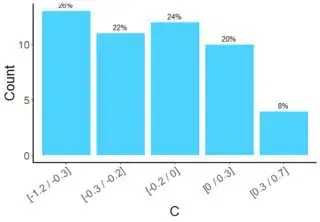
I would like to change the label on the bars (not the x-axis label but the ones that are right on top of each bar) from, e.g., 0.26 to 26%, 22% and so on.

How can I do that?

user213544
  • 2,046
  • 3
  • 22
  • 52
Glu
  • 327
  • 3
  • 14
  • Please consider making this question reproducible, otherwise you are risking downvotes – tjebo Jan 21 '20 at 12:58
  • I am sorry but I actually made a mistake in my question. The code was for the wrong plot and I think I didn't explain myself. The other question that was already answered is different from mine. What I want to know is not how to change x-axis label but how to change the number on top of the bar; that is, this: stat_count(geom="text", aes(label=sprintf("%.2f",..count../length(group_tags))), vjust=-0.5) Would it be possible to change the question and re-open it? (And I can also make it more reproducible) – Glu Jan 22 '20 at 10:34
  • when making it more reproducible, consider simply using one of the inbuilt data sets - this reduces the code massivley and makes the question more concise. Also consider removing the unnecesaary code bits for the plot, i.e. call to `tiff` and `theme` and `labs` – tjebo Jan 22 '20 at 10:39
  • 1
    @Glu there you go, edit away. – Roman Luštrik Jan 22 '20 at 10:41
  • 1
    @Glu also if you start to use github and stackoverflow more regularly, it's worth to use the `reprex` package. Once installed, this integrates fully into RStudio and helps to create really nice reproducible examples - you will never again create posts that are not reproducible. Image embedding included https://github.com/tidyverse/reprex#readme – tjebo Jan 22 '20 at 10:42
  • Thank you very much Roman, I didn't know about reprex but I will definitely try it. In the meantime, I will try to make a question that can also be reproducible and useful for others. – Glu Jan 22 '20 at 10:45
  • I have edited the question and tried using reprex (see the link). Hope that this will be better. Thank you for your suggestions. – Glu Jan 22 '20 at 11:21

1 Answers1

0

You can use percent_format from scales, first we define a function to do the conversion, and the rounding up you did with sprintf:

convert2perc = scales::percent_format(accuracy = 2)

You can test it:

convert2perc(0.107)  
[1] "10%"

Then use it in the plotting:

p2 = ggplot(data = as_tibble(group_tags), mapping = aes(x=value)) + 
  geom_bar(fill="deepskyblue1",color="white",alpha=0.7, ) + 
  stat_count(geom="text", aes(label=convert2perc(..count../length(group_tags))), vjust=-0.5) +
  labs(y = 'Count',  x='C') +
  theme(text = element_text(size=20), axis.line.x = element_line(color = "black", size = 1),
        axis.line.y = element_line(color = "black", size = 1), axis.text.x = element_text(angle = 35, hjust = 1, vjust = 1),
        panel.background = element_blank(), panel.border = element_blank(),
        panel.grid.minor = element_blank(),panel.grid.major = element_blank())

enter image description here

StupidWolf
  • 45,075
  • 17
  • 40
  • 72