I'm trying to implement a complex-ish design and I am having difficulties with clipping and masking. I'm assuming a combination of clipping or masking is needed as I'm not sure how else to make this work. I need clip part of the background of a parent or adjacent div to be transparent. The main div has a small drop shadow so it's noticeable if a solid color is used instead. I've started on a crass prototype of just markup and CSS, but where I am now illustrates what I need to do quiet well.
I need to remove/clip the white background of the parent div and have it transparent because the real body/background is more than a solid color. I've looked at clip-path and other features but in reality I need to do the inverse of what I've read about them. Here's the markup and styling I have so far:
body {
    background-color: #C4C4C4;
}
.big-div {
    width: 300px;
    height: 100px;
    background-color: #fff;
    left: 100px;
    position: absolute;
    box-shadow: 5px 5px 5px #000;
}
.number {
    border-radius: 20px;
    height: 50px;
    width: 50px;
    border: solid .5em #C4C4C4;
    padding: .5em;
    top: 10px;
    text-align: center;
    background: #008DCC content-box;
    left: -40px;
    position: absolute;
    clip: circle(100px, 200px, 300px, 400px);
}
and the simple bit of markup:
<div class="big-div">
    <div class="number">
        <p>2</p>
    </div>
</div>
In case I haven't illustrated my point as well as I would like, here's a snippet of the design in question pulled from Figma 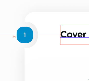
Thanks in advance for any tips or advice