0

I have a collection of values and labels that I'd like to include as a summary table within a matplotlib plot.

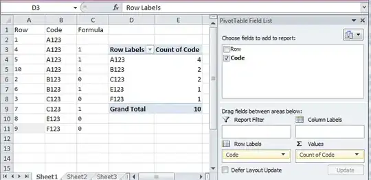
My table looks similar to this:

enter image description here

I'm currently using the matplotlib.pyplot text method applied a previously created axis object (ie, ax.text()) to specify locations for each of the entries and labels, but it's incredibly tedious and imprecise.

Imagine there's a more efficient way to do this, but haven't found one despite being somewhat familiar with a few of the data visualization libraries in python (eg, seaborn, plotly etc).

To be clear, the matplotlib table method, or answers here, don't address my question. Looking for an option with cleaner-looking output.
rpanai
  • 12,515
  • 2
  • 42
  • 64
Chris
  • 1,401
  • 4
  • 17
  • 28
  • The picture you show is easily achiveable with `plt.table` shown in the link. So what exactly did you try and where did you get stuck? Or what is this question really about? – ImportanceOfBeingErnest Jan 29 '20 at 22:48
  • I gather through additional parameters? Every example I found resulted in a similar basic solid line grid. Looking for something 'clean' in the way of seaborn – Chris Jan 29 '20 at 22:53
  • 1
    Seaborn does not provide any tables; it's a package for statistical plots built on top of matplotlib. You would also want to decide if you are looking for a matplotlib- or a plotly solution. Then show what you have tried, i.e. at least read through the list of arguments to the table function. – ImportanceOfBeingErnest Jan 29 '20 at 23:03
  • going through the documentation now, will update shortly. – Chris Jan 29 '20 at 23:06
  • https://stackoverflow.com/questions/47332924/plot-table-alongside-sns-barplot – Mohsen_Fatemi Jan 30 '20 at 00:17

0 Answers0