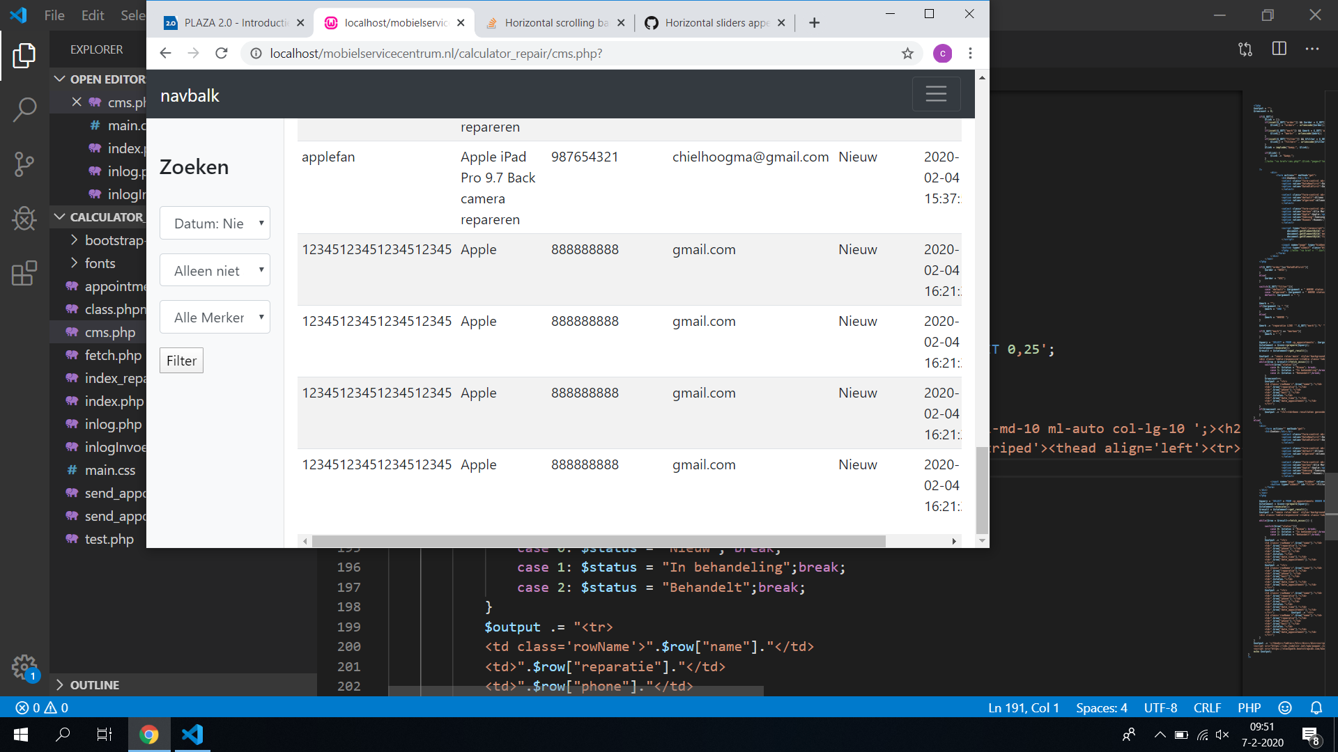
I am trying to make a page where data from a database is displayed, because I want to make it accessible on smaller devices where not all data fits on to the screen, so the user should be able to scroll from left to right. But the problem I am having now is that the scrollbar only appears when you are at the bottom of the page. Picture when the page is at bottom, The page when i scroll even up a little. So what I want as a result is to have the scrollbar always there(except when the page is large enough to display all the data.)
I have tried the answer of this post: Horizontal scrollbar only appearing at bottom of page, but unfortunetly it did not work.
My code:
           <div class="container-fluid w100 h-100 mt-5">
                <div class="row">
                    <nav style="position: fixed; "class="col-md-2  pt-5 sidebar h-100 w100">
                     ....
                    </nav

                    <main role='main' style='background: white;' class='col-md-10 ml-auto col-lg-10 ';>
                    <h2 class='d-flex justify-content-between flex-wrap flex-md-nowrap align-items-center
                     pt-3 pb-2 mb-3'>Afspraken:</h2>
                    <div class='table-responsive'><table class='table table-sm table-striped'><thead
                    align='left'><tr><th>Naam:</th><th>Reparatie</th><th>Telefoonnummer</th>
                    <th>Email</th><th>Status</th><th>Datum</th><th>Datum</th></tr></thead><tbody>```