I am using CSS grid to display 5 cards. The cards aligned perfectly in a single row in desktop. But, when I switch to a mobile device, they are displayed as per the image below.
Is it possible to specify to display only two rows in the CSS grid.
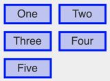
I am using CSS grid to display 5 cards. The cards aligned perfectly in a single row in desktop. But, when I switch to a mobile device, they are displayed as per the image below.
Is it possible to specify to display only two rows in the CSS grid.
You cannot specify only 2 rows but you can try to set the last rows to a minmax(0,0) value aside overflow:hidden; ...
to hide them :
section {
  display: grid;
  grid-template-columns: 1fr 1fr;
  grid-gap: 1em;
  overflow: hidden;
  grid-template-rows: minmax(100px, 1fr) minmax(100px, 1fr) minmax(0px, 0); /* third-row won't show, next might , grid-gap will increase height of section if set */
}

section {
  counter-reset: divs;
}

div {
  border: solid;
}

div:before {
  counter-increment: divs;
  content: counter(divs)
}
p:before {
color:red;
  content: counter(divs)
  }
<section>
<div></div>
<div></div>
<div></div>
<div></div>
<div></div>
</section>
<p> boxes are standing here </p>this hides the third row, if more , some element will show up since a grid-gap set will increase height for each extra rows.
You may use margin instead grid-gap and add for each extra rows to hide the mimax(0,0) value for the grid-template-rows.
Another demo below showing a single row (out of 7) and 2 boxes (out of 14).
section {counter-reset:divs;}
div {border:solid;margin:0.5em;}
div:before {counter-increment:divs;content:counter(divs)}

section {
  display:grid;
  grid-template-columns:1fr 1fr;
  overflow:hidden;
  grid-template-rows:
    minmax(100px,1fr) /* row to be seen */
    minmax(0,0)
    minmax(0,0)
    minmax(0,0)
    minmax(0,0)
    minmax(0,0)
    minmax(0,0)  ;/* 7 rows values set , 6 rows can be hidden */
}

p:before {
color:red;
  content: counter(divs)
  }
<section>
<div></div>
<div></div>
<div></div>
<div></div>
<div></div>
<div></div>
<div></div>
<div></div>
<div></div>
<div></div>
<div></div>
<div></div>
<div></div>
<div></div>
</section>
<p> boxes are standing here.</p>
You can work with css. Either you create a mobile-display-none class that will hide your content at a specific breakpoint. Or if you're receiving this data from an arrayyou can modify the array or specify in code wich index the items should be rendered to. However you will need a breakpoint for that as well so i'd just go for straight css @media screen. If you'd like to make the 5th div as third element in that row you might want to adjust your grid.
Just hide the last element in case the grid wraps. I made a working example.
<div class="wrapper">
  <div class="box a">A</div>
  <div class="box b">B</div>
  <div class="box c">C</div>
  <div class="box d">D</div>
  <div class="box e">E</div>
</div>
--
.wrapper {
  display: grid;
  grid-auto-flow: column;
}

.wrapper {
  display: grid;
  grid-auto-flow: column;
}

@media only screen and (max-width: 800px) {
  .wrapper {
      grid-auto-flow: row;
      grid-template-columns: repeat(2, minmax(300px, 500px));
  }
  .e{
    display: none;
  }
}
Fiddle: https://jsfiddle.net/k2zLqx1d/