1

"When an HTML page contains a small amount of content, the footer can sometimes sit halfway up the page leaving a blank space underneath."

And thats exactly whats happening when somebody opens this page on a larger screen. I found solutions online on how to fix this, but I do not know where to apply what. Ideal footer

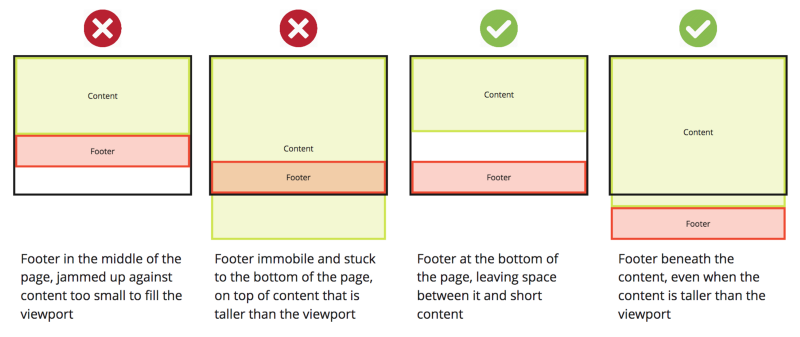
I tried these and a few more without success. They must be working, I just didn't know how to apply them. https://www.freecodecamp.org/news/how-to-keep-your-footer-where-it-belongs-59c6aa05c59c/ https://matthewjamestaylor.com/bottom-footer https://codepen.io/cbracco/pen/zekgx

<html lang="en">

  <head>
    <title>About Project</title>
    <meta charset="utf-8">
    <meta name="viewport" content="width=device-width, initial-scale=1, shrink-to-fit=no">

    <link href="https://fonts.googleapis.com/css?family=Work+Sans:400,700,900&display=swap" rel="stylesheet">

    <link rel="stylesheet" href="fonts/icomoon/style.css">

    <link rel="stylesheet" href="css/bootstrap.min.css">
    <link rel="stylesheet" href="css/bootstrap-datepicker.css">
    <link rel="stylesheet" href="css/jquery.fancybox.min.css">
    <link rel="stylesheet" href="css/owl.carousel.min.css">
    <link rel="stylesheet" href="css/owl.theme.default.min.css">
    <link rel="stylesheet" href="fonts/flaticon/font/flaticon.css">
    <link rel="stylesheet" href="css/aos.css">

    <!-- MAIN CSS -->
    <link rel="stylesheet" href="css/style.css">
    <link rel="stylesheet" href="css/form.css">

  </head>

  <body data-spy="scroll" data-target=".site-navbar-target" data-offset="300">


    <div class="site-wrap" id="home-section">

      <div class="site-mobile-menu site-navbar-target">
        <div class="site-mobile-menu-header">
          <div class="site-mobile-menu-close mt-3">
            <span class="icon-close2 js-menu-toggle"></span>
          </div>
        </div>
        <div class="site-mobile-menu-body"></div>
      </div>

      <header class="site-navbar site-navbar-target" role="banner">

        <div class="container">
          <div class="row align-items-center position-relative">

            <div class="col-3 ">
              <div class="site-logo">
                <a href="index.php" class="font-weight-bold">
                  <img src="images/logo.png" alt="Image" class="img-fluid">
                </a>
              </div>
            </div>

            <div class="col-9  text-right">    
                <span class="d-inline-block d-lg-none"><a href="#" class="text-white site-menu-toggle js-menu-toggle py-5 text-white"><span class="icon-menu h3 text-white"></span></a></span>
                <nav class="site-navigation text-right ml-auto d-none d-lg-block" role="navigation">
                  <ul class="site-menu main-menu js-clone-nav ml-auto ">
                    <li><a href="index.php" class="nav-link">Home</a></li>
                    <div class="dropdown">
                      <p id="ddm" class="dropbtn">Types of Violence &dtrif;</p>
                      <div class="dropdown-content">
                        <a id="f" href="fizicko.php">Physical  </a>
                      <a id="s" href="seksualno.php">Sexual  </a>
                      <a id="p" href="psiholosko.php">Psychological  </a>
                      <a id="d" href="digitalno.php">Digital  </a>
                        </div>
                      </div>
                  <li><a href="sim.php" class="nav-link">Simulation</a></li>
                  <li><a href="oprojektu.php" class="nav-link"><span style="color:rgba(255, 215, 0,0.9);">About Project</span></a></li>
                  <li><?php include_once 'jezici.php'; ?></li>
                </ul>
                </nav>
              </div>    
          </div>
        </div>
      </header>
    </div>
    </div>

      <div class="row" style="padding: 50px;">
  <div class="col-12 col-md-6">

    <h2 class="h1-responsive font-weight-bold text-center my-4">About project</h2>
      <div class="row">
          <div class="col-md-12 mb-md-0 mb-5">

            <p>The project is intended primarily for high school and elementary school students, but it can also be useful for the elderly. It consists of two main parts, informative and interactive.</p>

              <p>The informative section aims to present to the site visitors what are the most common forms of violence in schools and how they can be prevented.</p>

              <p>The interactive part is based on a simulation of a conversation between a user and another person, with the conversation having a different outcome relative to the answers.</p>
              <hr><p>The goal of this project is to raise awareness of the severity of peer violence, how much concequences it can cause if no one responds, and general education about peer violence.</p>
          </div>
      </div>
</div>

<div class="col-12 col-md-6">

  <h2 class="h1-responsive font-weight-bold text-center my-4">Contact us</h2>
  <p class="text-center w-responsive mx-auto mb-5">Have a question? Contact us directly via email, and we will respond as soon as possible.</p>

  <div class="row">
      <div class="col-md-12 mb-md-0 mb-5">
          <form id="contact-form" name="contact-form" action="kontakt.php" method="POST">

              <div class="row">
                  <div class="col-md-6">
                      <div class="md-form mb-0">
                          <input type="text" id="name" name="name" class="form-control">
                          <label for="name" class="">Name</label>
                      </div>
                  </div>

                  <div class="col-md-6">
                      <div class="md-form mb-0">
                          <input type="text" id="email" name="email" class="form-control">
                          <label for="email" class="">Email</label>
                      </div>
                  </div>
              </div>

              <div class="row">
                  <div class="col-md-12">
                      <div class="md-form mb-0">
                          <input type="text" id="subject" name="subject" class="form-control">
                          <label for="subject" class="">Subject</label>
                      </div>
                  </div>
              </div>

              <div class="row">
                  <div class="col-md-12">
                      <div class="md-form">
                          <textarea type="text" id="message" name="message" rows="2" class="form-control md-textarea"></textarea>
                          <label for="message" >Message</label>
                      </div>
                  </div>
              </div>
          </form>

          <div class="text-center text-md-left">
              <a style="float: right;" class="btn btn-primary" onclick="document.getElementById('contact-form').submit();">Send</a>
          </div>
          <div class="status"></div>
      </div>
  </div>
</div>
</div>

<footer style="width: 100%; text-align: center; background-color: #002366;">

  <div style="display: inline-block; margin-left: 5px; margin-right: 15px;">
    <b><p class="ftprijavimup" style="color:rgba(255, 215, 0,0.9); margin-top: 5px;">Report<br>violence</p></b>
   </div>

   <div class="col-lg-2.5" style="display: inline-block; margin-left: 5px; margin-right: 5px;">
     <p class="ftprijavimup" style="margin-top: 5px;">SOS violence in schools<br>(7.30-15.30h) <span style="color:rgba(255, 215, 0,0.9);">0800 200201</span></p>
   </div>   

     <div class="col-lg-2.5" style="display: inline-block; margin-left: 5px; margin-right: 5px;">
       <p class="ftprijavimup" style="margin-top: 5px;" >SOS CENTER FOR YOUTH<br>(18-22h) <span style="color:rgba(255, 215, 0,0.9);">3192 782</span></p>
     </div>

     <div class="col-lg-2.5" style="display: inline-block; margin-left: 5px; margin-right: 5px;">
       <p class="ftprijavimup" style="margin-top: 5px;">SOS INTERNET VIOLENCE <br>(7.30-15.30h) <span style="color:rgba(255, 215, 0,0.9);">198 33</span></p>
     </div>

     <div class="col-lg-2.5" style="display: inline-block; margin-left: 5px; margin-right: 5px;">
       <p class="ftprijavimup" style="margin-top: 5px;">SOS WOMEN'S CENTER<br>(10-20h) <span style="color:rgba(255, 215, 0,0.9);">2645 328</span></p>
     </div>
       </footer>
</body>
</html>
SasNarSak
  • 95
  • 8

3 Answers3

2

Try this.

Looks like your are using bootstrap

https://getbootstrap.com/docs/4.0/examples/sticky-footer/

https://startbootstrap.com/snippets/sticky-footer-flexbox/

Exc
  • 1,473
  • 3
  • 15
  • 30
0

First of all, wrap everything in the .site-wrap div as I did below. Add the classes d-flex flex-column to your body element and then add this CSS to that

 html,body{
    height: 100%
 }
 .site-wrap{
   flex-grow:1;
 }

Working Snippet here

html,body{
 height: 100%
}
.site-wrap{
  flex-grow:1;
}
<link href="https://stackpath.bootstrapcdn.com/bootstrap/4.4.1/css/bootstrap.min.css" rel="stylesheet" />
<html lang="en">

<head>
  <title>About Project</title>
  <meta charset="utf-8">
  <meta name="viewport" content="width=device-width, initial-scale=1, shrink-to-fit=no">

  <link href="https://fonts.googleapis.com/css?family=Work+Sans:400,700,900&display=swap" rel="stylesheet">

  <link rel="stylesheet" href="fonts/icomoon/style.css">

  <link rel="stylesheet" href="css/bootstrap.min.css">
  <link rel="stylesheet" href="css/bootstrap-datepicker.css">
  <link rel="stylesheet" href="css/jquery.fancybox.min.css">
  <link rel="stylesheet" href="css/owl.carousel.min.css">
  <link rel="stylesheet" href="css/owl.theme.default.min.css">
  <link rel="stylesheet" href="fonts/flaticon/font/flaticon.css">
  <link rel="stylesheet" href="css/aos.css">

  <!-- MAIN CSS -->
  <link rel="stylesheet" href="css/style.css">
  <link rel="stylesheet" href="css/form.css">

</head>

<body data-spy="scroll" class="site-mobile-menu d-flex flex-column" data-target=".site-navbar-target" data-offset="300">


  <div class="site-wrap" id="home-section">

    <div class="site-navbar-target">
      <div class="site-mobile-menu-header">
        <div class="site-mobile-menu-close mt-3">
          <span class="icon-close2 js-menu-toggle"></span>
        </div>
      </div>
      <div class="site-mobile-menu-body"></div>
    </div>

    <header class="site-navbar site-navbar-target" role="banner">

      <div class="container">
        <div class="row align-items-center position-relative">

          <div class="col-3 ">
            <div class="site-logo">
              <a href="index.php" class="font-weight-bold">
                <img src="images/logo.png" alt="Image" class="img-fluid">
              </a>
            </div>
          </div>

          <div class="col-9  text-right">
            <span class="d-inline-block d-lg-none"><a href="#" class="text-white site-menu-toggle js-menu-toggle py-5 text-white"><span class="icon-menu h3 text-white"></span></a>
            </span>
            <nav class="site-navigation text-right ml-auto d-none d-lg-block" role="navigation">
              <ul class="site-menu main-menu js-clone-nav ml-auto ">
                <li><a href="index.php" class="nav-link">Home</a></li>
                <div class="dropdown">
                  <p id="ddm" class="dropbtn">Types of Violence &dtrif;</p>
                  <div class="dropdown-content">
                    <a id="f" href="fizicko.php">Physical  </a>
                    <a id="s" href="seksualno.php">Sexual  </a>
                    <a id="p" href="psiholosko.php">Psychological  </a>
                    <a id="d" href="digitalno.php">Digital  </a>
                  </div>
                </div>
                <li><a href="sim.php" class="nav-link">Simulation</a></li>
                <li><a href="oprojektu.php" class="nav-link"><span style="color:rgba(255, 215, 0,0.9);">About Project</span></a></li>
                <li>
                  <?php include_once 'jezici.php'; ?>
                </li>
              </ul>
            </nav>
          </div>
        </div>
      </div>
    </header>


  <div class="row" style="padding: 50px;">
    <div class="col-12 col-md-6">

      <h2 class="h1-responsive font-weight-bold text-center my-4">About project</h2>
      <div class="row">
        <div class="col-md-12 mb-md-0 mb-5">

          <p>The project is intended primarily for high school and elementary school students, but it can also be useful for the elderly. It consists of two main parts, informative and interactive.</p>

          <p>The informative section aims to present to the site visitors what are the most common forms of violence in schools and how they can be prevented.</p>

          <p>The interactive part is based on a simulation of a conversation between a user and another person, with the conversation having a different outcome relative to the answers.</p>
          <hr>
          <p>The goal of this project is to raise awareness of the severity of peer violence, how much concequences it can cause if no one responds, and general education about peer violence.</p>
        </div>
      </div>
    </div>

    <div class="col-12 col-md-6">

      <h2 class="h1-responsive font-weight-bold text-center my-4">Contact us</h2>
      <p class="text-center w-responsive mx-auto mb-5">Have a question? Contact us directly via email, and we will respond as soon as possible.</p>

      <div class="row">
        <div class="col-md-12 mb-md-0 mb-5">
          <form id="contact-form" name="contact-form" action="kontakt.php" method="POST">

            <div class="row">
              <div class="col-md-6">
                <div class="md-form mb-0">
                  <input type="text" id="name" name="name" class="form-control">
                  <label for="name" class="">Name</label>
                </div>
              </div>

              <div class="col-md-6">
                <div class="md-form mb-0">
                  <input type="text" id="email" name="email" class="form-control">
                  <label for="email" class="">Email</label>
                </div>
              </div>
            </div>

            <div class="row">
              <div class="col-md-12">
                <div class="md-form mb-0">
                  <input type="text" id="subject" name="subject" class="form-control">
                  <label for="subject" class="">Subject</label>
                </div>
              </div>
            </div>

            <div class="row">
              <div class="col-md-12">
                <div class="md-form">
                  <textarea type="text" id="message" name="message" rows="2" class="form-control md-textarea"></textarea>
                  <label for="message">Message</label>
                </div>
              </div>
            </div>
          </form>

          <div class="text-center text-md-left">
            <a style="float: right;" class="btn btn-primary" onclick="document.getElementById('contact-form').submit();">Send</a>
          </div>
          <div class="status"></div>
        </div>
      </div>
    </div>
  </div>  
  </div>

  <footer style="width: 100%; text-align: center; background-color: #002366;" clas="footer">

    <div style="display: inline-block; margin-left: 5px; margin-right: 15px;">
      <b><p class="ftprijavimup" style="color:rgba(255, 215, 0,0.9); margin-top: 5px;">Report<br>violence</p></b>
    </div>

    <div class="col-lg-2.5" style="display: inline-block; margin-left: 5px; margin-right: 5px;">
      <p class="ftprijavimup" style="margin-top: 5px;">SOS violence in schools<br>(7.30-15.30h) <span style="color:rgba(255, 215, 0,0.9);">0800 200201</span></p>
    </div>

    <div class="col-lg-2.5" style="display: inline-block; margin-left: 5px; margin-right: 5px;">
      <p class="ftprijavimup" styhttps://stackoverflow.com/questions/60209899/footer-rising-up-because-of-not-sufficient-content#le="margin-top: 5px;">SOS CENTER FOR YOUTH<br>(18-22h) <span style="color:rgba(255, 215, 0,0.9);">3192 782</span></p>
    </div>

    <div class="col-lg-2.5" style="display: inline-block; margin-left: 5px; margin-right: 5px;">
      <p class="ftprijavimup" style="margin-top: 5px;">SOS INTERNET VIOLENCE <br>(7.30-15.30h) <span style="color:rgba(255, 215, 0,0.9);">198 33</span></p>
    </div>

    <div class="col-lg-2.5" style="display: inline-block; margin-left: 5px; margin-right: 5px;">
      <p class="ftprijavimup" style="margin-top: 5px;">SOS WOMEN'S CENTER<br>(10-20h) <span style="color:rgba(255, 215, 0,0.9);">2645 328</span></p>
    </div>
  </footer>
</body>

</html>
Vlad Racoare
  • 153
  • 11
-1

Did you tried with this:

footer {
  position: absolute;
  bottom: 0;
  width: 100%;
}
Yin
  • 437
  • 1
  • 6
  • 15
  • This could come with some issues, he would need a padding bottom the same size of his footer added to the wrapper or body element. I wouldn't consider this an optimal solution. I faced plenty of issues with this approach. We've got better ways of dealing with this kind of situations. aka CSS Grid or Flexbox – Vlad Racoare Feb 13 '20 at 14:42