0

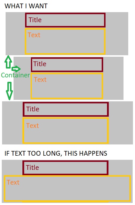
I have some centered divs that have a title and text below the title. The title is centered but the text is aligned on the left and starts from where the title starts. I used inline-block to make the div adjust in size based on the content. However, if the text is longer than the title, the container adjusts its width based on the text, not the title, so then the text appears wider than the title. How do I keep the width based on the title, not the text? I've included my code below as well as a badly drawn image to better understand what happens.

HTML and CSS:

.projects {
  width: 30vw;
  left: 10vw;
  right: 10vw;
  margin: 50px auto 0 auto;
  text-align: center;
}

.pContent {
  display: inline-block;
  margin-bottom: 10px;
}

.pInfo {
  text-align: left;
}
<div class="projects">
  <h2>My Projects:</h2>
  <div class="pContent">
    <h3 id="p1" class="pTitle">Project Title</h3>
    <div id="p1Info" class="pInfo">
      <p class="desc">This is a project description Lorem Ipsum Dolor</p> 
      <p class="demo">View a demo of the project.</p>
    </div>
  </div>
  <br>
  <div class="pContent">
    <h3 id="p2" class="pTitle">Another Project Title</h3>
    <div id="p2Info" class="pInfo">
      <p class="desc">This is a project</p>
      <p class="demo">View.</p>
    </div>
  </div>
</div>

Here's an image of what I want and what actually happens. Here's an image of what I want and what happens.

Rron Kurtishi
  • 33
  • 2
  • 7

4 Answers4

1

Add word-break: break-word (or break-all) to .pContent

Aluminium Shek
  • 306
  • 1
  • 5
1

I hope this should resolve your query :

.projects {
  width: 30vw;
  left: 10vw;
  right: 10vw;
  margin: 50px auto 0 auto;
  text-align: center;
}

.pTitle {
  width: 100%;
  display: flex;
  justify-content: center;
}

.p1Info {
  width: 100%;
}
<div class="projects">
  <h2>My Projects:</h2>
  <div class="pContent">
    <h3 id="p1" class="pTitle">Project Titdsdasdsads asdsa asd asd asdsa dasdsad sdsad sadsaa sadsa asdsadsa asdsadasdsale</h3>
    <div id="p1Info" class="pInfo">
      <p class="desc">This is a project description Lorem Ipsum Dolorhis is a project description Loremhis is a project description Lorem</p>
      <p class="demo">View a demo of the project.</p>
    </div>
  </div>
  <br>
  <div class="pContent">
    <h3 id="p2" class="pTitle">Another Project Title</h3>
    <div id="p2Info" class="pInfo">
      <p class="desc">This is a project description Lorem Ipsum Dolor</p>
      <p class="demo">View a demo of the project.</p>
    </div>
  </div>
</div>
Abhishek Pakhare
  • 476
  • 1
  • 4
  • 15
-1

How about adding padding-left and padding-right to your container

  • The problem is that each div's title is different in width so if I add padding for one, the others will also get the same padding. – Rron Kurtishi Feb 17 '20 at 17:13
-1

You need to set "max-width:325px;" and "width:100%;" of ".p1Info" div. Try below snippet. Just replace ".p1Info" class in CSS, rest CSS will be the same -

   .pInfo {
        text-align: left;
        max-width: 325px;
        width: 100%;
    }
Himanshu Joshi
  • 292
  • 2
  • 10
  • That doesn't work and even if a solution like this works, it would have to be customized separately for each pContent div, so if I add a lot of projects, that becomes a problem. I wanted to know if there's a solution that adjusts any new project I add to the width of its title. – Rron Kurtishi Feb 17 '20 at 17:23
  • I don't think so it if many products add, it will lead to a problem. Can you please clarify your point ? – Himanshu Joshi Feb 17 '20 at 17:26