How to create a teardrop/water drop filling using the css and javascript dynamically filling the water.
for example.
it will fill the water/tear drop depends on the percentage.
example when the percentage is 100% it will full the water/tear drop.
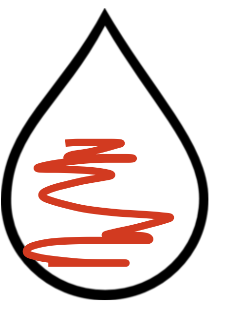
How to create a teardrop/water drop filling using the css and javascript dynamically filling the water.
for example.
it will fill the water/tear drop depends on the percentage.
example when the percentage is 100% it will full the water/tear drop.
The best way to approach the problem is with SVG graphic so create it dynamically
<div class="box">
<svg width="100%" viewbox="0 0 50 42">
  <path class="tear"
        d="M15 6
           Q 15 6, 25 18
           A 12.8 12.8 0 1 1 5 18
           Q 15 6 15 6z" />
</svg>
  </div>
The next thing you would want to look at is filling the path with a color based on
.tear {
  fill: red;
  stroke: black;
  stroke-width: 2PX;

  transform-origin: top center;
}
<div class="box">
<svg width="100%" viewbox="0 0 50 42">
<path class="tear"
d="M15 6
Q 15 6, 25 18
A 12.8 12.8 0 1 1 5 18
Q 15 6 15 6z" />
</svg>
</div>The last step is to create a create a gradient and with JS manipulate the where the gradient starts and finishes
//change gradient

function change()
{
let tear = document.getElementById('tear');
tear.setAttribute("fill","url(#grad2)");

}


var click1 =document.getElementById('clickMe');
click1.addEventListener("click",change);
.tear {
stroke: black;
stroke-width: 2PX;
transform-origin: top center;
}<div id='clickMe'> Click here !</div>
<div class="box">
<svg width="100%" viewbox="0 0 50 42">
<defs>
<linearGradient id="grad1" x1="0%" y1="0%" x2="0%" y2="100%">
<stop offset="0%" style="stop-color:rgb(255,0,0);stop-opacity:1" />
<stop offset="50%" style="stop-color:rgb(255,255,255);stop-opacity:1" />
<stop offset="60%" style="stop-color:rgb(0,0,255);stop-opacity:1" />
</linearGradient>
<linearGradient id="grad2" x1="0%" y1="0%" x2="0%" y2="100%">
<stop offset="0%" style="stop-color:rgb(255,0,0);stop-opacity:1" />
<stop offset="20%" style="stop-color:rgb(255,255,255);stop-opacity:1" />
<stop offset="30%" style="stop-color:rgb(0,0,255);stop-opacity:1" />
</linearGradient>
</defs>
<path id="tear" class="tear"
d="M15 6
Q 15 6, 25 18
A 12.8 12.8 0 1 1 5 18
Q 15 6 15 6z" fill="url(#grad1)"/>
</svg>
</div>On other examples around the web the guys try to overlay another path but for the easiest approach just use a a couple of gradients with your svg and bit of JS
I trust this helps you