-1

I am trying to create a layout which allows me change the order of elements between mobile and desktop as demonstrated by the diagram bellow:

enter image description here

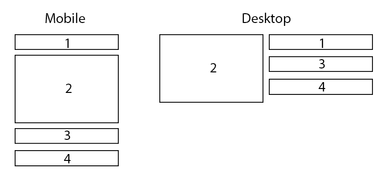
I have ordered them in the DOM within a single container in the order as they are numbered. I'm trying to get the second item to display to the left as shown. I tried with flex but couldn't get it right. I also tried floating the second div to the left and the rest to the right, but this is messy, especially if the 4th element in right column overlaps the 3rd.

Can somebody help me with this?

Thanks

Marcus Horne
  • 363
  • 1
  • 5
  • 16

3 Answers3

2

This might be better suited to CSS Grid Layout and media queries.

.container {
  display: grid;
  grid-template-columns: repeat(1, 1fr);
}

@media(min-width: 375px) {
  .container {
    grid-template-rows: repeat(3, 100px);
    grid-template-columns: repeat(2, 1fr);
  }

  .child2 {
    grid-row-start: 1;
    grid-row-end: 4;
  }
}
<div class="container">
  <div>1</div>
  <div class="child2">2</div>
  <div>3</div>
  <div>4</div>
</div>
Gary Thomas
  • 2,291
  • 1
  • 9
  • 21
0

Example using CSS grid:

section {
  display: grid;
  grid-template-areas: "block1" "block2" "block3" "block4"
}

.block-1 {
  grid-area: block1;
  background-color: red;
}

.block-2 {
  grid-area: block2;
  background-color: blue;
}

.block-3 {
  grid-area: block3;
  background-color: green;
}

.block-4 {
  grid-area: block4;
  background-color: yellow;
}

@media screen and (min-width: 767px) {
  section {
    grid-template-areas: "block2 block1" "block2 block3" "block2 block4"
  }
}
<section>
  <div class="block-1">
    Block 1
  </div>
  <div class="block-2">
    Block 2
  </div>
  <div class="block-3">
    Block 3
  </div>
  <div class="block-4">
    Block 4
  </div>
</section>
Mr T
  • 839
  • 6
  • 16
0

try this

.container {
  display: flex;
  flex-wrap: wrap;
  position: relative;
}

.container .inner-container1 {
  flex-grow: 2;
}

.container .inner-container2 {
  flex-grow: 1;
}

.box {
  flex-grow: 1;
}

.diff {
  position: absolute;
  width: 50%;
  background-color: red;
  left: 0px;
  top: 0px;
  height: 100%;
}


/* set your desired max-width */

@media screen and (max-width: 500px) {
  .diff {
    position: initial;
    width: initial;
  }
  .container .inner-container1 {
    display: none;
  }
}
  <div class="container">

    <div class="inner-container1">
    </div>

    <div class="inner-container2">

      <div class="box">1</div>
      <div class="box diff">2</div>
      <div class="box">3</div>
      <div class="box">4</div>

    </div>

</div>
MJ07
  • 1
  • 3