0

Hello I have a problem where my container is exceeding the maximum allowed width of my flex container (with justify space - between)

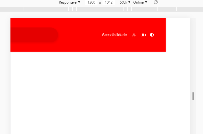
basically i divided my 3 children into 33.33%, but even so it exceeds the width:

img:

enter image description here

my jsx****:

const NavAcessibility = props => {
  return (
    <Accessibility>
      <ul>
        <li>
          <a>
            <p>Acessibilidade</p>
          </a>
        </li>
        <li>
          <a>A-</a>
        </li>
        <li>
          <a>A+</a>
        </li>
        <li>
          <a>
            <FontAwesomeIcon
              className="adjust"
              icon={faAdjust}
              size="1x"
              fixedWidth
              color="white"
            />
          </a>
        </li>
      </ul>
    </Accessibility>
  );
};

const ItemsTop = () => {
  return (
    <>
      <ImgWrap>
        <img src={LogoImg} />
      </ImgWrap>
      <SearchContainer>
        <IconContainer>
          <FontAwesomeIcon
            className="searchIcon"
            icon={faSearch}
            size="2x"
            fixedWidth
            color="white"
          />
        </IconContainer>
        <input placeholder="Pesquisar" />
      </SearchContainer>
    </>
  );
};

const TopHeader = () => {
  return (
    <ContainerTop>
      <HeaderTop>
        <ItemsTop />
        <NavAcessibility />
      </HeaderTop>
    </ContainerTop>
  );
};

my css:

export const ContainerTop = styled.div`
  position: relative;
  width: 100%;
  background: red;
  box-shadow: 0 0 5px rgba(18, 23, 39, 0.2);
`;

export const HeaderTop = styled.div`
  ${mxw80}
  padding-bottom: 10px;
  padding-top: 10px;
  display: flex;
  justify-content: space-between;
  align-items: center;
  padding: 1em 0;
`;

export const ImgWrap = styled.div`
  width: 33.3333%;
  display: flex;
  align-items: center;
  & > img {
    width: 80px;
  }
`;

export const IconContainer = styled.div``;
export const SearchContainer = styled.div`
  display: inline-flex;
  align-items: center;
  width: 33.3333%;
  border-radius: 25px;
  overflow: hidden;
  height: 50px;
  border: 0;
  background: rgba(0, 0, 0, 0.1);
  box-shadow: 3px 3px 6px 0 rgba(0, 0, 0, 0.07);
  transition: all 0.4s;
  margin-right: 20px;
  ${IconContainer} {
    ${flexAlignCenter}
    width: 50px;
    padding: 0.5rem 1.3rem;
    height: 100%;
    & > svg {
      font-size: 1.3em;
      color: white;
    }
  }
  & > input {
    background: transparent;
    width: calc(100% - 50px);
    height: 100%;
    border: 0;
    padding: 0.5rem 0.5rem 0.5rem 0.5rem;
    outline: none;
    color: white;
    font-size: 16px;
    -webkit-font-smoothing: antialiased;
    -moz-osx-font-smoothing: grayscale;
    box-sizing: initial;
    font-family: Roboto, Arial, sans-serif;
    ::placeholder {
      font-size: 16px;
      color: white;
      -webkit-font-smoothing: antialiased;
      -moz-osx-font-smoothing: grayscale;
      box-sizing: initial;
      font-family: Roboto, Arial, sans-serif;
    }
  }
`;

export const Accessibility = styled.nav`
  width: 33.3333%;
  height: 100%;
  & > ul {
    ${flexAlignCenter}
    width:100%;
    flex-wrap: wrap;
    height: auto;
    justify-content: center;
  }
  & > ul > li {
    position: relative;
    display: inline-block;
    font-family: "Open Sans", sans-serif;
    font-size: 13px;
    line-height: 24px;
    color: #fff;
    user-select: none;
  }
  & > ul > li:nth-child(2) {
    cursor: not-allowed;
    pointer-events: none;
    font-size: 18px;
    font-weight: 700;
    font-style: italic;
    opacity: 0.5;
    padding: 0 9px;
  }
  & > ul > li:nth-child(3) {
    font-size: 18px;
    font-weight: 700;
    font-size: 18px;
    font-weight: 700;
    padding: 0 9px;
  }
  & > ul > li > a {
    font-family: "Open Sans", sans-serif;
    font-size: 13px;
    line-height: 24px;
  }
  & > ul > li > a > p {
    position: relative;
    display: inline-block;
    pointer-events: none;
    padding: 0 9px;
  }
`;

example:

https://codesandbox.io/s/long-monad-m54pu

I can't find where I went wrong.

3 Answers3

1

You need to constrain the parent width inside the html & body. I suggest you should use 100vw for the parent element instead of 100%

Tasos
  • 1,880
  • 13
  • 19
  • But I need to center my content on a max-width other than 100 on the screen. –  Feb 19 '20 at 14:20
  • The problem with your css is that the ContainerTop has width 817px and the first child of it (HeaderTop) has width 1280. Your items are actually centered with regards to HeaderTop, not the ContainerTop which has the red background. Maybe I don't understand correctly what you want to accomplish, but if you add ` width: fit-content;` to your ContainerTop fixes your problem – Tasos Feb 19 '20 at 14:34
  • basically i just need 3 children of equal width inside my container with 80 rem 80 rem / 3 –  Feb 19 '20 at 14:53
0

in your styled.js remove the width and maxwidth from

const mxw80 = css`
  height: 100%;
  margin: 0 auto;
  max-width: 80rem !important;
  width: 80rem !important;
`;

or simply dont use mxw80 component.

or just use % or vw units instead of rem. https://www.sitepoint.com/understanding-and-using-rem-units-in-css/

Gene Sy
  • 1,325
  • 2
  • 10
  • 17
  • but i need this is my container . –  Feb 19 '20 at 14:15
  • I need this css is my container with defined maximum width and I have a container with width 100% flex between where I have 3 children with 33% –  Feb 19 '20 at 14:16
  • either use a different width that matches the page. use width 100% instead of 80rem – Gene Sy Feb 19 '20 at 14:16
  • But I need to center my content on a max-width other than 100 on the screen. –  Feb 19 '20 at 14:19
  • you can add another wrapper with the width80 but the main wrapper should be width 100% – Gene Sy Feb 19 '20 at 14:20
  • But I already do that I have a main wrapper with 100% width and this one with 80rem –  Feb 19 '20 at 14:21
  • export const ContainerTop = styled.div` position: relative; width: 100%; background: red; box-shadow: 0 0 5px rgba(18, 23, 39, 0.2); `; –  Feb 19 '20 at 14:22
  • Why are you using rem btw? why not 80% instead of 80rem? https://www.sitepoint.com/understanding-and-using-rem-units-in-css/ you can even also use 80vw instead of % – Gene Sy Feb 19 '20 at 14:24
0

Try to use width in 100% rather then in rem

.css-ydgvn1-HeaderTop {
    height: 100%;
    margin: 0 auto;
    max-width: 100% !important;
    width: 100% !important;
    padding-bottom: 10px;
    padding-top: 10px;
    display: -webkit-box;
    display: -webkit-flex;
    display: -ms-flexbox;
    display: flex;
    -webkit-box-pack: justify;
    -webkit-justify-content: space-between;
    -ms-flex-pack: justify;
    justify-content: space-between;
    -webkit-align-items: center;
    -webkit-box-align: center;
    -ms-flex-align: center;
    align-items: center;
    padding: 1em 0;
}
Awais
  • 4,752
  • 4
  • 17
  • 40
  • but I need this max-width to center the content like a bootstrap container and row –  Feb 19 '20 at 14:17
  • I thought it was possible within these 80 rem to divide the 3 children into equal widths, Basically inside that flex container I have 3 children with equal widths = 100% –  Feb 19 '20 at 14:18
  • justify content space between divide equaly its childeren ans you were using align item center which center the child. so it works as bootstrap container... So can you explain a little bit waht actualy u want? – Awais Feb 19 '20 at 14:45
  • I basically have a container with width: 100% and I have a div with 80 rem and this div is flex with justify between and I have 3 children in it with widths of 33% = 100% but I still have this problem of passing the screen. –  Feb 19 '20 at 14:46
  • Thats due to 80rem as its fixed width, When ever you play with responsive design the best unit to use is % – Awais Feb 19 '20 at 15:21
  • @Mykon it depends on you both works same , i mostly use % and never had any issue by using vw over % – Awais Feb 19 '20 at 16:16
  • For further clarification between `%` and `vw` please visit this [link](https://stackoverflow.com/questions/31039979/css-units-what-is-the-difference-between-vh-vw-and) – Awais Feb 20 '20 at 06:36