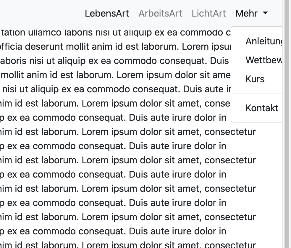
I am using Bootstrap to create a Navbar. When I click on the dropdown the items in the dropdown are placed outside of the window. but they increase the window. I put ml-auto in to show the items on the right side.
<!DOCTYPE html>
<html lang="en">
  <head>
    <!-- Required meta tags -->
    <meta charset="utf-8">
    <meta name="viewport" content="width=device-width, initial-scale=1, shrink-to-fit=no">

    <!-- Bootstrap CSS -->
    <link rel="stylesheet" href="https://stackpath.bootstrapcdn.com/bootstrap/4.3.1/css/bootstrap.min.css" integrity="sha384-ggOyR0iXCbMQv3Xipma34MD+dH/1fQ784/j6cY/iJTQUOhcWr7x9JvoRxT2MZw1T" crossorigin="anonymous">
  </head>
  <body>
    <nav class="navbar fixed-top navbar-expand-lg navbar-light bg-light">
  <a class="navbar-brand" href="#">AR PhotoArt</a>
  <button class="navbar-toggler" type="button" data-toggle="collapse" data-target="#navbarSupportedContent" aria-controls="navbarSupportedContent" aria-expanded="false" aria-label="Toggle navigation">
    <span class="navbar-toggler-icon"></span>
  </button>

  <div class="collapse navbar-collapse" id="navbarSupportedContent">
    <ul class="navbar-nav ml-auto">
      <li class="nav-item active">
        <a class="nav-link" href="#">LebensArt <span class="sr-only">(current)</span></a>
      </li>
      <li class="nav-item">
        <a class="nav-link" href="#">ArbeitsArt</a>
      </li>
      <li class="nav-item">
        <a class="nav-link" href="#">LichtArt</a>
      </li>
      <li class="nav-item dropdown">
        <a class="nav-link dropdown-toggle" href="#" id="navbarDropdown" role="button" data-toggle="dropdown" aria-haspopup="true" aria-expanded="false">
          Mehr
        </a>
        <div class="dropdown-menu" aria-labelledby="navbarDropdown">
          <a class="dropdown-item" href="#">Anleitung</a>
          <a class="dropdown-item" href="#">Wettbewerb</a>
          <a class="dropdown-item" href="#">Kurs</a>
          <div class="dropdown-divider"></div>
          <a class="dropdown-item" href="#">Kontakt</a>
        </div>
      </li>
    </ul>
  </div>
</nav>

    <!-- jQuery first, then Tether, then Bootstrap JS. -->
    <script src="https://code.jquery.com/jquery-3.1.1.slim.min.js" integrity="sha384-A7FZj7v+d/sdmMqp/nOQwliLvUsJfDHW+k9Omg/a/EheAdgtzNs3hpfag6Ed950n" crossorigin="anonymous"></script>
    <script src="https://cdnjs.cloudflare.com/ajax/libs/tether/1.4.0/js/tether.min.js" integrity="sha384-DztdAPBWPRXSA/3eYEEUWrWCy7G5KFbe8fFjk5JAIxUYHKkDx6Qin1DkWx51bBrb" crossorigin="anonymous"></script>
    <script src="https://stackpath.bootstrapcdn.com/bootstrap/4.3.1/js/bootstrap.min.js" integrity="sha384-JjSmVgyd0p3pXB1rRibZUAYoIIy6OrQ6VrjIEaFf/nJGzIxFDsf4x0xIM+B07jRM" crossorigin="anonymous"></script>
  </body>
</html>