7

I am trying to loop some items with an ngFor and create a mat-expansion-panel for each item.

I would like to encapsulate the logic for each item into an item component:

    <item></item>

Initial attempt:

<mat-accordion>
  <div *ngFor="let item of items" >
    <item [item]="item"></item>
  </div>
</mat-accordion>

Where item template is:

    <mat-expansion-panel>
      <mat-expansion-panel-header>
        Header Content
      </mat-expansion-panel-header>

      <div>
         Expandable content
      </div>
    </mat-expansion-panel>

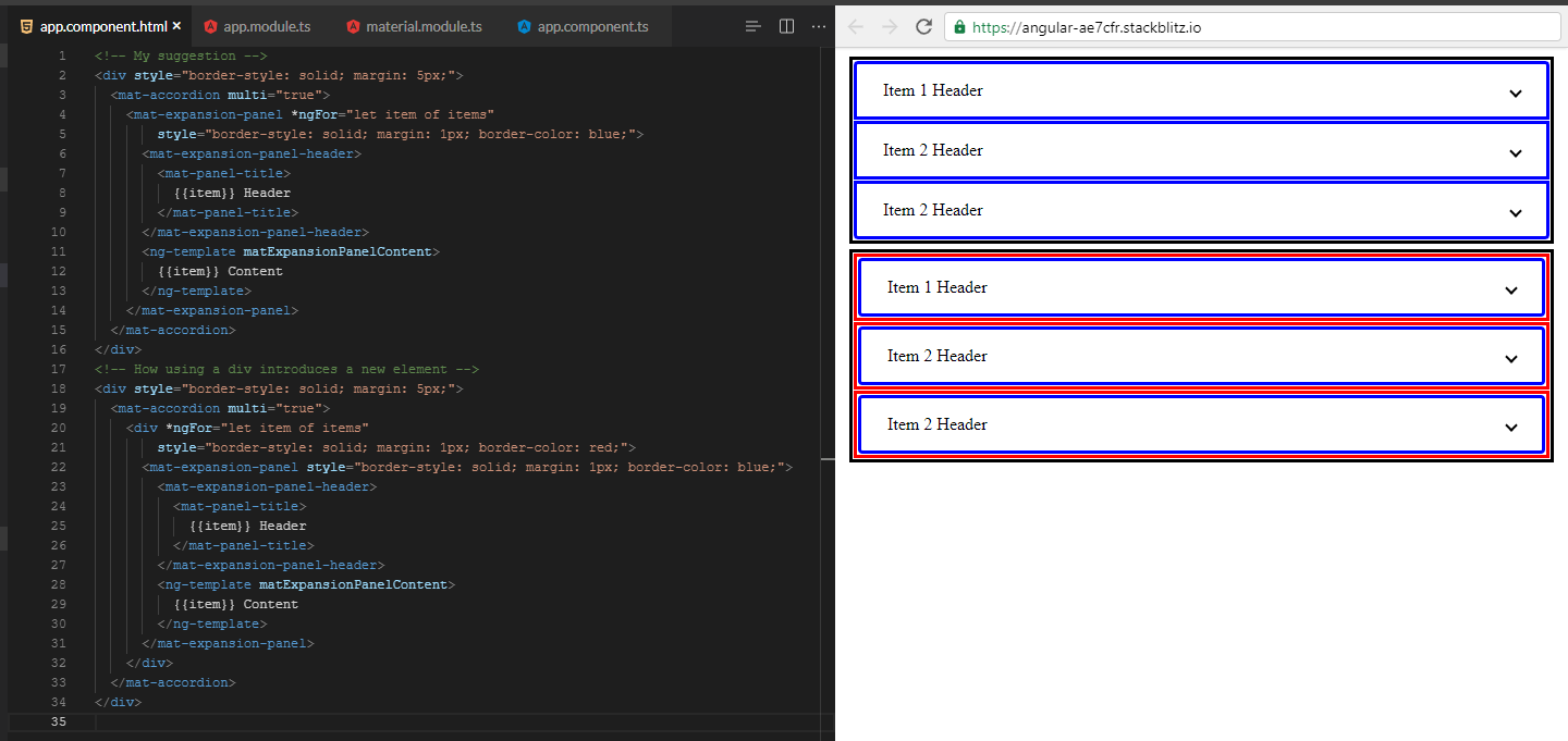
The problem with this approach is that there is an extra html element for my component between <mat-accordion> and <mat-expansion-panel>, which messes up the css for the accordion.

Is there a way that my component can provide the header and content?

    <mat-accordion>
      <div *ngFor="let item of items" >
          <mat-expansion-panel>
            <mat-expansion-panel-header>
              <!-- put item component header here->
            </mat-expansion-panel-header>

          <div>
            <!-- put item component content here->
          </div>
        </mat-expansion-panel>
      </div>
    </mat-accordion>

I have read up on ng-content, but I think that is backwards from what I want, I don't want to shove custom content into my component, I want to extract elements from my component and have them render in the parent.

I do realize I could create 2 components, item-header and item-content. However I would really like to keep that login in one component.

Kurt Hamilton
  • 12,490
  • 1
  • 24
  • 40
lostintranslation
  • 23,756
  • 50
  • 159
  • 262
  • are you trying to create a generic component? – Aravind Feb 28 '20 at 18:35
  • @Aravind I suppose not generic in the sense that each item will always be an expansion panel. Which relates to my first attempt. However that create an extra element that screws with the material css. – lostintranslation Feb 28 '20 at 18:43
  • 2
    Would putting the *ngFor on the – JMP Feb 28 '20 at 18:43
  • 1
    @JMP wouldn't that create an accordion for each item? – lostintranslation Feb 28 '20 at 18:46
  • Shouldn’t do. Should repeat what is within the tag, e.g.
      with for repeats the
    • within. But haven’t tried on mat-accordian and been long day so could be wrong!
    – JMP Feb 28 '20 at 18:49
  • What CSS is getting messed up by having the additional element in there? – Kurt Hamilton Feb 28 '20 at 18:51
  • @KurtHamilton material angular expects the accordion to have mat-expansion-panel as direct children. I can look at the css, but imagine this is a common problem. – lostintranslation Feb 28 '20 at 18:54
  • 1
    @JMP ngFor on accordion creates multiple accordion elements, this is not correct, there should only be one. – lostintranslation Feb 28 '20 at 18:55
  • 1
    Take out of the template and loop on that? Last guess! – JMP Feb 28 '20 at 18:56
  • @JMP nope, tried that as well :( Angular material throws an error if there is not a as a direct child of . Looping on the panel creates the component element between those 2. In angularJS I would use replace: true on the directive, however that was deprecated and not ported to angular. – lostintranslation Feb 28 '20 at 19:02
  • 1
    Does this answer your question? [Angular2 : render a component without its wrapping tag](https://stackoverflow.com/questions/38716105/angular2-render-a-component-without-its-wrapping-tag) – Kaustubh Badrike Feb 28 '20 at 20:24
  • 1
    Can you please create basic stackblitz instance where we can see the issue ? – Jasdeep Singh Mar 07 '20 at 13:20

5 Answers5

7

I encountered the same problem. A Pull Request is opened on this subject but never merged. We can improve a little the layout (border radius), by adding this code below. To keep things simple, best we can do is to restore border-radius on top and bottom of first and last panel.

But it's more difficult for bottom of previous panel not expanded, and top of next panel not expanded...

main component.html :

<mat-accordion class="custom-accordion">
  <item *ngFor="let item of items" [item]="item"></item>
</mat-accordion>

item.component.ts:

@Component({
  selector: 'app-item',
  template: `
    <mat-expansion-panel>
      <mat-expansion-panel-header>
        Header Content
      </mat-expansion-panel-header>
      <div>
        Expandable content
      </div>
    </mat-expansion-panel>
  `,
  host: {
    'class': 'expansion-panel-wrapper',
    '[class.expanded]': 'expansionPanel && expansionPanel.expanded',
  }
})
export class ItemComponent {
  @ViewChild(MatExpansionPanel, { static: false }) expansionPanel;
  ...
}

in styles.scss :

.custom-accordion.mat-accordion {
  .expansion-panel-wrapper:first-of-type .mat-expansion-panel {
    border-top-right-radius: 4px;
    border-top-left-radius: 4px;
  }

  & > :not(.expanded) .mat-expansion-panel {
    border-radius: 0;
  }

  & > .expansion-panel-wrapper:last-of-type > .mat-expansion-panel {
    border-bottom-right-radius: 4px;
    border-bottom-left-radius: 4px;
  }
}
Thierry Falvo
  • 5,892
  • 2
  • 21
  • 39
  • Nice catch - I totally missed the very slight errors in styling in my answer. Upvoted as a much better answer. – TotallyNewb Mar 10 '20 at 13:44
  • Don't think they will merge that PR. More info here as well: https://github.com/angular/components/issues/6870#issuecomment-327847741. Mentions tight coupling discussion between accordion and expansion panel. Guess its either hack the css, or make 2 components, one for header and one for content. – lostintranslation Mar 11 '20 at 00:58
  • I have changed css a bit, changed part: `& > .expansion-panel-wrapper:first-of-type > .mat-expansion-panel {border-top-right-radius: 4px; border-top-left-radius: 4px;} & > .expansion-panel-wrapper > .mat-expansion-panel:not(.mat-expanded) { border-radius: 0;}` Now we don't need to use `@ViewChild` and `host.class-expanded` – Damian Pioś Feb 17 '21 at 08:52
5

You were almost there. You don't need to have any wrapping element - you can simply use *ngFor directly on your component:

<mat-accordion>
    <item *ngFor="let item of items" [item]="item"></item>
</mat-accordion>

Working stack-blitz with simple example of working code: https://stackblitz.com/edit/angular-pvse7t

TotallyNewb
  • 3,884
  • 1
  • 11
  • 16
-1

By looking at the code, I think your problem comes from this:

<mat-accordion>
  <div *ngFor="let item of items" > **//this right here creates a 'div' element for each loop**
    <item [item]="item"></item>
  </div>
</mat-accordion>

Try replacing the div with ng-container instead:

<mat-accordion>
  <ng-container *ngFor="let item of items" > **//ng-container is never rendered in the DOM**
    <item [item]="item"></item>
  </ng-container>
</mat-accordion>
-2

From https://stackoverflow.com/a/38716164/11928194 , try

<mat-accordion>
  <ng-container *ngFor="let item of items" >
    <mat-expansion-panel item  [item]="item"></mat-expansion-panel>
  </ng-container>
</mat-accordion>

With ItemComponent selector as '[item]'

Kaustubh Badrike
  • 495
  • 1
  • 4
  • 18
-2

Why not apply ngFor to the expansion panel directly?

<mat-accordion>
  <mat-expansion-panel *ngFor="let item of items">
    <mat-expansion-panel-header>
      <mat-panel-title>
        Header Content
      </mat-panel-title>
    </mat-expansion-panel-header>
    <ng-template matExpansionPanelContent>
      Expandable Content
    </ng-template>
  </mat-expansion-panel>
</mat-accordion>

I was trying to share a link from Stackblitz, but unfortunately it seems we have a bug there with sharing, so I'm going to share a screenshot of what I mean:

enter image description here

Edit: it seems Stackblitz decided to cooperate now. Here is the link: https://stackblitz.com/edit/angular-ae7cfr

  • Check the question again, along with other comments. The problem is this messes up the css styling for the panels due to the extra html element. – lostintranslation Apr 07 '20 at 15:41
  • @lostintranslation, I would like you to reconsider in case one of the downvotes came from you, even if this answer didn't help you. The reason is that my answer doesn't actually introduce a new element and is in reality different from the other answers. In your question, you ngFor a wrapping div. Sidson Aidson and Kaustubh Badrike ngFor a wrapping ng-container. TotallyNewb ngFor the component that has the expansion panel (essentially the same as ngFor a wrapping ng-container). Mine ngFor the expansion panel directly and you could use this as a component that has the list as an input. – Guilherme Taffarel Bergamin Oct 10 '20 at 22:19