I have no idea what's causing this, but it seems like some combination of grid container, ul and li text being wider than the container causes the font size of the text to GROW as screen size of either smartphone or in Chrome phone simulation. This of course causes text to be disproportionate towards the rest of the page which pretty much breaks any design.
As far as I can say this should replicate the problem:
    <html lang="sr">
<head>
    <meta charset="utf-8"/>
    <style>
        body {
            margin: 0;
            font-style: normal;
            font-family: Robo, Arial, Helvetica, sans-serif;
            font-size: 16px;
            display: grid;
            grid-template-columns: 300px auto;
        }
        .nav {
            margin: 0;
            padding: 5px;
            grid-column: 1;
            background-color: yellow;
            border-top-right-radius: 10px;
            border-bottom-right-radius: 10px;
        }
    </style>
</head>
<body>
<div class="nav">
    <p><a href="#">THis is a test text to show when and how this effect happens.</a></p>
    <p>THis is a test text to show when and how this effect happens.</p>
    <p><a href="#">THis is a test text to show when and how this effect happens.</a></p>
    <ul>
        <li><h3>Test</h3>
            <ul>
                <li>ABC</li>
                <li><a href="#" >THis is a test text to show when and how this effect happens.</a></li>
            </ul>
        </li>
    </ul>
</div>
</body>
</html>
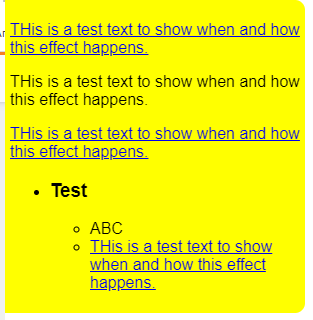
With this page if you open it on a computer it should show something like this:
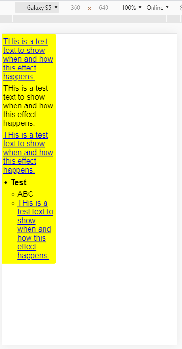
But if I switch to device mode in Chrome inspector and reduce the width I get something like this:
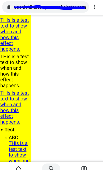
Same happens if I view the page on a smartphone:
Inspector shows that for example that ABC item, even though it's font size should be 16px, the height of the item is 49px, for some reason.
So, what completely obvious thing am I missing here?!?