-2

Wrapping items are positioned horizontally and center aligned. How would you control the vertical and horizontal spacing?

enter image description here

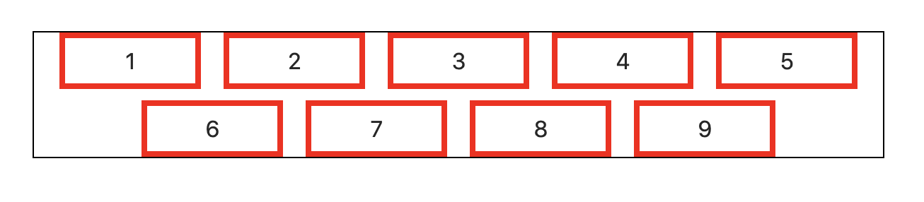
In this example, we'd like to have 16px horizontal space between items and 8px vertical space.

Here is a possible solution:

/* Solution */

.flex-wrapper {
  padding-top: 1px;
}

.flex-wrapper:before {
  content: "";
  display: block;
  margin-top: -9px;
}

.flex {
  display: flex;
  flex-wrap: wrap;
  margin-left: -16px;
  justify-content: center;
}

.flex-item {
  padding-left: 16px;
  padding-top: 8px;
}


/* For demo purposes, not related to solution. */

body {
  margin: 50px;
}

.container {
  width: 600px;
  outline: 1px solid black;
}

button {
  width: 100px;
  height: 40px;
  background: none;
  border: 4px solid red;
  font-size: 16px;
}
<div class="container">
  <div class="flex-wrapper">
    <div class="flex">
      <div class="flex-item">
        <button>1</button>
      </div>
      <div class="flex-item">
        <button>2</button>
      </div>
      <div class="flex-item">
        <button>3</button>
      </div>
      <div class="flex-item">
        <button>4</button>
      </div>
      <div class="flex-item">
        <button>5</button>
      </div>
      <div class="flex-item">
        <button>6</button>
      </div>
      <div class="flex-item">
        <button>7</button>
      </div>
      <div class="flex-item">
        <button>8</button>
      </div>
      <div class="flex-item">
        <button>9</button>
      </div>
    </div>
  </div>
</div>

This solution feels somewhat hacky, especially the .flex-wrapper part.

Is there a better way?


Notes:

  • Items can have various widths.
  • I'm looking for a solution that works regardless of whether the items wrap or not. Items can also span across many lines, not just 2 lines like in this example.
  • At the time of writing this question, browsers don't have a great support for gap in Flex.

This question shows how to horizontally center align the items, but it doesn't demonstrate how to control the vertical and horizontal space between the items.

Misha Moroshko
  • 166,356
  • 226
  • 505
  • 746
  • Already answered at [How to center elements on the last row in CSS Grid?](https://stackoverflow.com/questions/46276793/how-to-center-elements-on-the-last-row-in-css-grid) – rx2347 Mar 07 '20 at 14:38

7 Answers7

1

Welcome to the wonderful world of CSS-Grid, which is perfect for this. Way less code and easier to understand as you can see below.

Control of the space between columns and rows is done by grid-column-gap for the gap between - you guessed it - columns and grid-row-gap for the gap between rows.

You could write this even easier, use a repeat function for the columns for example:

grid-template-columns: repeat(5, 100px);

Pretty amazing.

Definetly look into what else you can do with CSS-Grid and forget about Flexbox. This is the future. To get you started check: https://www.w3schools.com/css/css_grid.asp

.container {
  display: grid;
  width: 564px;
  grid-template-columns: auto auto auto auto auto;
  grid-column-gap: 16px;
  grid-row-gap: 8px;
  outline: 1px solid black;
}

button {
  width: 100px;
  height: 40px;
  background: none;
  border: 4px solid red;
  font-size: 16px;
}
<div class='container'>
  <button>1</button>
  <button>2</button>
  <button>3</button>
  <button>4</button>
  <button>5</button>
  <button>6</button>
  <button>7</button>
  <button>8</button>
</div>

Browser-Support for CSS-Grid is pretty solid btw.

rx2347
  • 1,071
  • 1
  • 6
  • 26
  • I forgot to mention that I want to be able to horizontally center align the items. I updated the question. – Misha Moroshko Mar 07 '20 at 09:50
  • I'll mark this as a duplicate then, your question has already been answered at https://stackoverflow.com/questions/46276793/how-to-center-elements-on-the-last-row-in-css-grid – rx2347 Mar 07 '20 at 14:37
  • That question doesn't explain how to control vertical and horizontal spacing between the items which is the essence of this question. – Misha Moroshko Mar 08 '20 at 00:45
  • 3
    Well, it would have helped if you had thought about what your question really was, before submitting it. Now the answer is a bit of mine and a bit of the answer at that link, because centering all the items in the last row is not what CSS-Grid is good at. It can be done (as shown by clearlight), but especially with dynamic content will be a painful solution. But yeah, you're all welcome. – rx2347 Mar 08 '20 at 01:02
1

Starting with @rx2347's CSS-grid based answer as a baseline, but getting closer to the layout you are actually seeking... If you have a reasonable number of fixed items you want to place you could manually set the position of your elements to where you want by using repeat() to create a much finer grid, and then place your element at specific columns with finer granularity.

There are probably other ways to achieve this on per-row offset / indent basis with CSS-grid. To make it really automatic, for example to handle a large number of items, and/or an arbitrary number of items, I would be tempted to use jQuery scripting, possibly with CSS grid to iterate and set positions. There may be pure CSS and HTML ways to accommodate a more arbitrary number of elements. It really depends on your application.

enter image description here

.container {
  display: grid;
  width: 800px;
  grid-template-columns: repeat(60, 10px);
  grid-column-gap: 16px;
  grid-row-gap: 8px;
}

#button1 {
  grid-column-start: 4;
}

#button2 {
  grid-column-start: 8;
}

#button3 {
  grid-column-start: 12;
}

#button4 {
  grid-column-start: 16;
}

#button5 {
  grid-column-start: 20;
}

#button6 {
  grid-column-start: 6;
  grid-row-start: 2;

}
#button7 {
  grid-column-start: 10;
  grid-row-start: 2;     
}

#button8 {
  grid-column-start: 14;
  grid-row-start: 2;     
}

#button9 {
  grid-column-start: 18;
  grid-row-start: 2;
}
 
button {
  width: 100px;
  height: 40px;
  background: none;
  border: 4px solid red;
  font-size: 16px;
}
  <div class='container'>
  <button id="button1">1</button>
  <button id="button2">2</button>
  <button id="button3">3</button>
  <button id="button4">4</button>
  <button id="button5">5</button>
  <button id="button6">6</button>
  <button id="button7">7</button>
  <button id="button8">8</button>
  <button id="button9">9</button>
</div>
clearlight
  • 12,255
  • 11
  • 57
  • 75
  • This solution doesn't seem to be dynamic enough. It requires hard coding the `grid-column-start` values and also breaks if the items do not have the same width. – Misha Moroshko Mar 08 '20 at 00:50
  • @MishaMoroshko: Dynamic enough for who? Was a 'dynamic solution' part of the question? If you're looking for a specific solution, please state it in the question. I'm not enough of a CSS/grid expert to give the most refined answer. If I couldn't find an elegant html/CSS only way to make it flexible, I might try jQuery to script the page to make it extremely intelligent and flexible. – clearlight Jun 18 '21 at 14:15
1

A simple solution could be to use box-sizing and then control the vertical and horizontal spacing with padding.

.flex-item {
  box-sizing: border-box;
  padding: 4px 8px;
}

Or apply it universally:

*, *:before, *:after {
  box-sizing: border-box;
}

https://developer.mozilla.org/en-US/docs/Web/CSS/box-sizing

NinaW
  • 638
  • 3
  • 7
0

You might use margin to set the spacing:

.container {
  width: 600px;
  border: 1px solid;
}

section {
  display: flex;
  flex-flow: row wrap;
  justify-content: center;
  margin: -8px -8px 0;
}

button {
  width: 100px;
  height: 40px;
  margin: 8px 8px 0;
  border: 4px solid red;
  background: none;
  font-size: 16px;
}
<div class="container">
  <section>
    <button>1</button>
    <button>2</button>
    <button>3</button>
    <button>4</button>
    <button>5</button>
    <button>6</button>
    <button>7</button>
    <button>8</button>
    <button>9</button>
  </section>
</div>
Kosh
  • 16,966
  • 2
  • 19
  • 34
0

You're not controlling space between elements in your question, as you're using padding property, elements are one after another but you're reaching the effect. If you put a background on each you'll notice what i'm trying to explain.

To control space between elements in a flexbox layout (or another) you need to use margin on items, in this case, on items inside the display: flex; element.

I've used calc values due to SCSS variables, here i changed my variable name to 30px.

There's a snippet that reach what you want.

.flexcontainer {
  padding: 0 15px;
  width: 100%;
  border:1px solid black;
}
.flexrow {
  display:flex;
  flex-flow: row wrap;
  /* only horizontal negative margin for beggining and end of the element, as you may not know which element is first on the left or right, it will compensate the padding of container */
  margin: 0px calc(30px/2 * -1);
  justify-content: space-around;
}

.flexrow.row-5-el > .element { 
  flex: 0 1 calc(100%/5  - 30px);
  max-width: calc(100%/5  - 30px); 
  /* sets 15px of margin on each side */
  margin: calc(30px/2); 
  /* for testing purposes */
  outline: 1px auto green;
}
<div class="flexcontainer">
  <div class="flexrow row-5-el">
    <div class="element"> Lorem ipsum </div>
    <div class="element"> Lorem ipsum </div>
    <div class="element"> Lorem ipsum </div>
    <div class="element"> Lorem ipsum </div>
    <div class="element"> Lorem ipsum </div>
    <div class="element"> Lorem ipsum </div>
    <div class="element"> Lorem ipsum </div>
    <div class="element"> Lorem ipsum </div>
    <div class="element"> Lorem ipsum </div>
  </div>
</div>

if you want the first item start at the left 0, you only need to delete the container padding.

here's a live example i did some time ago: https://codepen.io/joelbonetr/pen/gOpPYbR

(without justify-content as the desired effect was keeping wrapped elements aligned to left)

JoelBonetR
  • 1,551
  • 1
  • 15
  • 21
0

You can use multiple values for gap, the first being vertical, the second horizontal.

.container {
  display: flex;
  justify-content: center;
  flex-wrap: wrap;
  gap: 8px 16px;
}
Driesigner
  • 31
  • 3
0

You can set row-gap to control the gap between rows, such as with gap: 10px; row-gap: 2px;.

There are a few syntax alternatives which do the same thing, such as gap: 2px 10px;, and column-gap: 10px; row-gap: 2px;.

.container {
  display: flex;
  flex-wrap: wrap;
  gap: 10px;
  row-gap: 2px;
  width: 100px;
}
.item {
  border: 1px solid hsl(0, 0%, 80%);
}
<div class="container">
  <div class="item">content</div>
  <div class="item">size</div>
  <div class="item">can</div>
  <div class="item">vary</div>
  <div class="item">with</div>
  <div class="item">gap</div>
  <div class="item">so</div>
  <div class="item">you</div>
  <div class="item">don't</div>
  <div class="item">need</div>
  <div class="item">a</div>
  <div class="item">fixed</div>
  <div class="item">width</div>
</div>
yeerk
  • 2,103
  • 18
  • 16