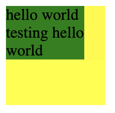
I think this is not possible with CSS. See, your .inner element is div, which is a block element by default. This means it has 100% width of the parent by default. You can change the display of your .inner to inline-block for example to not have the 100% default width, but the problem is that there is a text inside. Once that text fills at least one row (one full width of the parent), and needs to wrap - from that moment the text is automatically considered to need the full width of the parent. And that is even if the text visually looks like it uses less width (it doesn't, it actually uses wull-width - it just wraps). You could see this point if you would take a look at a shorter text. I am providing an example with inline-block here:
.outer {
  max-width: 100px;
  max-height: 300px;
  min-height: 100px;
  background-color: yellow;
}

.inner {
  background-color: green;
  display: inline-block;
  margin-bottom: 10px;
}
<div class="outer">
  <div class="inner">
    hello world testing hello world
  </div>
  <div class="inner">
    hello
  </div>
  <div class="inner">
    hello world
  </div>
</div>
One thing I can assure you of in the meantime is that the absolute position on the parent element does not affect this in any way at all.