5

I'm trying to make a form using Material UI and React. This is what I have so far:

import React from 'react'
import {Button, TextField} from '@material-ui/core'
import AddIcon from '@material-ui/icons/Add'
import PropTypes from 'prop-types'

class AddItem extends React.Component {

    state = {
        text: ''
    }

    handleChange = e => {
        this.setState({text: e.target.value})
    }

    render() {
        return (
            <form onSubmit={this.props.onSubmit(this.state.text)}>
                <TextField id="task" label="Task" placeholder="e.g. Feed the fish" value={this.state.text}
                           onChange={this.handleChange} color="secondary" variant="outlined" size="small"/>
                <Button color="secondary" variant="outlined" endIcon={<AddIcon/>} size="large">
                    Add
                </Button>
            </form>
        )
    }
}

AddItem.propTypes = {
    onSubmit: PropTypes.func.isRequired
}

export default AddItem

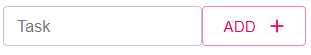
The result is the following screenshot:

enter image description here

But wait! Can you see that? The Button height and the TextField height are just so slightly misaligned! (By 2.5px I think). Is there any way to fix this?

This is better than earlier, where the TextField was a lot bigger than the Button (my fix was size="small" on the TextField).

How can I make sure that the TextField and the Button are the same height?

I know that in Bulma there's something like a level component that helps out with that, so is there any similar solution in Material UI?

Mike Lischke
  • 48,925
  • 16
  • 119
  • 181
  • Does this answer your question? https://stackoverflow.com/questions/2997767/how-do-i-keep-two-side-by-side-divs-the-same-height – keikai Mar 19 '20 at 05:22
  • @keikai I was actually wondering whether there was any solution specific to Material UI, but if I can't find one, then I'll use the question you linked. Thanks! – matthewcoding0 Mar 19 '20 at 16:05

2 Answers2

2

You can make your custom <Button> styled as you want.

Lets create <StyledButton> by overwriting style (padding) of outlined and large variant of button.

import { withStyles } from "@material-ui/core/styles";

const styles = {
  outlinedSizeLarge: {
    padding: "6px 21px" // default is "7px 21px" https://github.com/mui-org/material-ui/blob/master/packages/material-ui/src/Button/Button.js#L202
  }
};

const StyledButton = withStyles(styles)(Button);

Then you can use it in your component:

<form onSubmit={this.props.onSubmit(this.state.text)}>
    <TextField id="task" label="Task" placeholder="e.g. Feed the fish" value={this.state.text} onChange={this.handleChange} color="secondary" variant="outlined" size="small"/>
    <StyledButton color="secondary" variant="outlined" endIcon={<AddIcon/>} size="large">Add</StyledButton>
</form>

Result:

enter image description here

Live demo

Edit sad-resonance-u6y9d

m51
  • 1,950
  • 16
  • 25
  • Thanks for your answer, I ended up making up an inline style for my button with a padding-top of 7px and padding-bottom of 8px. Thank you for your help! – matthewcoding0 Mar 19 '20 at 16:14
1

Did you try to use variant attribute with value outlined?

<Button variant='outlined' size='small'>Add</Button>
Mario Boss
  • 1,784
  • 3
  • 20
  • 43