I'm trying to adjust the width of a container if it can't add a character box.
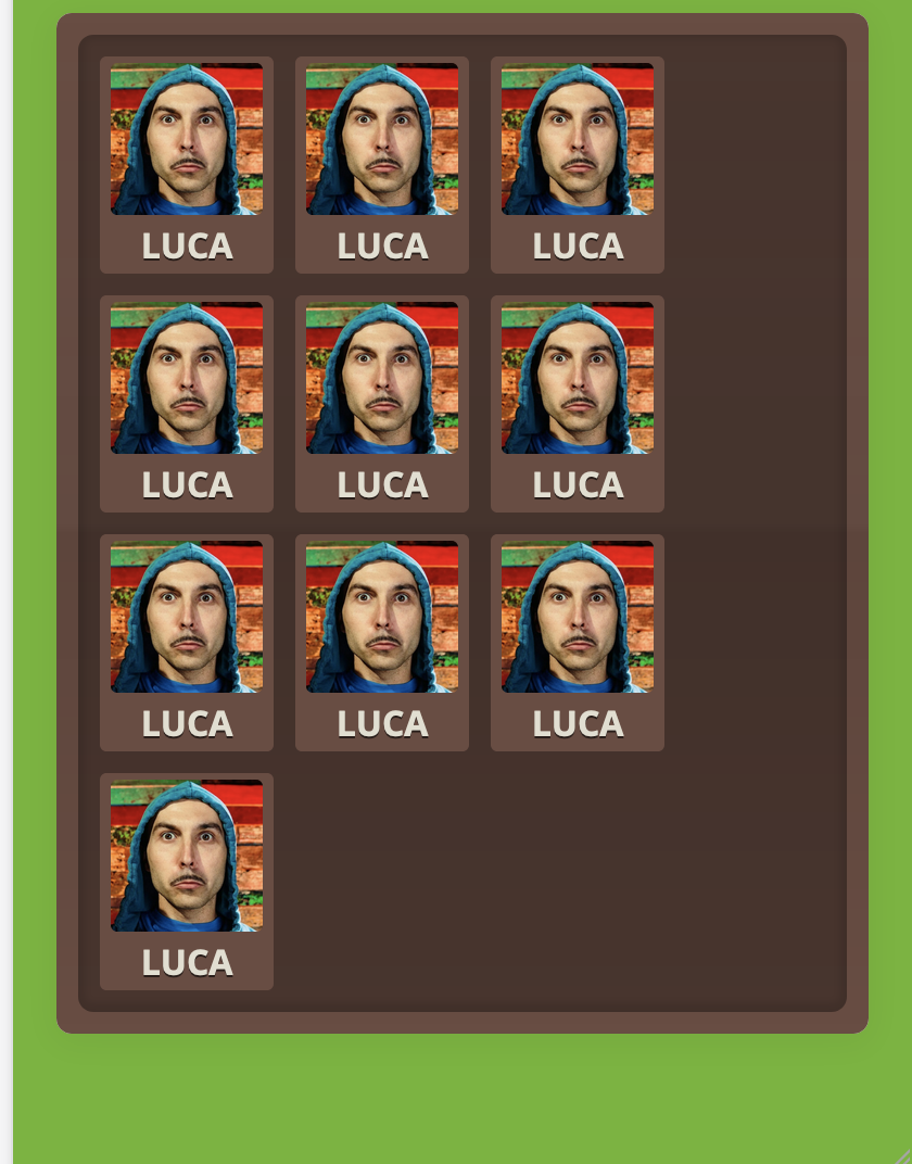
IMAGE: Remove the extra right space by resizing the width
This is the HTML
    <section id="list_users">
        <div id="list_users_fill">
            <div class="character" id="me">
                <div class="user_img">
                    <img src="../../assets/images/avatar.jpg">
                </div>
                <div class="user_name">LUCA</div>
            </div>
            <div class="character" id="me">
                <div class="user_img">
                    <img src="../../assets/images/avatar.jpg">
                </div>
                <div class="user_name">LUCA</div>
            </div>
            <div class="character" id="me">
                <div class="user_img">
                    <img src="../../assets/images/avatar.jpg">
                </div>
                <div class="user_name">LUCA</div>
            </div>
            <div class="character" id="me">
                <div class="user_img">
                    <img src="../../assets/images/avatar.jpg">
                </div>
                <div class="user_name">LUCA</div>
            </div>
            <div class="character" id="me">
                <div class="user_img">
                    <img src="../../assets/images/avatar.jpg">
                </div>
                <div class="user_name">LUCA</div>
            </div>
            <div class="character" id="me">
                <div class="user_img">
                    <img src="../../assets/images/avatar.jpg">
                </div>
                <div class="user_name">LUCA</div>
            </div>
            <div class="character" id="me">
                <div class="user_img">
                    <img src="../../assets/images/avatar.jpg">
                </div>
                <div class="user_name">LUCA</div>
            </div>
            <div class="character" id="me">
                <div class="user_img">
                    <img src="../../assets/images/avatar.jpg">
                </div>
                <div class="user_name">LUCA</div>
            </div>
            <div class="character" id="me">
                <div class="user_img">
                    <img src="../../assets/images/avatar.jpg">
                </div>
                <div class="user_name">LUCA</div>
            </div>
            <div class="character" id="me">
                <div class="user_img">
                    <img src="../../assets/images/avatar.jpg">
                </div>
                <div class="user_name">LUCA</div>
            </div>

        </div>
    </section>
And there the CSS
main {
  background: #F5F5F5;
  margin: 20px;
  -webkit-box-shadow: 0 3px 15px 1px rgba(0,0,0,0.05);
  box-shadow: 0 3px 15px 1px rgba(0,0,0,0.05);
  border-radius: 7px;
}

#list_users {
  background: #684D43;
  background-image: -moz-linear-gradient(top, rgba(255, 255, 255, 0) 0%, rgba(51, 51, 51, 0.1) 50%, rgba(0, 0, 0, 0.1) 51%, rgba(252, 252, 252, 0) 100%);
  background-image: -webkit-linear-gradient(top, rgba(255, 255, 255, 0) 0%, rgba(51, 51, 51, 0.1) 50%, rgba(0, 0, 0, 0.1) 51%, rgba(252, 252, 252, 0) 100%);
  background-image: -o-linear-gradient(top, rgba(255, 255, 255, 0) 0%, rgba(51, 51, 51, 0.1) 50%, rgba(0, 0, 0, 0.1) 51%, rgba(252, 252, 252, 0) 100%);
  background-image: linear-gradient(to bottom, rgba(255, 255, 255, 0) 0%, rgba(51, 51, 51, 0.1) 50%, rgba(0, 0, 0, 0.1) 51%, rgba(252, 252, 252, 0) 100%);
  -moz-background-clip: padding;
  -webkit-background-clip: padding;
  background-clip: padding-box;
  border-radius: 7px;
  padding: 10px;
}

#list_users > div {
  background-color: rgba(0,0,0,0.3);
  border-radius: 7px;
  -webkit-box-shadow: inset 0 -1px 3px 3px rgba(0,0,0,0.1);
  box-shadow: inset 0 -1px 3px 3px rgba(0,0,0,0.1);
  display: flex;
  flex-wrap: wrap;
  margin: 0 auto !important;
  padding: 0 10px 10px 10px;
}

.character {
  width: 80px;
  height: 100px;
  background: #684D43;
  border-radius: 3px;
  text-align: center;
  color: #E1DED1;
  text-shadow: 0px 1px 0px rgba(0,0,0,0.6);
  text-transform: uppercase;
  font-weight: bold;
  line-height: 27px;
  margin: 10px 10px 0 0;
}

.user_img img{
  margin-top: 3px;
  width: 70px;
  height: 70px;
  border-radius: 3px;
}
But a tried everything finding some about flex box or width property. I don't know if is it possible but I don't think. I'm just losing some details that can help me. Let me know, thanks!