0

.element-label {
  display: block;
  float: left;
  width: 260px;
  padding-left: .5em;
  background: #f0f0f0;
  color: #A00000;
  font-size: 9pt;
}

.element-value {
  display: block;
  float: left;
  margin-left: 1em;
  font-weight: bolder;
  white-space: nowrap;
  font-size: 9pt;
}
<div id="field1">
  <span class="element-label">Label 1 </span>
  <span class="element-value">テスト </span>
</div>
<br />
<div id="field2">
  <span class="element-label">Label 2 </span>
  <span class="element-value">testing value</span>
</div>

In MS IE:

IE for Japanese chars

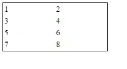
However, in Chrome or MS Edge: the html looks like: Chrome/Edge for Japanese chars

The layout in IE is what I expect/want.

However, when I change to the Japanese chars to other language chars (English, Chinese, Korean, etc.). They all look right.

All browsers for non-Japanese chars

  1. How can I format the Japanese chars correctly in this case

  2. Why Japanese chars are so special in this case in different browsers provided that they are all UTF-8 encoded?

TylerH
  • 20,799
  • 66
  • 75
  • 101
kzfid
  • 688
  • 3
  • 10
  • 17

1 Answers1

0

Why Japanese chars are so special in this case in different browsers provided that they are all UTF-8 encoded?

They are special because they use different font and therefore are taller than Latin characters. You can see the same result if you use Latin text, but increase the font-size for that specific value span.

However the main problem is that your wrapper div elements are basically non-existent and not forcing child elements to be in rows and therefore each element is trying to be next to its sibling. If you removed the br element you would see that there is only one row.

A better solution is to use css to order your elements into rows and remove the br completely. Simple way to do that is to use flex on your wrapper elements. Also you should fix the height of rows to get a more consistent appearance (I added line-height to counter that).

.element-label {
  display: block;
  float: left;
  width: 260px;
  padding-left: .5em;
  background: #f0f0f0;
  color: #A00000;
  font-size: 9pt;
}

.element-value {
  display: block;
  float: left;
  margin-left: 1em;
  font-weight: bolder;
  white-space: nowrap;
  font-size: 9pt;
}

.row {
  display: flex;
  line-height: 9pt;
  margin-bottom: .3em;
}
<div class="row" id="field1">
  <span class="element-label">Label 1 </span>
  <span class="element-value">テスト </span>
</div>
<div class="row" id="field2">
  <span class="element-label">Label 2 </span>
  <span class="element-value">testing value</span>
</div>
Cray
  • 2,774
  • 7
  • 22
  • 32
  • Thanks so much with clear explanation on the root cause, you save me another few hours. Fixing the height seems needs to hardcode a number there. Just wonder if there is any standard/common way to have
    rendered at a new row/line. Just saw that someone else is suggesting
    at another post.
    – kzfid Mar 20 '20 at 08:58
  • `clear: both;` does work, but as explained [here](https://stackoverflow.com/questions/9776840/are-floats-bad-what-should-be-used-in-its-place) floats are not meant for layouts. Since the introduction of flexbox it is easy to make responsive layouts if you have proper wrapper elements. – Cray Mar 20 '20 at 09:03
  • Yes, you are right. Indeed, there is no responsive layout requirement at my case and a table should be good enough. – kzfid Mar 20 '20 at 10:17