3

I'd like to simulate a particle explosion, from the center of a screen out to the edges (In CSS, and I promise to not use this for nefarious purposes)

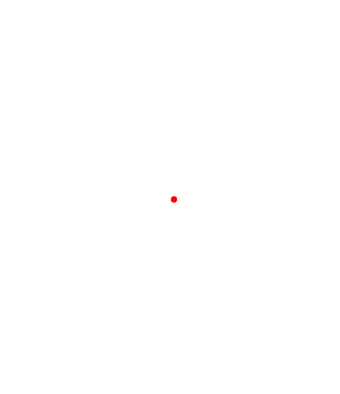
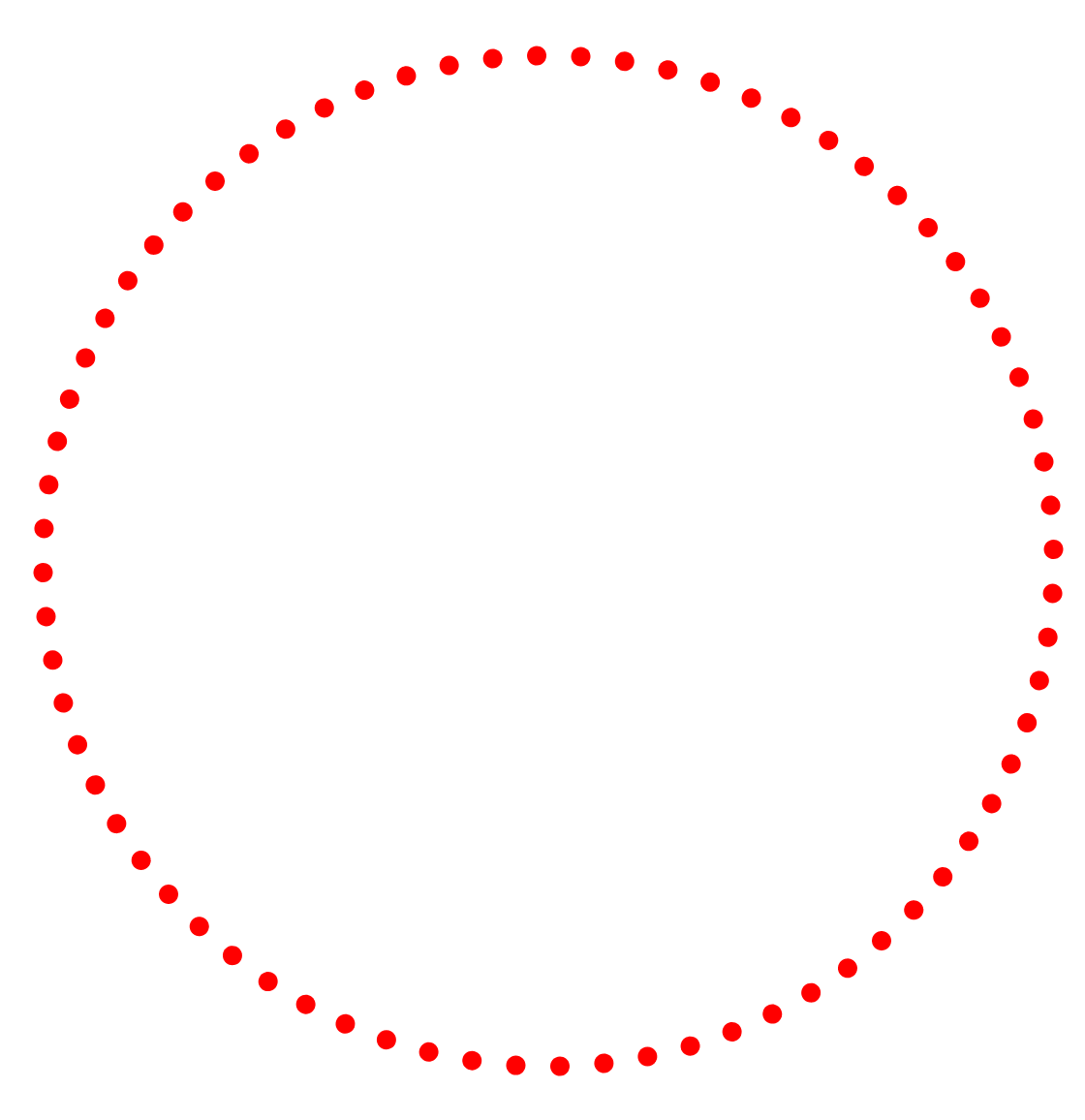
Here's a visual so you know what I'm talking about:

BEFORE:

BEFORE

AFTER:

AFTER

I've tried using the following HTML/CSS/JS, but it doesn't work (dots stay still in the middle of the screen):

The HTML is just this:

<div id="animated"></div>

The CSS:

// SCSS
#animated {
  position: relative; 
  width: 100%;
  height: 100%;
  overflow: hidden;

  .particle {
    position: absolute;
    left: 50%;
    top: 50%;
    width: 10px;
    height: 10px;
    transition: transform 1s ease-in-out;

    &.on {
      transform: translate(-30vw, -30vh);
    }

    &::after {
      position: absolute;
      content: "";
      width: 10px;
      height: 10px;
      border-radius: 50%;
      background: red;
    }
  }
}

And the Javascript:

document.addEventListener('DOMContentLoaded', onLoad);

function onLoad() {
  // animate
  for(var i = 0; i < 360; i+=5) {
    const particle = createParticle(animated, i);
  }
}

function createParticle(parentElem, rotation) {
  const particle = document.createElement('div');
  particle.style.transform = `rotate(${rotation}deg)`;
  particle.classList.add('particle');
  particle.classList.add('on'); // turn on
  parentElem.appendChild(particle);

  return particle;
}

Here's a link to a CodePen: https://codepen.io/floatingrock/pen/KKpxpvJ

FloatingRock
  • 6,741
  • 6
  • 42
  • 75

1 Answers1

4

Here is an idea with CSS variable where it's easy to adjust with few code.

Run on full screen for better result:

document.addEventListener('DOMContentLoaded', onLoad);

function onLoad() {
  let parentElem = document.querySelector('.container');
  for (var i = 0; i < 360; i += 10) {
    const particle = document.createElement('div');
    particle.style = `--r:${i}deg`;
    parentElem.appendChild(particle);
  }
}
.container {
  width: 20px;
  height: 20px;
  position: fixed;
  top: 50%;
  left: 50%;
  transform: translate(-50%, -50%);
}

.container>div {
  position: absolute;
  top: 0;
  left: 0;
  width: 100%;
  height: 100%;
  border-radius: 50%;
  background: red;
  transform: rotate(var(--r, 0deg)) translate(0);
  animation: splash 1s infinite alternate 1s;
}

@keyframes splash {
  to {
    transform: rotate(var(--r, 0deg)) translate(44vmin);
  }
}
<div class="container">
</div>

You can consider different delay for another kind of animation:

document.addEventListener('DOMContentLoaded', onLoad);

function onLoad() {
  let parentElem = document.querySelector('.container');
  for (var i = 0; i < 360; i += 10) {
    const particle = document.createElement('div');
    particle.style = `--r:${i}deg;--d:${(i/360)}s`;
    parentElem.appendChild(particle);
  }
}
.container {
  width: 20px;
  height: 20px;
  position: fixed;
  top: 50%;
  left: 50%;
  transform: translate(-50%, -50%);
}

.container>div {
  position: absolute;
  top: 0;
  left: 0;
  width: 100%;
  height: 100%;
  border-radius: 50%;
  background: red;
  transform: rotate(var(--r, 0deg)) translate(0);
  animation: splash 1s infinite alternate var(--d,0s);
}

@keyframes splash {
  to {
    transform: rotate(var(--r, 0deg)) translate(44vmin);
  }
}
<div class="container">
</div>

We can still optimize the code with less CSS:

document.addEventListener('DOMContentLoaded', onLoad);

function onLoad() {
  let parentElem = document.querySelector('.container');
  for (var i = 0; i < 360; i += 10) {
    const particle = document.createElement('div');
    particle.style = `--r:${i}deg`;
    parentElem.appendChild(particle);
  }
}
.container > div {
  position: fixed;
  top: 50%;
  left: 50%;
  width: 20px;
  height: 20px;
  border-radius: 50%;
  background: red;
  transform:translate(-50%, -50%) rotate(var(--r, 0deg)) translate(0);
  animation: splash 1s infinite alternate 1s;
}

@keyframes splash {
  to {
    transform:translate(-50%, -50%) rotate(var(--r, 0deg)) translate(calc(50vmin - 10px));
  }
}


/* Irrelevant styles */
html {
  height:100%;
  border:1px solid blue; /* screen border*/
  box-sizing:border-box;
  background:linear-gradient(green,green) center/10px 10px no-repeat; /* the center of the screen */
}
body {
 margin:0;
}
<div class="container">
</div>

The order of transformation is important. Related: Why does order of transforms matter? rotate/scale doesn't give the same result as scale/rotate

Temani Afif
  • 245,468
  • 26
  • 309
  • 415
  • This is fantastic -- overcomes the need to have the pseudoelement AND the `on` class – FloatingRock Mar 22 '20 at 09:30
  • @FloatingRock added another optimized version – Temani Afif Mar 22 '20 at 09:37
  • Why do you use `translate` twice here: `transform:translate(-50%, -50%) rotate(var(--r, 0deg)) translate(0);` – FloatingRock Mar 22 '20 at 09:37
  • @FloatingRock The first one will center, the second one (rotation) will rotate the element and the last one will move the element and create the translation animation. The order is important because each transform is affected by the previous one. – Temani Afif Mar 22 '20 at 09:39
  • Ah, so without the last `translate(0)` the animation does not get triggered? I didn't not know about this.. – FloatingRock Mar 22 '20 at 09:42
  • @FloatingRock you can omit translate(0) in this case since it's a null transform the browser will by default add it. I kept it for clarity so we understand that we are doing an animation from 0 to 50vmin – Temani Afif Mar 22 '20 at 09:44