6

I'm working on a SwiftUI List cell that can expand/shrink, something very simple you can see in a lot of contexts. Something like the following (the following is implemented in UIKit):

enter image description here

To be honest I'm struggling implementing the same on SwiftUI. I tried a couple of approaches:

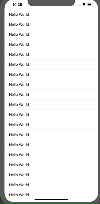
1) First approach: conditionally include the cell bottom part:

import SwiftUI

struct Approach1: View {
    @State private var selectedIndex = -1

    var body: some View {
        List {
            ForEach(0...20, id: \.self) { idx in
                Cell(isExpanded: self.selectedIndex == idx)
                    .onTapGesture {
                        withAnimation {
                            self.selectedIndex = (self.selectedIndex == idx) ? -1 : idx
                        }
                    }
            }
        }
    }
}

private struct Cell: View {
    let isExpanded: Bool
    var body: some View {
        VStack(alignment: .leading) {
            Text("Hello World")
                .animation(nil)
            if isExpanded {
                VStack {
                    Text("Lorem ipsum")
                    Text("Lorem ipsum")
                    Text("Lorem ipsum")
                    Text("Lorem ipsum")
                    Text("Lorem ipsum")
                    Text("Lorem ipsum")
                }
            }
        }
    }
}

struct Approach1_Previews: PreviewProvider {
    static var previews: some View {
        Approach1()
    }
}

In this case, though, SwiftUI won't animate the cell expansion, it just animates the bottom content that appears/disappears and the result is really weird (I slowed down the animations to let you see):

enter image description here

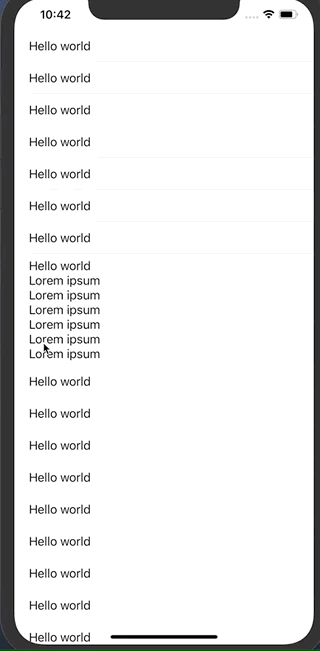
2) Second approach: create two versions of the cell:

import SwiftUI

struct Approach2: View {
    @State private var selectedIndex = -1

    var body: some View {
        List {
            ForEach(0...20, id: \.self) { idx in
                Group {
                    if self.selectedIndex == idx {
                        ExpandedCell()
                            .onTapGesture {
                                self.selectedIndex = -1
                            }
                    } else {
                        Cell()
                            .onTapGesture {
                                self.selectedIndex = idx
                            }
                    }
                }
            }
        }
    }
}

private struct Cell: View {
    var body: some View {
        Text("Hello world")
    }
}

private struct ExpandedCell: View {
    var body: some View {
        VStack(alignment: .leading) {
            Cell()
            Text("Lorem ipsum")
            Text("Lorem ipsum")
            Text("Lorem ipsum")
            Text("Lorem ipsum")
            Text("Lorem ipsum")
            Text("Lorem ipsum")
        }
    }
}

struct Approach2_Previews: PreviewProvider {
    static var previews: some View {
        Approach2()
    }
}

This seems the right way to do what I want. It is really near to what I'd like to get:

enter image description here

Unfortunately there's a weird glitch I can't fix when I tap on a cell above an expanded cell:

enter image description here

Can you help me? Thank you.

superpuccio
  • 11,674
  • 8
  • 65
  • 93

2 Answers2

4

Here is an attempted solution. It works better than Approach1 and Approach2 as outlined in the question. But there is a slight "wobble" during the transition between heights that I've not so far been able to eliminate. Maybe this approach can be further refined to eliminate that glitch.

The approach here draws on:

First we measure the height of the expanded cell and the contracted cell in Cell using a helper view called ChildHeightReader. Then we create an AnimatableModifier - called AnimatingCellHeight - to animate the height change as the cell expands and contracts using the information gathered by ChildHeightReader. AnimatingCellHeight includes a clipping call so that as the frame expands and contracts the content outside the frame is clipped. And it also sets the alignment of the frame to .top, so that when contacted we see the beginning of the content and not the (default) middle.

    struct ExpandingList: View {

      @State private var selectedIndex = -1

      var body: some View {
            List {
                  ForEach(0...20, id: \.self) { idx in
                        Cell(isExpanded: self.selectedIndex == idx)
                              .onTapGesture {
                                    withAnimation {
                                          self.selectedIndex = (self.selectedIndex == idx) ? -1 : idx
                                    }
                        }
                  }
            }
      }
}

private struct Cell : View {
      let isExpanded: Bool

      @State var expandedHeight : CGFloat = .zero
      @State var defaultHeight : CGFloat = .zero

      var body: some View {

            return ChildHeightReader(size: $expandedHeight) {
                  VStack(alignment: .leading) {

                        ChildHeightReader(size: self.$defaultHeight) {
                              Text("Hello World")
                        }

                        Text("Lorem ipsum")
                        Text("Lorem ipsum")
                        Text("Lorem ipsum")
                        Text("Lorem ipsum")
                        Text("Lorem ipsum")
                        Text("Lorem ipsum")
                  }
            }.modifier(AnimatingCellHeight(height: isExpanded ? expandedHeight : defaultHeight) )
      }
}

struct AnimatingCellHeight: AnimatableModifier {
      var height: CGFloat = 0

      var animatableData: CGFloat {
            get { height }
            set { height = newValue }
      }

      func body(content: Content) -> some View {
            return content.frame(height: height, alignment: .top).clipped()
      }
}

struct HeightPreferenceKey: PreferenceKey {
      typealias Value = CGFloat
      static var defaultValue: Value = .zero

      static func reduce(value _: inout Value, nextValue: () -> Value) {
            _ = nextValue()
      }
}

struct ChildHeightReader<Content: View>: View {
      @Binding var size: CGFloat
      let content: () -> Content
      var body: some View {
            ZStack {
                  content()
                        .background(
                              GeometryReader { proxy in
                                    Color.clear
                                          .preference(key: HeightPreferenceKey.self, value: proxy.size.height)
                              }
                  )
            }
            .onPreferenceChange(HeightPreferenceKey.self) { preferences in
                  self.size = preferences
            }
      }
}

struct ExpandingList_Previews: PreviewProvider {
      static var previews: some View {
            VStack() {
                  ExpandingList()
            }
      }
}
Obliquely
  • 7,002
  • 2
  • 32
  • 51
2

Maybe consider the use of DisclosureGroup

struct ContentView: View {
var body: some View {
    List(0...20, id: \.self) { idx in
        DisclosureGroup { 
            Text("Lorem Ipsum")
            Text("Lorem Ipsum")
            Text("Lorem Ipsum")
            Text("Lorem Ipsum")
        } label: { 
            Text("Hello World")
        }
        
    }
}

}

This automatically includes the animations. The result looks as following: [Result][1]

Meyssam
  • 192
  • 1
  • 8