1

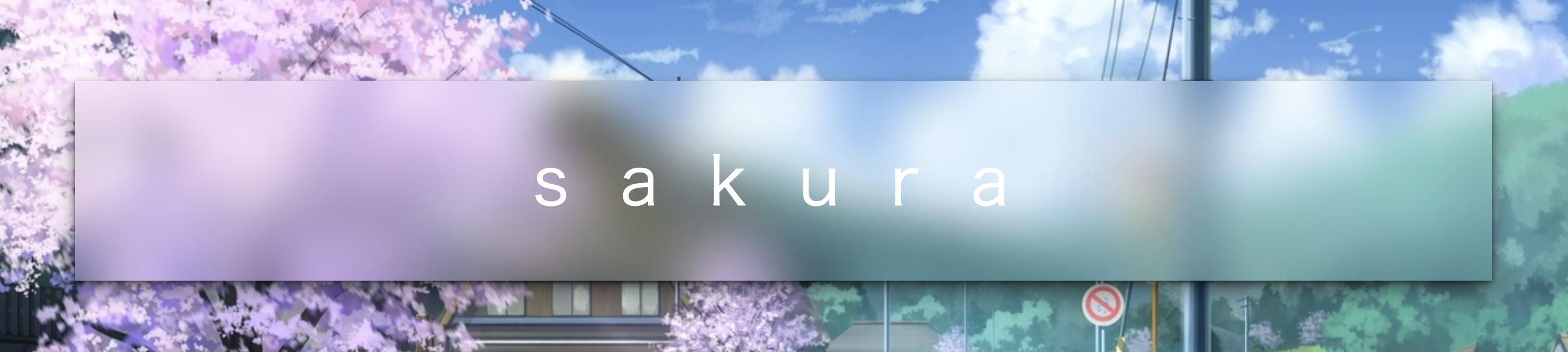
I have a background image and a box with a title in it. How would I blur part of the image in the box? I tried using web kit filter but it blurred the title

Example

.title {
  height: 90px;
  margin: auto;
  margin-top: 90px;
  margin-left: 250px;
  margin-right: 250px;
  display: flex;
  justify-content: center;
  align-items: center;
  border-width: 1px;
  border-style: solid;
 filter: blur(8px);
  -webkit-filter: blur(8px);

}
.bgimage {
  width: 100%;
  height: 540px;
  background-size: 100%;
  background-repeat: no-repeat;
  background-image: url("img");
}
   <div className="bgimage">
    <div className="title">Title</div>
  </div>

Naterz
  • 387
  • 4
  • 14
  • Please review [How to Ask](https://stackoverflow.com/help/how-to-ask) and update your question with a [Minimal, Complete, and Reproducible](https://stackoverflow.com/help/minimal-reproducible-example) example of your issue, what you've tried, and what isn't working, and what your expected result should be. Please be as specific as possible. – Drew Reese Mar 24 '20 at 00:57

2 Answers2

2

You may need backdrop-filter

The backdrop-filter CSS property lets you apply graphical effects such as blurring or color shifting to the area behind an element. Because it applies to everything behind the element, to see the effect you must make the element or its background at least partially transparent.

backdrop-filter: blur(20px);

An amazing online demo: https://codepen.io/alphardex/pen/pooQMVp

body {
  display: flex;
  justify-content: center;
  align-items: center;
  height: 100vh;
  /* background: URL(); */
  background-size: cover;
  background-position: center;
}

.bgimage {
  display: flex;
  justify-content: center;
  align-items: center;
  width: 72vw;
  height: 36vh;
  /* box-shadow: ; */
  backdrop-filter: blur(20px);
  transition: 0.5s ease;

  &:hover {
    /* box-shadow: ; */
  }

  .title {
    padding-left: 0.375em;
    font-size: 3.6em;
    font-family: Lato, sans-serif;
    font-weight: 200;
    letter-spacing: 0.75em;
    color: white;

    @media (max-width: 640px) {
      font-size: 2em;
    }
  }
}

enter image description here

keikai
  • 14,085
  • 9
  • 49
  • 68
  • 1
    Beware browser support is still very low. And even in Chrome which is the only one to pretend to support it fully, there are still many bugs caused by this. I honestly advice not to use it today. – Kaiido Mar 24 '20 at 01:35
1

Add another blurred image with a pseudo-element and clip it:

.example {
  position: relative;
  width: 400px;
  height: 400px;
  background: #000 url(https://picsum.photos/id/870/400/400) no-repeat center center scroll;
    display: flex;
  justify-content: center;
  align-items: center;
}

.example::before {
  content: "";
  position: absolute;
  top: 0;
  right: 0;
  bottom: 0;
  left: 0;
  background: #000 url(https://picsum.photos/id/870/400/400) no-repeat center center scroll;
  clip-path: inset(80px);
  filter: blur(10px);
}

.example p {
  font-size: 4rem;
  position: relative;
  z-index: 1;
}
<div class="example">
  <p>Title</p>
</div>
Daniel Sixl
  • 2,488
  • 2
  • 16
  • 29
  • The solution **keikai** posted, with `backdrop-filter: blur(20px);` is WAY nicer. – Daniel Sixl Mar 24 '20 at 01:27
  • 1
    What makes you think it is? Yours is way easier to compute for the browser and has way better browser support. A backdrop-filter means the browser has to badly mess with the clipping areas of the whole page, it's currently completely broken both in the specs and in the implementations. If you have some 3D transforms or other filters that are applied on the page, you can be pretty sure to see unexpected behavior. Your solution is very simple, very elegant, perfectly specified and supported by all modern browsers. – Kaiido Mar 24 '20 at 01:48