I am a relative beginner with R, so please forgive me if I make conceptual errors here.
I'm trying to plot a graph that measures the number of petitions that are certified or denied ("C" and "D") over time, from 1992 to 2019. The data set uses individual petitions that are dated YMD. The "C" and "D" are characters under the variable "Determ". The code I used is:
ggplot(data = TAA, mapping = aes(x = DetermDate, y = frequency(Determ), color = Determ)) +
  geom_line() +
  scale_x_date(date_breaks = "2 years", date_labels = "%Y") +
  theme_clean()
The resulting graph is:
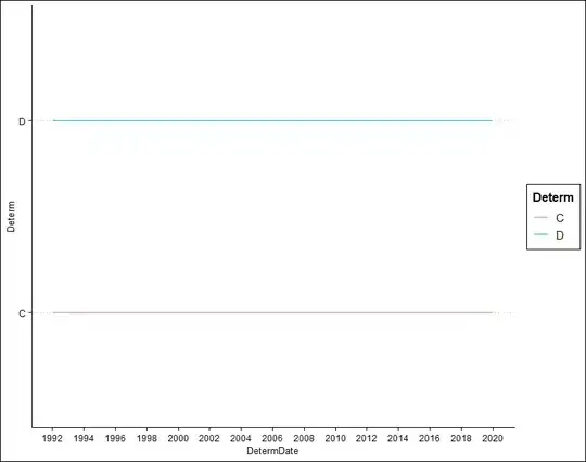 .
.
Obviously, it's not very helpful. It shows that certifications and denials exist from 1992 to 2019, but that's about it. Again, I'm interested in the quantity of each over time. Any help at all would be greatly appreciated!
EDIT: Below is a copied head(TAA) from R.
 head(TAA)
  DetermDate           Company Name          City State   Zip    Workers                           Product Petitioner Determ EstNoWorkers
3 1992-03-06           Gleason Corp     Rochester    NY 14692 Production      Ctting and grinding machines    Workers      D           65
4 1992-02-28  Northwest Alloys, Inc          Addy    WA 99101 Production                   Metal magnesium    Workers      C          200
5 1992-03-06     Pan American World       Jamaica    NY 11430 Production                   Airline carrier    Workers      D         1100
6 1992-02-10     Potomac Sportswear   Martinsburg    WV 25401 Production                Childrens garments      Union      C           91
7 1992-02-18 Sage Drilling Co., Inc       Wichita    KS 67202 Production                 Oil, gas drilling    Workers      C           14
8 1992-02-18 Sage Drilling Co., Inc Oklahoma City    OK 73127 Production Oil, gas exploration and drilling    Workers      C           15
The data frame is mostly filler for the purposes of this question, with the focus being on "DetermDate" and "Determ". The row IDs on the side begin with "3" because I deleted NAs from a prior dirty data set. Thank you!