I have table in the a page where I need to implement a vertical scroll only for the tbody part of the table. My table has columns of dynamic width, there's horizontal scrolling implemented if increase in width of a column causes the table to overflow. What I want is for only the body of the table to scroll on vertical overflow, but want the table header to remain visible. What I have implemented scrolls the entire table vertically
Following is my code for now. It has dummy data, as I cant post the actual code, but the structure is the same(jsfiddle link):
th,
td {
  text-align: left;
  padding: 5px;
  outline: solid 0.5px;
}

table {
  table-layout: auto;
  width: 100%;
  white-space: nowrap;
  overflow-x: scroll;
  overflow-y: scroll;
  height: 100px;
  display: block;
}

.container {
  width: 300px;
}
<div class="container">
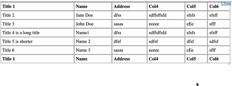
<table>
<thead>
<tr>
<th>Title 1</th>
<th>Name</th>
<th>Address</th>
<th>Col4</th>
<th>Col5</th>
<th>Col6</th>
</tr>
</thead>
<tbody>
<tr>
<td>Title 2</td>
<td>Jane Doe</td>
<td>dfss</td>
<td>sdffsffsfd</td>
<td>sfsfs</td>
<td>sfsff</td>
</tr>
<tr>
<td>Title 3</td>
<td>John Doe</td>
<td>sasas</td>
<td>eeeee</td>
<td>eEe</td>
<td>sfff</td>
</tr>
<tr>
<td>Title 4 is a long title</td>
<td>Name1</td>
<td>dfss</td>
<td>sdffsffsfd</td>
<td>sfsfs</td>
<td>sfsff</td>
</tr>
<tr>
<td>Title 5 is shorter</td>
<td>Name 2</td>
<td>dfsf</td>
<td>sdfsf</td>
<td>dfsf</td>
<td>sdfsf</td>
</tr>
<tr>
<td>Title 6</td>
<td>Name 3</td>
<td>sasas</td>
<td>eeeee</td>
<td>eEe</td>
<td>sfff</td>
</tr>
</tbody>
</table>
</div>I have checked multitiple solutions on stackoverflow for this problem but they all set a fixed width for their columns and then use wrap the content inside if it exceeds the width. table with fixed thead and scrollable tbody is the only solution that didn't completely mess up my page, but doesn't work, it gives different column widths for columns in header and body.
All other solutions, even the ones that use nested table use fixed width column, and the ones which don't use js/jQuery which I would rather not use unless its the absolute, last ever option. Can anyone please suggest something?