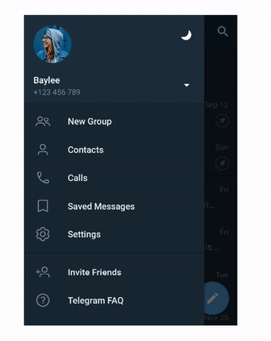
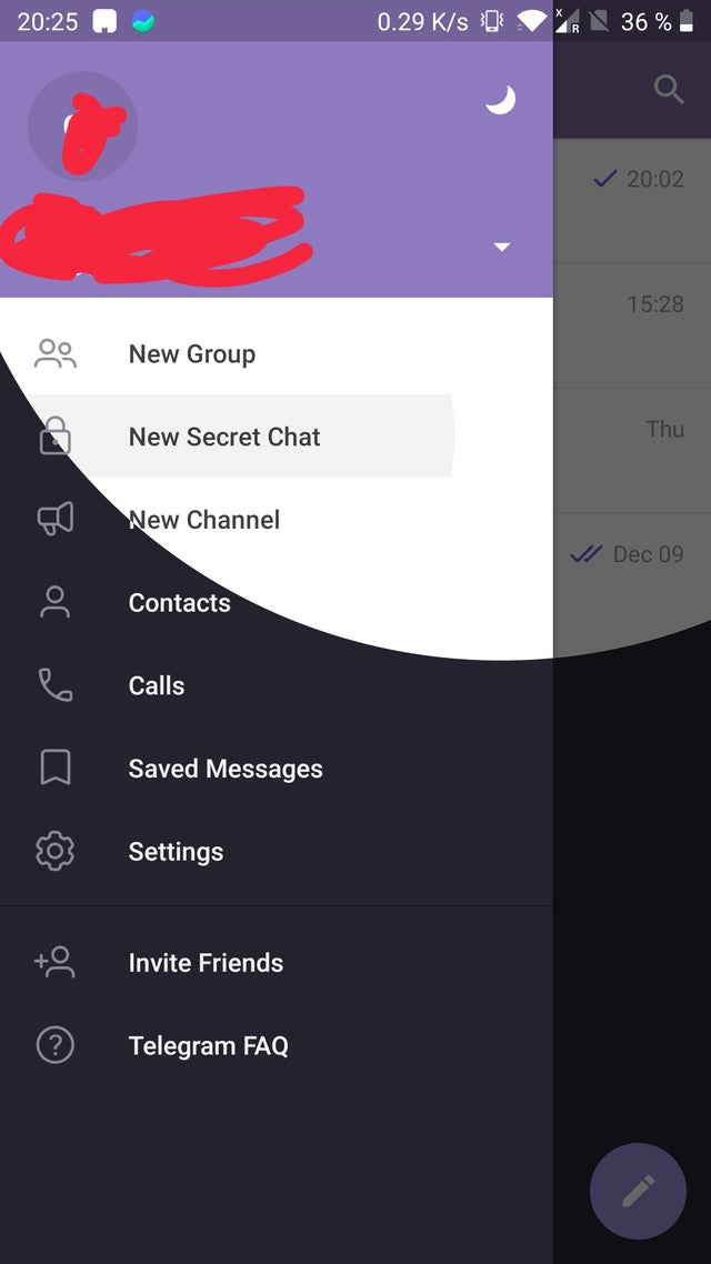
I want to add animation for switching theme from light to dark or vice versa in flutter like telegram do :
can't see any way to do it in flutter, is it possible in flutter?
thx for any answer
I want to add animation for switching theme from light to dark or vice versa in flutter like telegram do :
can't see any way to do it in flutter, is it possible in flutter?
thx for any answer
It’s not hard, but you need to do several things.

update! I've converted our code to a package with simple api.
import 'package:equatable/equatable.dart';
import 'package:flutter/material.dart';
void main() => runApp(MyApp());
class MyApp extends StatelessWidget {
@override
Widget build(BuildContext context) {
return BrandTheme(
child: Builder(builder: (context) {
return MaterialApp(
title: 'Flutter Demo',
theme: BrandTheme.of(context).themeData,
home: MyHomePage(),
);
}),
);
}
}
GlobalKey switherGlobalKey = GlobalKey();
class MyHomePage extends StatefulWidget {
MyHomePage({Key key}) : super(key: key);
@override
_MyHomePageState createState() => _MyHomePageState();
}
class _MyHomePageState extends State<MyHomePage>
with SingleTickerProviderStateMixin {
AnimationController _controller;
@override
void initState() {
_controller = AnimationController(
duration: const Duration(milliseconds: 300),
vsync: this,
);
_controller.forward();
super.initState();
}
@override
void dispose() {
_controller.dispose();
super.dispose();
}
int _counter = 0;
BrandThemeModel oldTheme;
Offset switcherOffset;
void _incrementCounter() {
setState(() {
_counter++;
});
}
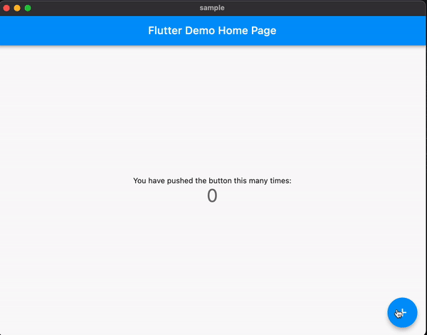
_getPage(brandTheme, {isFirst = false}) {
return Scaffold(
backgroundColor: brandTheme.color2,
appBar: AppBar(
backgroundColor: brandTheme.color1,
title: Text(
'Flutter Demo Home Page',
style: TextStyle(color: brandTheme.textColor2),
),
),
body: Center(
child: Column(
mainAxisAlignment: MainAxisAlignment.spaceAround,
children: <Widget>[
Text(
'You have pushed the button this many times:',
style: TextStyle(
color: brandTheme.textColor1,
),
),
Text(
'$_counter',
style: TextStyle(color: brandTheme.textColor1, fontSize: 200),
),
Switch(
key: isFirst ? switherGlobalKey : null,
onChanged: (needDark) {
oldTheme = brandTheme;
BrandTheme.instanceOf(context).changeTheme(
needDark ? BrandThemeKey.dark : BrandThemeKey.light,
);
},
value: BrandTheme.of(context).brightness == Brightness.dark,
)
],
),
),
floatingActionButton: FloatingActionButton(
onPressed: _incrementCounter,
tooltip: 'Increment',
child: Icon(
Icons.add,
),
),
);
}
@override
void didUpdateWidget(Widget oldWidget) {
var theme = BrandTheme.of(context);
if (theme != oldTheme) {
_getSwitcherCoodinates();
_controller.reset();
_controller.forward().then(
(_) {
oldTheme = theme;
},
);
}
super.didUpdateWidget(oldWidget);
}
void _getSwitcherCoodinates() {
RenderBox renderObject = switherGlobalKey.currentContext.findRenderObject();
switcherOffset = renderObject.localToGlobal(Offset.zero);
}
@override
Widget build(BuildContext context) {
var brandTheme = BrandTheme.of(context);
if (oldTheme == null) {
return _getPage(brandTheme, isFirst: true);
}
return Stack(
children: <Widget>[
if(oldTheme != null) _getPage(oldTheme),
AnimatedBuilder(
animation: _controller,
child: _getPage(brandTheme, isFirst: true),
builder: (_, child) {
return ClipPath(
clipper: MyClipper(
sizeRate: _controller.value,
offset: switcherOffset.translate(30, 15),
),
child: child,
);
},
),
],
);
}
}
class MyClipper extends CustomClipper<Path> {
MyClipper({this.sizeRate, this.offset});
final double sizeRate;
final Offset offset;
@override
Path getClip(Size size) {
var path = Path()
..addOval(
Rect.fromCircle(center: offset, radius: size.height * sizeRate),
);
return path;
}
@override
bool shouldReclip(CustomClipper<Path> oldClipper) => true;
}
class BrandTheme extends StatefulWidget {
final Widget child;
BrandTheme({
Key key,
@required this.child,
}) : super(key: key);
@override
BrandThemeState createState() => BrandThemeState();
static BrandThemeModel of(BuildContext context) {
final inherited =
(context.dependOnInheritedWidgetOfExactType<_InheritedBrandTheme>());
return inherited.data.brandTheme;
}
static BrandThemeState instanceOf(BuildContext context) {
final inherited =
(context.dependOnInheritedWidgetOfExactType<_InheritedBrandTheme>());
return inherited.data;
}
}
class BrandThemeState extends State<BrandTheme> {
BrandThemeModel _brandTheme;
BrandThemeModel get brandTheme => _brandTheme;
@override
void initState() {
final isPlatformDark =
WidgetsBinding.instance.window.platformBrightness == Brightness.dark;
final themeKey = isPlatformDark ? BrandThemeKey.dark : BrandThemeKey.light;
_brandTheme = BrandThemes.getThemeFromKey(themeKey);
super.initState();
}
void changeTheme(BrandThemeKey themeKey) {
setState(() {
_brandTheme = BrandThemes.getThemeFromKey(themeKey);
});
}
@override
Widget build(BuildContext context) {
return _InheritedBrandTheme(
data: this,
child: widget.child,
);
}
}
class _InheritedBrandTheme extends InheritedWidget {
final BrandThemeState data;
_InheritedBrandTheme({
this.data,
Key key,
@required Widget child,
}) : super(key: key, child: child);
@override
bool updateShouldNotify(_InheritedBrandTheme oldWidget) {
return true;
}
}
ThemeData defaultThemeData = ThemeData(
floatingActionButtonTheme: FloatingActionButtonThemeData(
shape: RoundedRectangleBorder(),
),
);
class BrandThemeModel extends Equatable {
final Color color1;
final Color color2;
final Color textColor1;
final Color textColor2;
final ThemeData themeData;
final Brightness brightness;
BrandThemeModel({
@required this.color1,
@required this.color2,
@required this.textColor1,
@required this.textColor2,
@required this.brightness,
}) : themeData = defaultThemeData.copyWith(brightness: brightness);
@override
List<Object> get props => [
color1,
color2,
textColor1,
textColor2,
themeData,
brightness,
];
}
enum BrandThemeKey { light, dark }
class BrandThemes {
static BrandThemeModel getThemeFromKey(BrandThemeKey themeKey) {
switch (themeKey) {
case BrandThemeKey.light:
return lightBrandTheme;
case BrandThemeKey.dark:
return darkBrandTheme;
default:
return lightBrandTheme;
}
}
}
BrandThemeModel lightBrandTheme = BrandThemeModel(
brightness: Brightness.light,
color1: Colors.blue,
color2: Colors.white,
textColor1: Colors.black,
textColor2: Colors.white,
);
BrandThemeModel darkBrandTheme = BrandThemeModel(
brightness: Brightness.dark,
color1: Colors.red,
color2: Colors.black,
textColor1: Colors.blue,
textColor2: Colors.yellow,
);
class ThemeRoute extends PageRouteBuilder {
ThemeRoute(this.widget)
: super(
pageBuilder: (
context,
animation,
secondaryAnimation,
) =>
widget,
transitionsBuilder: transitionsBuilder,
);
final Widget widget;
}
Widget transitionsBuilder(
BuildContext context,
Animation<double> animation,
Animation<double> secondaryAnimation,
Widget child,
) {
var _animation = Tween<double>(
begin: 0,
end: 100,
).animate(animation);
return SlideTransition(
position: Tween<Offset>(
begin: const Offset(0, 1),
end: Offset.zero,
).animate(animation),
child: Container(
child: child,
),
);
}
While @Kherel's answer above works perfectly fine, I wanted to share my version of this effect.
class DarkTransition extends StatefulWidget {
  const DarkTransition(
      {required this.childBuilder,
      Key? key,
      this.offset = Offset.zero,
      this.themeController,
      this.radius,
      this.duration = const Duration(milliseconds: 400),
      this.isDark = false})
      : super(key: key);

  /// Deinfe the widget that will be transitioned
  /// int index is either 1 or 2 to identify widgets, 2 is the top widget
  final Widget Function(BuildContext, int) childBuilder;

  /// the current state of the theme
  final bool isDark;

  /// optional animation controller to controll the animation
  final AnimationController? themeController;

  /// centeral point of the circular transition
  final Offset offset;

  /// optional radius of the circle defaults to [max(height,width)*1.5])
  final double? radius;

  /// duration of animation defaults to 400ms
  final Duration? duration;

  @override
  _DarkTransitionState createState() => _DarkTransitionState();
}

class _DarkTransitionState extends State<DarkTransition>
    with SingleTickerProviderStateMixin {
  @override
  void dispose() {
    _darkNotifier.dispose();
    super.dispose();
  }

  final _darkNotifier = ValueNotifier<bool>(false);

  @override
  void initState() {
    super.initState();
    if (widget.themeController == null) {
      _animationController =
          AnimationController(vsync: this, duration: widget.duration);
    } else {
      _animationController = widget.themeController!;
    }
  }

  double _radius(Size size) {
    final maxVal = max(size.width, size.height);
    return maxVal * 1.5;
  }

  late AnimationController _animationController;
  double x = 0;
  double y = 0;
  bool isDark = false;
  // bool isBottomThemeDark = true;
  bool isDarkVisible = false;
  late double radius;
  Offset position = Offset.zero;

  ThemeData getTheme(bool dark) {
    if (dark)
      return ThemeData.dark();
    else
      return ThemeData.light();
  }

  @override
  void didUpdateWidget(DarkTransition oldWidget) {
    super.didUpdateWidget(oldWidget);
    _darkNotifier.value = widget.isDark;
    if (widget.isDark != oldWidget.isDark) {
      if (isDark) {
        _animationController.reverse();
        _darkNotifier.value = false;
      } else {
        _animationController.reset();
        _animationController.forward();
        _darkNotifier.value = true;
      }
      position = widget.offset;
    }
    if (widget.radius != oldWidget.radius) {
      _updateRadius();
    }
    if (widget.duration != oldWidget.duration) {
      _animationController.duration = widget.duration;
    }
  }

  @override
  void didChangeDependencies() {
    // TODO: implement didChangeDependencies
    super.didChangeDependencies();
    _updateRadius();
  }

  void _updateRadius() {
    final size = MediaQuery.of(context).size;
    if (widget.radius == null)
      radius = _radius(size);
    else
      radius = widget.radius!;
  }

  @override
  Widget build(BuildContext context) {
    isDark = _darkNotifier.value;
    Widget _body(int index) {
      return ValueListenableBuilder<bool>(
          valueListenable: _darkNotifier,
          builder: (BuildContext context, bool isDark, Widget? child) {
            return Theme(
                data: index == 2
                    ? getTheme(!isDarkVisible)
                    : getTheme(isDarkVisible),
                child: widget.childBuilder(context, index));
          });
    }

    return AnimatedBuilder(
        animation: _animationController,
        builder: (BuildContext context, Widget? child) {
          return Stack(
            children: [
              _body(1),
              ClipPath(
                  clipper: CircularClipper(
                      _animationController.value * radius, position),
                  child: _body(2)),
            ],
          );
        });
  }
}

class CircularClipper extends CustomClipper<Path> {
  const CircularClipper(this.radius, this.center);
  final double radius;
  final Offset center;

  @override
  Path getClip(Size size) {
    final Path path = Path();
    path.addOval(Rect.fromCircle(radius: radius, center: center));
    return path;
  }

  @override
  bool shouldReclip(covariant CustomClipper<Path> oldClipper) {
    return true;
  }
}
Here's my medium blog post explaining this effect
You can find a complete code sample with Usage here https://gist.github.com/maheshmnj/815642f5576ebef0a0747db6854c2a74